
CPI at Odds with the Food Economy
Food Puzzle: Part 10

By the end of the last section, we had run out of plausible suspects. Farms, supply chains, corporate margins, consumer behavior, external shocks, and regulation all failed the stress test and were dismissed from the witness stand. Each explained small pieces of the story, but none could absorb the huge cost savings implied by a century of agricultural productivity gains. The food system is not innocent in every respect, but the central question is: why have prices not fallen nearly as far as production efficiency suggests they should? The evidence points away from the physical economy and toward the measurement system itself.
The main yardstick we use for inflation, the Consumer Price Index (CPI), tracks how the prices of a typical consumer basket change over time. It only ever sees the prices households pay, after markets have already absorbed both money‑driven inflation and productivity‑driven cost reductions. Agriculture gives us the best experiment we have for testing whether CPI has a productivity blind spot, because we can see, in physical units, how much input it now takes to produce a given amount of output. The conclusion is that CPI tends to understate how much the dollar has really weakened, because part of the inflation is “hidden” behind efficiency gains that never show up as lower measured prices.
To see how big that bias might be and in which direction, the next articles will put three major CPI interpretations, as well as the official index itself, under the same stress test we have used throughout this series. The first is the Boskin Commission’s view, the most influential official critique, which argues that CPI overstates inflation. The second is a more extreme set of claims from ShadowStats and the Chapwood Index, which say CPI wildly understates it. The third is a more modest 1.5‑percentage‑point‑per‑year understatement, my own thesis, developed outside the food series but tested against it. When we run that 1.5% drift through the same food price and productivity data, it behaves as a good measuring stick should: it turns the food puzzle into a consistent story rather than further breaking the data.
How to Read the Data in This Post
Unless otherwise noted, all dollar figures in this section are expressed in CPI‑adjusted 2024 dollars. The charts and tables draw on standard public data sets, USDA (NASS and ERS), BLS, Census, FRED, and widely used population estimates, so nothing here depends on exotic or private sources. To keep the main story readable, I limit in‑text citations and technical details; each figure has a short caption explaining how it was calculated and which datasets it uses. A Methods and Sources section at the end lists all underlying series and transformations, so anyone who wants to audit or recreate the charts can do so.
Why CPI Fails the Food Puzzle.
The first test is simple. We compare how much total commodity revenue per person and total agricultural expenses per person fell, after CPI adjustment, with how much they should have fallen given measured Total Factor Productivity (TFP) gains. In Graph 1, the blue line shows the cumulative decrease in cost implied by productivity, while the green and gray lines show the observed changes in revenue and expenses per capita. From the 1970s into the 1980s, the observed series sometimes come close, but they usually lag well behind the productivity benchmark.
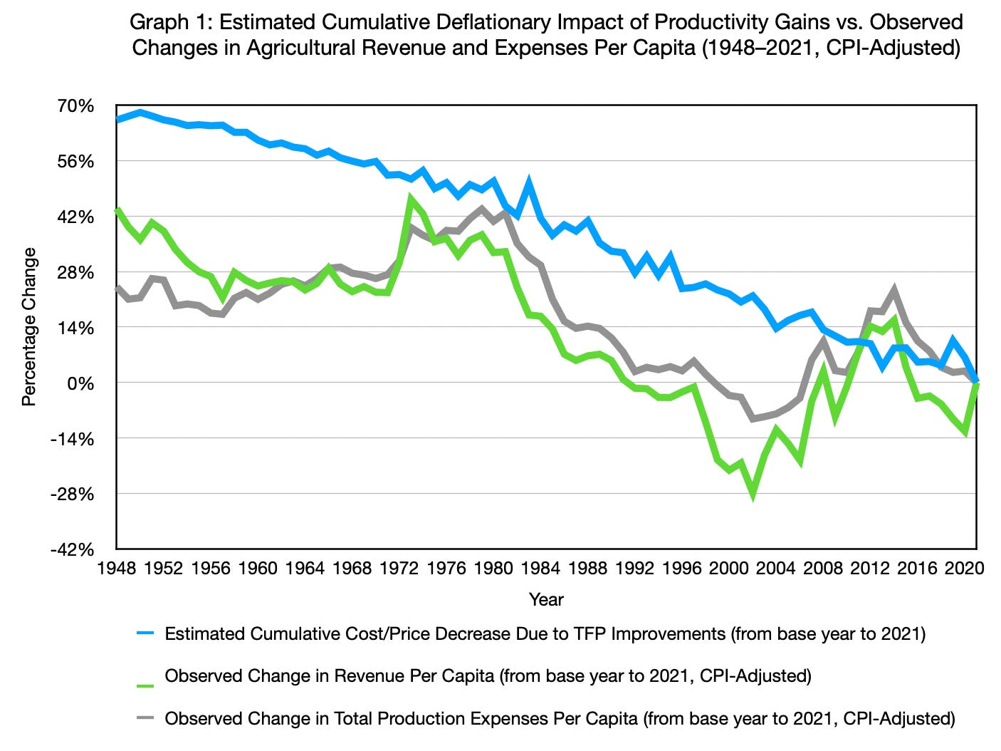
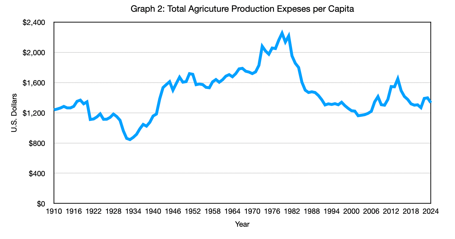
That apparent catch‑up needs context. The 1970s and early 1980s were a massive bubble period for farm costs, driven by energy crises, high inflation, high interest rates, rising debt burdens, and weather‑related supply problems. Graph 2 shows that CPI-adjusted total agricultural expenses per person almost doubled from 1910 to 1980; even from 1948 to 1980, they rose 38%, despite an expected 31% decline due to productivity, leaving a roughly 70-point gap that no single bubble can explain. The surge leading up to 1980 also distorts the baseline, since prices were already elevated by the agricultural bubble; thus, the post-1980 decline (40.69% under CPI) still falls well short of what sustained TFP should deliver.
Once we set aside the 1970s and early 1980s bubble, a consistent pattern emerges. For most starting years across the twentieth century, the CPI‑adjusted declines in revenue and expenses per person reach only about half to three‑quarters of what the TFP data say they should, typically ending up roughly 25 to a bit over 40 percentage points short of the productivity‑implied cost reductions. Taken together, those gaps show that CPI systematically misses a large share of the savings from productivity gains in agriculture.
This still leaves us with abstract aggregates, so the next step is to look at the prices you pay at the grocery store and compare them with those in 1980. Across 17 common staples in a typical household basket, CPI‑adjusted data show only a 3.12% decline in average prices since 1980, even after the massive bubble in agricultural expenses and revenue during that period. That figure also closely matches CPI’s own inflation picture, because CPI relies on percentage changes rather than price levels to limit calculation errors. Yet when we total the cost of all 17 items and compare it across years, the basket is only about 11.5% cheaper, a strikingly small payoff for the underlying productivity boom and for coming down from such an extreme bubble. These are exactly the kinds of foods that should be most exposed to cost reductions from farm and supply‑chain productivity gains: they are basic staples that households buy over and over again, creating strong pressure for large, efficient supply, and they are only lightly processed, so the post‑farm supply chain adds relatively little value and its own productivity improvements should reinforce, not offset, the cost savings from the field.
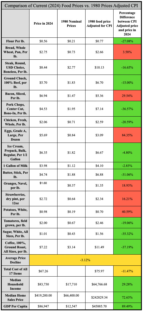
We also must step back and ask a deeper question. Over the same period, CPI says median household income is up about 29.3%, and GDP per capita is up almost 90%, yet many Americans feel more squeezed than ever as they try to balance their monthly budgets. At the same time, the median home price has risen roughly 72.6%, so wages have clearly not kept pace with the cost of a basic place to live.
In an economy that can produce food, goods, and services far more efficiently than in 1980, how is it possible that higher measured incomes coexist with a growing sense that everyday life is harder to afford? When we put CPI’s handling of the food puzzle alongside its picture of household finances, it becomes difficult to believe that the index is fully capturing the economic reality most families face. In that sense, CPI has failed the stress test; the numbers and the physical world no longer line up. At this point, CPI must show that its interpretation of the economy is still reliable, rather than remaining the standard, mostly because it got there first and was built into everything else. The natural next question is whether an alternative interpretation of inflation can do better. We turn first to the Boskin Commission’s view, to see whether its claim that CPI overstates inflation fits the hard data any more closely than the standard index does.
Methods and Sources
Estimated Cumulative Deflationary Impact of Agricultural Productivity Gains vs. Observed Changes in Per Capita Revenue and Expenses (1948–2021, CPI-Adjusted)
All series are converted to per‑capita values in 2024 dollars using the official CPI, then expressed as percentage changes from each base year to 2021, the last year available in the USDA TFP series. In practice, that means the 2021 values are first restated in 2024 dollars for consistency with the rest of the Food Puzzle series, and the percentage changes shown in the graph are calculated using these CPI‑adjusted figures; this introduces a small timing mismatch, but it keeps all dollar amounts in a common 2024 frame while preserving a valid comparison of trends.
Blue line (TFP‑implied decrease): Uses the USDA ERS TFP index to compute cumulative productivity gains from each year to 2021, then converts those gains into the expected percentage decline in costs if productivity were fully passed through (for example, a 50.8% expected expense reduction from a 1980 base to 2021).
Green line (revenue per capita): Uses USDA ERS all‑commodity farm revenue, deflated by CPI into 2024 dollars and divided by population, then shows the percentage change in real revenue per capita from each base year to 2021.
Gray line (expenses per capita): Uses USDA ERS total production expenses, deflated by CPI into 2024 dollars and divided by population, then shows the percentage change in real expenses per capita from each base year to 2021, with signs flipped so that cost declines plot as positive numbers and increases (like the 38.37% rise from 1948–1980) stand out as negative.
Graph 2: Total Agricultural Production Expenses Per Capita, Adjusted for CPI (1910–2024)
This graph uses total U.S. agricultural production expenses from the USDA ERS Farm Income and Wealth Statistics (production expenses series), converted to real per capita values in 2024 dollars.
Nominal expenses for each year 1910–2024 are deflated with the official CPI (all‑items U.S. city average) to obtain constant‑dollar values.
These CPI‑adjusted expenses are divided by total U.S. population in each year to produce real expenses per capita.
The plotted series is simply this real per‑capita expense level over time, from which changes like the 38.37% real increase between 1948 and 1980, and the subsequent post‑1980 decline, are calculated directly as percentage differences between years.
Comparison of Current (2024) Food Prices vs. 1980 Prices Adjusted CPI
All price and income figures are converted to 2024 dollars using the official CPI‑U before comparison.
Food item prices: For each of the 17 food items, nominal monthly prices for 1980 and 2024 are taken from the BLS Average Price (AP) series and averaged over the 12 months to get an annual price for each year. The 1980 annual prices are then multiplied by the CPI ratio (CPI-2024 ÷ CPI-1980) to obtain CPI-adjusted 2024-dollar values, which are compared with actual 2024 prices to compute percentage differences. The “average price change” row is the simple mean of these 17 percentage differences.
Basket totals and hours of work: The “basket” cost in each year is the sum of the 17 food items’ prices; hours of work required are calculated as basket cost ÷ average hourly wage for that year (BLS wage series), with 1980 wages also CPI‑adjusted to 2024 dollars for consistency.
Income, housing, and rent: Median household income is taken from Census historical income tables; median home prices from the FRED MSPUS series. The 1980 value is inflated to 2024 dollars using CPI before computing percentage differences.
GDP per capita: GDP levels are assembled from MeasuringWorth and FRED, population from Maddison‑style estimates and Macrotrends; I compute GDP per capita directly as real GDP ÷ population and then CPI‑adjust it to 2024 dollars where needed.
Sources
Bolt, J., & van Zanden, J. L. (2024). Maddison style estimates of the evolution of the world economy: A new 2023 update. Journal of Economic Surveys, 38(1), 1–41. https://doi.org/10.1111/joes.12618
Bureau of Labor Statistics. (2026). Consumer Price Index for All Urban Consumers (CPI-U) [Data set]. U.S. Department of Labor. https://www.bls.gov/cpi/
Federal Reserve Bank of St. Louis. (2024). Gross domestic product (GDP) [Data set]. FRED, Federal Reserve Bank of St. Louis. https://fred.stlouisfed.org/series/GDP
Federal Reserve Bank of St. Louis. (2024). Median sales price of houses sold for the United States (MSPUS) [Data set]. FRED, Federal Reserve Bank of St. Louis. https://fred.stlouisfed.org/series/MSPUS
Macrotrends. (2025). United States population 1820–2024 [Data set]. Macrotrends LLC. https://www.macrotrends.net/global-metrics/countries/usa/united-states/population
U.S. Bureau of Labor Statistics. (2024). Average price data (AP), U.S. city average. https://www.bls.gov/charts/consumer-price-index/consumer-price-index-average-price-data.htm
U.S. Census Bureau. (2024). Historical income tables: Households [Data set]. U.S. Department of Commerce. https://www.census.gov/data/tables/time-series/demo/income-poverty/historical-income-households.html
U.S. Department of Agriculture, Economic Research Service. (n.d.). Agricultural productivity in the U.S.: Summary of recent findings. Retrieved March 14, 2026, from https://www.ers.usda.gov/data-products/agricultural-productivity-in-the-united-states/summary-of-recent-findings
U.S. Department of Agriculture, Economic Research Service. (n.d.). Farm income and wealth statistics [Data set]. U.S. Department of Agriculture. https://data.ers.usda.gov/report.aspx?ID=4059
U.S. Department of Agriculture, Economic Research Service. (n.d.). Farm income and wealth statistics: Value of production and cash receipts tables [Data set]. U.S. Department of Agriculture. https://data.ers.usda.gov/report.aspx?ID=4055
Williamson, S. H. (2025). What was the U.S. GDP then? MeasuringWorth. http://www.measuringworth.org/usgdp/
Author: Kyle Novack
April 17, 2026
A Monumental Venture, LLC: research project (Novack Equilibrium Theory – NETs)
Attribution Required: © 2025–2026 Kyle Novack / Monumental Venture, LLC. For educational use with credit; commercial use requires permission. Full details in linked PDFs.