
From Farm Gate to Cart: The Missing Miracle
Food Puzzle: Part 3

Up to this point, we have stayed on the farm side of the story: more food, fewer people, less land, and a money world that somehow refuses to show the full extent of the savings. In this section, we follow those crops past the farm gate and into the grocery aisle. Food is one of the best stress tests for CPI because it is not optional. It hits every household every week, and staple items are far easier to compare over time than products whose quality, branding, and features constantly change. If our inflation yardstick is working, a century of productivity gains should show up as clearly lower real costs for an ordinary basket of groceries.
This is exactly why the earlier farm evidence matters so much. We know U.S. agriculture experienced an extraordinary productivity boom: from 1910 to today, the average number of people served per farm rose from about 14.5 to 182. Yet in CPI-adjusted dollars, total farm output per person fell by only about 26%. This closely matches the roughly 28% reduction in profit margins, while total farm expenses per person rose by about 7%. In other words, once we run everything through CPI, it still appears more expensive to farm today than in the past, even after a century of huge efficiency gains.
But farm data by itself cannot settle the issue. Consumers do not buy raw agricultural output; they buy food after processing, packaging, transportation, wholesaling, and retailing have all added value and cost. So even though the monetary data already suggest that farm‑level savings are not showing up the way we would expect, we still must ask a separate question: did those productivity gains ultimately translate into lower costs for consumers at the grocery store?
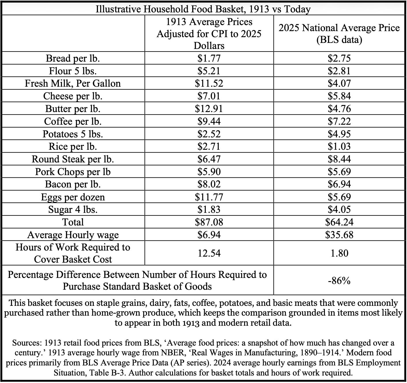
When we run a simple grocery‑basket test, the results are mixed. We can see this by using an illustrative household basket built from staple grocery items that appear in both 1913 and today. Using this standard basket of goods, we find that in 1913, the CPI‑adjusted cost would have been $87.08. Today, that same basket costs about 26% less than it did in 1913, adjusted for inflation. That is hard to believe: only a 26% decrease in food prices when every part of the process from farm to consumer has seen dramatic improvements. However, one piece of evidence shows that productivity gains have made food more affordable. When we examine the hours of work required to buy that same basket, we find they have been reduced by roughly 86%. This means food has clearly become more affordable over time in terms of human labor, even if CPI does not fully reflect the underlying productivity story.
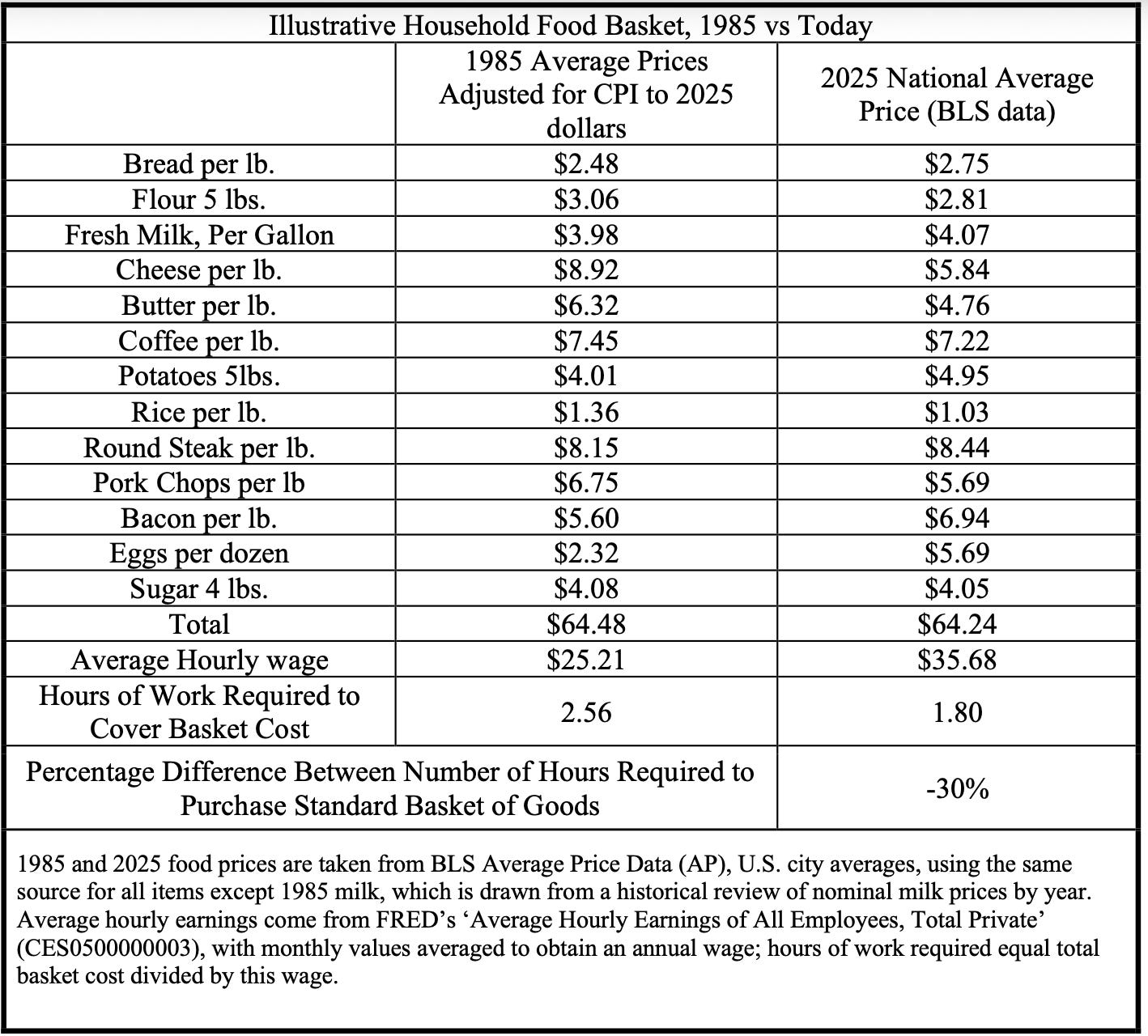
If we compare the same basket of goods from 1985 to today, the story gets even more complicated. USDA data show that farm productivity rose from 0.69 to 1.10 by 2021, implying a potential 34% decrease in food production costs over that period. This comparison matters because the 1985 economy looks much more like our modern economy than the 1913 economy does. Yet when we compare the total food basket cost adjusted for CPI, it is roughly the same price in 2025 as it was in 1985. That is not a typo: according to CPI, households see essentially no difference in the cost of this food basket despite the massive changes in the farm economy underneath.
This is confusing because economists often say the cost of living has improved. Under this reading of the data, it takes about the same inflation‑adjusted income in 2025 as in 1985 to cover the same basket of goods. That does not sound like an improvement in the cost of living, which is why so many people feel the pinch in the modern economy. Economists will quickly point out that, compared with wages from that year, it now takes about 30% fewer hours of work to pay for the same basket, and they wear that figure like a badge of honor. But there is more to the story than the fact that the hours went down; what matters is how we achieved that cost reduction.
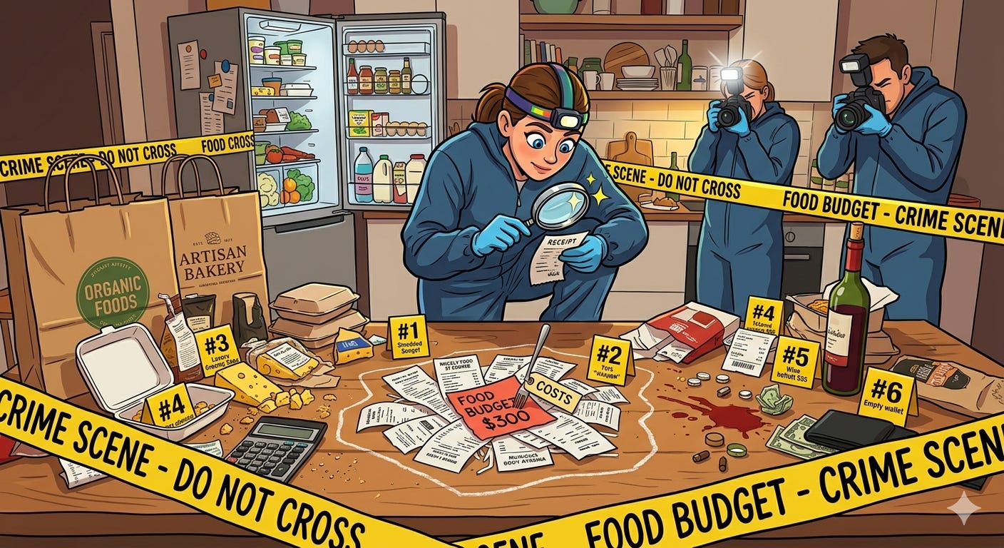
This illustrative household food basket is like blood spatter at a crime scene. It tells us something happened, but it does not, by itself, tell us exactly how. We know the hours of work needed to buy the basket fell by 30%, indicating improved affordability, but hours alone cannot tell us why. Within any single year, comparing prices to wages is straightforward: if both are in the same dollars, the hours come out the same.
The trouble starts when we compare prices across decades. Then the inflation adjustment becomes the ‘ruler’ we use to reconstruct the scene. This is more like piecing together a crime from grainy cameras and faded memories than watching it unfold in real time. If that ruler is off, we can easily mistake wage growth for cheaper food, or the other way around.
Economists are quick to say that if the hours of work required to buy food are falling, living standards must be improving, and the rest is just quibbling over indexes. But in a genuinely productivity‑driven economy, an hour of work should buy more over time because the real inputs needed to create each unit of output keep shrinking.
When productivity is doing the heavy lifting, we should see both the CPI‑adjusted price of the basket and the hours of work required move down together. Not one flat while the other does all the work. When hours fall, but CPI-adjusted prices stay stubbornly level. The pattern stops looking like a clean productivity win and starts looking like a problem with the yardstick we are using to measure inflation in the first place.
If CPI is roughly right, then one of the most dramatic productivity booms in the economy translated into only slight real declines in many staple food prices. This is hard to square with the scale of the agricultural transformation shown by the data. If CPI is missing part of the story, then this food basket is not just a table of grocery prices. It becomes evidence that productivity‑driven cost reductions were real but were masked by a deeper devaluation of the dollar.
Getting this right matters because the inflation measure we choose does not just change the story of food; it changes the story of wages, housing, and living standards more broadly. Even small differences in the index can reshape how we interpret past economies and how we judge the one we are living in now.
Because this pattern clashes with what both common sense and basic economic theory would predict, commentators and researchers have developed a set of familiar explanations for why grocery prices have not fallen more. These explanations are often presented as if they fully resolve the issue. In the next section, I lay them out clearly and then test the evidence to see whether they really explain why decades of productivity gains have not translated into lower food prices.
Before we turn to the standard explanations, a brief note on my use of the data. Wherever possible, I trace each series back to the earliest year the underlying source is reliable and internally consistent, even though not every series appears in a chart. I do not apply any exotic statistical adjustments. Instead, I use standard published series and stitch them together in a new way, with full citations so you can independently verify every step if you have any concerns.
The Standard Narrative for Food Prices.
When we ask why grocery prices have not fallen more despite massive gains in agricultural productivity. It is easy for commentators and researchers to fall back on a familiar set of explanations to dismiss the puzzle. None of these explanations is frivolous, and that is precisely why they are so persuasive at first glance: each contains enough truth to feel satisfying before the deeper questions are asked. Here are the five familiar suspects.
1. Suspect: Supply-Chain Dilution and Non-Farm Costs
The first and most intuitive answer is that the savings generated on the farm were absorbed by everything that happens after the farm gate: processing, packaging, transportation, wholesaling, and retailing. Even if raw agricultural production became far cheaper, consumers do not buy raw farm output; they buy food that has been moved, stored, branded, processed, and sold through a far more elaborate system than existed in the past.
2. Suspect: Market Power and Corporate Capture
A second explanation is that large food and beverage companies gained enough scale and bargaining power to keep consumer prices elevated even as their own input costs improved. In this view, concentration in branded and packaged foods allows dominant firms to squeeze suppliers, defend shelf prices, and capture a larger share of productivity gains rather than pass them through to households.
3. Suspect: External Shocks and Offsets
A third explanation indicates that a steady stream of disruptions affects food markets, including weather events, droughts, floods, animal disease outbreaks, energy price spikes, wars, and policy shocks. Even if productivity is quietly pushing costs downward in the background, repeated disruptions like these can keep prices elevated, create volatility, or obscure the long-run trend that would otherwise be easier to see.
4. Suspect: Regulation
A fourth explanation is that the modern food economy carries more rules, compliance burdens, and legal requirements than it once did. These added costs absorb part of the productivity dividend. Under this argument, farms, processors, distributors, and retailers may all be more efficient than they used to be. That thicker layer of regulation keeps those savings from fully reaching the consumer.
5. Suspect: Measurement Flaws in Inflation.
The final objection is that the problem may not lie entirely in food itself, but in the yardstick we use to compare prices across time. If the Consumer Price Index misstates inflation or causes us to misread past prices, then food may have fallen more than we think, and the puzzle may be partly a measurement problem rather than a production problem.
Taken together, these five suspects form the standard narrative for why grocery prices have not fallen more in real terms, despite agriculture’s extraordinary productivity boom. The real test, however, is not whether each explanation sounds plausible on paper, but whether the data show that any of them absorbed the missing savings that should have reached consumers.
In the next article, The Supply Chain Heist, we put the first suspect on the stand and follow the food dollar step by step from the farm gate to the checkout line to see how much of the farm-level miracle was quietly consumed by processing, packaging, transportation, wholesaling, and retailing.
Next: If the supply chain did not absorb the savings, it is time to put it on the stand directly. Continue to “The Supply Chain Heist Part 1.”
Sources and Methodology
Note on agricultural figures: Summary statistics on farm productivity, costs, and profit margins over 1910–2024 in this section are derived from USDA and related data using methods documented in Section 1 (‘Why Agriculture Is the Perfect Smoking Gun’) and Section 2 (‘The Money-World Paradox: Where Did All the Savings Go?’). Readers wishing to audit or replicate those calculations should consult the data sources and methods described there.
Federal Reserve Bank of St. Louis. (2026). Average hourly earnings of all employees, total private (CES0500000003) [Data set]. FRED. https://fred.stlouisfed.org/series/CES0500000003
Rees, A. (1966). Real wages in manufacturing, 1890–1914. In D. S. Brady (Ed.), Output, employment, and productivity in the United States after 1890 (pp. 83–130). National Bureau of Economic Research. https://www.nber.org/system/files/chapters/c2287/c2287.pdf
Taste of Home. (2023, November 27). Here’s the price of milk the year you were born. https://www.tasteofhome.com/article/heres-the-price-of-milk-the-year-you-were-born/
U.S. Bureau of Labor Statistics. (2013). Average food prices: A snapshot of how much has changed over a century (Beyond the Numbers, Vol. 2, No. 13). U.S. Department of Labor. https://www.bls.gov/opub/btn/volume-2/average-food-prices-a-snapshot-of-how-much-has-changed-over-a-century.htm
U.S. Bureau of Labor Statistics. (2024). Average price data (AP), U.S. city average. https://www.bls.gov/charts/consumer-price-index/consumer-price-index-average-price-data.htm
U.S. Bureau of Labor Statistics. (2026). Table B‑3. Average hourly and weekly earnings of all employees on private nonfarm payrolls by industry sector and selected industry detail [Data table]. The employment situation — January 2026. U.S. Department of Labor. https://www.bls.gov/news.release/empsit.t19.htm
Author: Kyle Novack
March 24, 2026
A Monumental Venture, LLC: research project (Novack Equilibrium Theory – NETs)
Attribution Required: © 2025–2026 Kyle Novack / Monumental Venture, LLC. For educational use with credit; commercial use requires permission. Full details in linked PDFs.