

Over the past month or two, while working through research on the Novack Equilibrium Theory, a thread kept surfacing in my sessions with Claude that could pose a problem for the theory. When you adjust historical dollar aggregates like GDP for a higher inflation rate, they show less growth over time. Push the rate high enough, and the growth disappears entirely. Real GDP is supposed to be the honest picture of physical output, so a nearly flat GDP per capita, one that rises only about 40% from 1910 to 2024, looked like a red flag. It looked like I was erasing something that could not be erased. At the time, it was the objection most likely to take the whole theory down.
That 40% comes out of the 1.5% annual drift estimate this framework was built on, and it’s worth being clear about what that number is. It isn’t a measurement. It’s what the math produces if you assume a 1.5% annual drift and run it forward, nothing more than that assumption expressed as a percentage. Whether the 1.5% itself holds up is a separate question, one I’m still testing, and that testing is where part 2 of this series picks up.
What I want to work through here is a different question, separate from whether the 1.5% survives: what do real GDP and CPI measure, and are they as independent of each other as they seem? What I’ve found digging into them is that both have a real place. Each one answers the specific question it was built to answer. The trouble starts when they get asked to answer a question they were never built for.
As I am working through the theory, it became increasingly clear that when real GDP and CPI are applied to a question they were not built to answer, problems start to show up. The net versus gross argument had already given me a definitional case that measured inflation was understating the real rate, and if that was right, GDP per capita should look smaller in real, constant terms than the official series shows. This helped reinforce a belief I held for a long time before I could show why it was true. I wasn’t making a claim about the widgets. I was making a claim about the dollar’s value.
But I could not yet say why the two claims were separable, why doubting the dollar didn’t also mean doubting the quantity data sitting inside the same aggregate. What I only worked out recently is that the arithmetic already guarantees the separation. Whatever you do to the dollar figures, the physical goods and services already recorded cannot change. If the economy produced a billion widgets in a given year, that stays true no matter what happens to the dollar value attached to it. It changes where that value shows up, not whether the quantity is still there.
This is where economics runs into something physics never has to. Some of what it measures is physically true by necessity: a billion widgets is a billion widgets, and no accounting choice touches that. But a price is not like a widget count. It is one number that multiple different forces could have produced, and there is no label attached telling you which force did how much of the work. A car costs what it costs. Whether that price reflects supply and demand, the cost of materials, the state of the dollar, or some mix of all three is a question the price itself does not answer, and it’s a live dispute even in real time, not just in hindsight. That’s part of why I can hand you twenty dollars and ask what it is worth, and you cannot answer without telling me what it buys, knowing the number doesn’t tell you what produced it.
That tangle is why real GDP and CPI exist in the first place, and it is worth seeing exactly how each one tries to untangle it, because they do so with the same raw data.
What Real GDP Actually Measures
First, it is important to understand what real GDP provides. For economists, this should not be new information. For everyone else, real GDP is not what you think. As defined by the BEA, this is a quantity-based index. This means that, yes, real GDP is given in dollars. However, when you compute the growth rate between any two years, say 1960’s value compared to 2017’s, the difference between those two is the unit growth of the economy, not a statement about what a dollar was worth in either year (1).
Here is the problem that forces that construction. If I take one billion units of X, one million units of Y, and a hundred thousand units of Z, and try to combine them into one growth figure, the result is not accurate, because they are separate units and cannot simply be summed. If X is paperclips, Y is cars, and Z is houses, adding the unit counts together tells you nothing about what actually happened to the economy. Making 50% more paperclips, once the machinery is in place, is barely a feat. Producing 20% more houses would be something to celebrate.
The arithmetic makes the problem concrete. Start with one billion paperclips, one million cars, and a hundred thousand houses. Grow paperclips 50%, hold cars flat, grow housing 20%, and add up the raw unit totals in each year. The combined total rises from just over one billion units to just over one and a half billion, an increase of 49.94%. That figure is being driven almost entirely by paperclips, because there are simply so many more of them than anything else in the count. A 20% jump in housing, the kind of change people would feel, barely moves the number at all. The two do not carry the same weight, and raw counts cannot tell them apart.
This is also why you cannot resolve the problem by counting goods and services together as one combined unit. Services are not even well defined the same way goods are. What is a haircut, measured against a car? They share no physical unit at all, and no dollar figure changes that. A price tag on a haircut and a price tag on a car are not two readings of some shared underlying quantity, the way two prices for gallons of milk would be. There is no haircut-equivalent hiding inside a car’s price.
What the dollar does is different, and narrower. It doesn’t give goods and services a common physical unit. It gives you a common weight for combining their separate growth rates. A haircut’s own growth in quantity can be tracked against what people spent on haircuts last year; a car’s growth can be tracked the same way against car spending. Neither measurement requires knowing what a haircut is worth in car terms. Combining them means weighting each by what was spent on it, not converting one thing into units of the other. That is the question real GDP exists to answer: given everything the economy produced this year and everything it produced the year before, how much more, or less, did it produce, once the effect of prices simply moving is stripped back out. The physical incommensurability between a haircut and a car never gets solved. It gets set aside, because the question was never how many car-equivalents a haircut is worth, it was always how much more, in total, the economy produced. Price only enters as the tool that makes unlike things addable, not as something being measured for its own sake. But for that tool to work, you need an accurate price level for each individual industry, so that the quantity growth attributed to that industry is accurate too (1).
This is exactly what real GDP does. Working industry by industry, BEA applies a price index specific to that industry, most of them produced by BLS, to strip out price change and isolate that industry’s quantity growth. Those deflated components are then combined into a single aggregate figure, and dividing the nominal figure for that year by the real figure gives the GDP deflator. The same operation run at the industry level gives industry-specific deflators (2).
What that produces is one link. The calculation compares a year against the year beside it, using both years’ prices and both years’ quantities, and the result is that single year’s growth in real terms. It is not a measurement of that year standing alone. A price index for 2020 is not a fact about 2020; it is a ratio of 2020 to 2019. There is no version of this that exists without two years in the picture (2).
The full series is those links multiplied together. Since 1996, BEA has used Fisher chain-weighting, which means real GDP from 1960 to 2017 is not one comparison against a fixed base year. It is roughly fifty-seven separate adjacent-year comparisons, each computed the way described above, chained end to end. Only at the very last step does the dollar label get attached: the chain itself is unitless, a pure sequence of quantity ratios, and it gets multiplied by one reference year’s actual nominal GDP so the numbers read in familiar units. That is where “real GDP in 2017 dollars” comes from. It is a readability convention, not a statement about the 2017 dollar (1, & 2).
There is a good reason it is built this way, and it is not only a practical one. Pricing 2017 quantities directly at 1960 prices requires prices for goods that did not exist in 1960 and quantities for goods that had disappeared by 2017. But the deeper problem is that a fixed base year locks its own relative prices in as permanent weights, and the goods whose quantities grow fastest are usually the goods that got relatively cheap. Keep applying the old weight to something that has become cheap, and growth is overstated. This means the further you travel from the base year the more pronounced this error becomes. Chaining removes that by refreshing the weights every year and never comparing anything to a year more than twelve months away. What it gives up is that any long-span claim about growth becomes a product of many small comparisons rather than one large one, and the properties of that product are not the same as the properties of any link inside it (1).
That is what real GDP actually is. Not a photograph of the economy at some fixed moment, not a single comparison against one base year, but a long chain of small, adjacent-year comparisons, each one asking only how much quantity changed since the year right before it, with the dollar figure attached at the very end purely so the result is readable. At no point in that chain does real GDP ask what a dollar was worth. It isn’t built to. Its entire purpose is to hold the price side still, link by link, so that whatever is left over is quantity and nothing else (1).
That is also its limit. Real GDP can tell you the economy produced more, and by how much, but by design it has already discarded the price information needed to say anything about what happened to the dollar along the way. For that, you need a measure built to do the opposite: hold quantity still and let price move. That is what CPI is for.
What CPI Is Built to Do
CPI is designed to ask a different question entirely. It is designed to ask how much prices are changing over time. To do this, the BLS collects price quotes for 94,000 items and 8,000 rental housing quotes across 200 categories. Then they must determine the weights for each category, to establish how much each category represents in the average consumer’s spending. Those weights come from the Consumer Expenditure Survey, a separate BLS survey that tracks what households actually spend money on. It’s what supplies the spending weights CPI applies to each category, and those weights have been updated annually since 2023, rather than on the two-year cycle BLS used before that (3).
This basket is not absolutely fixed from year to year. But it is not in constant flux either. Pull the BLS basket from 1970 and compare it to 2000, and the core categories, food, housing, transportation, medical care, are still recognizably the same, even as what falls inside each one has shifted. Pull the 2000 basket and compare it to 2024, and the same is true again. The basket updates. It does not reinvent itself.
Now that they have the basket, the price quotes, and the weights, they do not compare price levels directly to get the inflation rate. They compare price change. For each item within a category, BLS computes the ratio of this period’s price to last period’s, then combines those ratios within most categories using a geometric mean rather than a simple average, a formula adopted in 1999 in response to the Boskin Commission. The geometric mean allows for substitution, but only inside a narrowly defined item group. If round steak gets expensive and New York strip does not, the formula assumes some shifting between the two cuts. It does not allow shifting from beef to chicken. Substitution across categories is not part of CPI-U at all; that is what the Chained CPI added in 2002, and it is published as a separate series. Shelter, roughly a third of the index, is one of the exceptions to the geometric mean and still uses an arithmetic form. Those category-level changes are then weighted by spending shares drawn from the Consumer Expenditure Survey and aggregated up to the number you see reported: the annual rate of inflation according to CPI-U (3).
This is where the two measures stop being independent.
The Same Data, Split Two Ways
BEA does not collect its own consumer price data. It does not need to, because BLS is already in the field taking roughly 94,000 price quotes a month. So when BEA deflates Personal Consumption Expenditures (PCE), which is roughly two-thirds of GDP, it does it largely with detailed CPI component indexes: the item-level series that go into CPI, applied to the corresponding pieces of consumer spending. Elsewhere in the accounts it uses PPI for much of domestic output and BLS import and export price indexes for trade. The price side of real GDP is, to a significant degree, BLS price data (4).
That does not make real GDP a repackaged CPI, and it is worth being precise about the difference. The PCE price index and CPI use different weights, with PCE drawing on business survey data and CPI on the Consumer Expenditure Survey. They cover different scope, PCE including spending made on households’ behalf by employers and government, CPI covering only out-of-pocket urban consumer spending. They aggregate with different formulas, PCE chain-weighted like the rest of the accounts, CPI-U not. Those differences are real enough that PCE inflation and CPI inflation regularly come out several tenths of a point apart, and the Federal Reserve targets the PCE rather than the CPI for exactly that reason (4).
But the raw material underneath both is the same collection effort. Whatever is true of how BLS observes a price, defines an item, handles a quality change, or treats a substitution flows into both measures, because there is only one set of price quotes and both are built from it.
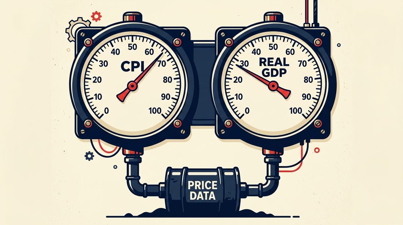
This is the point I want to sit on. Real GDP and CPI look like two independent instruments taking two independent readings of the economy. They are not. One number gets observed, nominal spending, and both measures divide it: CPI holding quantities fixed and letting prices move, real GDP holding prices still and letting quantities move. They then split it using price data drawn from the same source. If there is something the price data does not capture, it does not fail to appear in one measure and show up in the other. It is missing from both, and it is missing in a way that is invisible from inside either one, because neither has an outside reference to check against.
Two measures built to look at opposite sides of the same split end up in the same neighborhood, not because either one confirms the other, but because the neighborhood was set by construction before either calculation ran. CPI and real GDP will not produce identical numbers. It is not in dispute that their different weights, different formulas, and different scope guarantee they won’t. However, they share the same underlying data, and different constructions applied to that same data still produce different answers, not because anything was measured badly, but because the choice of formula is itself a choice about what to count as price and what to count as quantity. What they will do is come out close, close enough that a chart of CPI-deflated GDP and official real GDP tracks the same shape almost every year. That closeness looks like agreement, like two independent instruments checking each other and coming back with the same reading. It is not that. It is what happens when two different splits of one number are performed on data drawn from the same source. The proximity was built in by the question each one was set up to answer. It is not evidence that either answer is right (4).
Both Are Reading From the Same Page.
It is worth saying plainly that the shared-data point above is not a new observation. BLS published the reconciliation itself in 1981, when users kept asking why CPI and the PCE deflator gave different inflation readings if both were supposedly tracking consumer prices. Jack Triplett, an assistant commissioner at BLS at the time, answered directly: eighty-five of the deflator’s one hundred fifteen components were taken straight from CPI. That has been documented by the agencies that build both measures for well over four decades, not discovered here (5).
What the reconciliation literature does with that fact is explain the gap. BEA sorts the divergence between CPI and the PCE deflator into a formula effect, a weight effect, a scope effect, and a small residual, and those categories are well studied. That is also as far as the literature goes. It treats real GDP and CPI as two instruments that happen to share data and occasionally disagree about how to weight it (6).
That is not quite what they are, and it is the reason this article exists. Two instruments implies two chances to catch something the other one missed. What’s actually here is one division of one number, run twice, with two different rules for which half is called price and which half is called quantity. If something about the dollar’s own movement was never visible to the price data in the first place, that absence does not get caught by the other measure. It was never in a position to catch it. Both are reading from the same page.
That is the limit this piece has been circling from the start. The search for something outside CPI and real GDP that could independently confirm either one comes up empty, not because nobody has looked hard enough, but because the same source data sits underneath both, documented as such since 1981. What that absence means for the dollar specifically, and whether anything can be built that doesn’t inherit it, is where the next piece in this series picks up.
Reference
1. Bureau of Economic Analysis. Concepts and Methods of the U.S. National Income and Product Accounts, Chapters 1–4. December 2024. https://www.bea.gov/resources/methodologies/nipa-handbook/pdf/chapters-01-04.pdf
2. Bureau of Economic Analysis. NIPA Handbook, Chapter 4: Estimating Methods (chain-weighting mechanics). https://www.bea.gov/resources/methodologies/nipa-handbook/pdf/chapter-04.pdf
3. Bureau of Labor Statistics. Handbook of Methods, Chapter 17: The Consumer Price Index. https://www.bls.gov/opub/hom/cpi/home.htm
4. Bureau of Economic Analysis. “What is the ‘market-based’ PCE price index?” FAQ 83, on PCE components deflated by detailed CPI and PPI series. https://www.bea.gov/help/faq/83 Accessed August 17,2026
5. Triplett, Jack E. “Reconciling the CPI and the PCE Deflator.” Monthly Labor Review, September 1981. https://www.bls.gov/opub/mlr/1981/09/art1full.pdf
6. Bureau of Economic Analysis. “What accounts for the differences in the PCE price index and the Consumer Price Index?” FAQ 555. https://www.bea.gov/help/faq/555 Accessed August 17,2026
Author: Kyle Novack
Date: August 21, 2026
A Monumental Venture, LLC research project
Novack Equilibrium Theory (NETs)
Attribution Required: ©2025–2026 Kyle Novack / Monumental Venture, LLC. For educational use with credit; commercial use requires permission. Full details in linked PDFs.