
The Final Straw: Comparing Inflation Metrics to Monetary Expansion
Food Puzzle: Part 13


The extreme critiques in the last section highlight a genuine issue: the official CPI may indeed under‑capture some cost pressures in specific urban or lifestyle contexts, but the magnitude of these pressures leads to conclusions that defy empirical reality. ShadowStats applies a rough, constant adjustment to official data rather than a full methodological recalculation. The Chapwood Index relies on informal surveys of frequently purchased items in major cities, which overweights high‑cost urban areas and volatile essentials. Both approaches overcorrect, producing numbers that do not line up with observable productivity gains, wage trends, or overall economic stability.
Like the Boskin Commission, these alternatives identify real measurement flaws but misjudge their scale and direction. The Food Puzzle, and the broader perception of stagnation, remains unresolved until we adopt a more modest adjustment, such as my roughly 1.5% annual understatement proposed here (the 1.5% drift). This allows for unmeasured deflationary forces from productivity without drifting into absurdity.
How to Read the Data in This Post
To keep the main story readable, I keep in‑text citations and technical details to a minimum. Tables and figures include only short captions and a few key references, so you can follow the argument without wading through footnotes on every line. All of the underlying data series, transformations (such as per‑capita conversions and velocity adjustments), and exact inflation formulas are documented in the Methods and Sources section at the end of this part. If you have questions about where a number comes from or how a graph was constructed, that is the place to look for full sourcing and methodology.
Why the Monetary Test is Necessary
To put these inflation measures under one more stress test, we need to compare them with monetary expansion. In the classical monetary tradition, going back at least to the quantity theory of money, sustained inflation is largely seen as a monetary phenomenon: over long periods, the price level tends to track the amount of money circulating in the economy, once you allow for real growth. That does not mean every short‑term price move is caused by money, but it does give us a simple benchmark: if an inflation index claims large changes in the value of the dollar, those changes should bear some reasonable relationship to how much the money stock itself has grown.
First, we need to clarify the key money‑supply metrics.
Monetary Base (high‑powered money): Currency in circulation plus reserve balances held by banks at the Federal Reserve; in 2024–2025, this stood at roughly 5.4–5.9 trillion dollars.
M1: Currency held by the public plus transaction deposits such as checking accounts.
M2: The broadest and most relevant for consumer spending; includes M1 plus small‑denomination time deposits (under 100,000 dollars) and retail money‑market mutual fund shares.
Alongside these levels, economists track the velocity of money, how many times, on average, each dollar of M2 is used in transactions over the course of a year. If M2 measures the size of the pool of liquid dollars, velocity measures how quickly that pool circulates through actual purchases. A higher velocity means the same stock of money is doing more work in generating nominal GDP. A lower velocity means more of it is sitting idle in reserves or savings. Because many critics argue that “extra M2 never reached the real economy,” velocity is crucial here: it already discounts dollars that do not turn over into measured spending and therefore is the natural way to adjust raw money growth before comparing it to long‑run price changes.
To ensure a fair and honest comparison, there is one final step: we need to adjust for population size. When more people share a stable stock of money, the amount available per person falls, which mechanically raises the value of each dollar and pushes the system toward monetary deflation. Too few dollars chasing goods and services. Persistent deflation is just as destabilizing as high inflation in any economy. This means that a growing population naturally requires a larger money supply over time. That means the relevant question is not simply “How big is M2?” but “How much money is there per person?”, and, once we bring velocity back in, “How much effective money per person is actually turning over into the economy each year?”
That is why, in this section, I take the two extra steps of adjusting M2 by velocity of money, so only the portion of broad money that turns over into measured GDP each year is counted, and I convert this “effective” money stock into per‑capita terms so that simple population growth does not exaggerate inflationary pressure. These adjustments do not make the data flawless, but they deliberately incorporate the standard objections to using M2 as an inflation proxy and provide the fairest monetary benchmark we can construct from public series before comparing it to different inflation interpretations.
How Different Inflation Interpretations Compare to the Money Supply
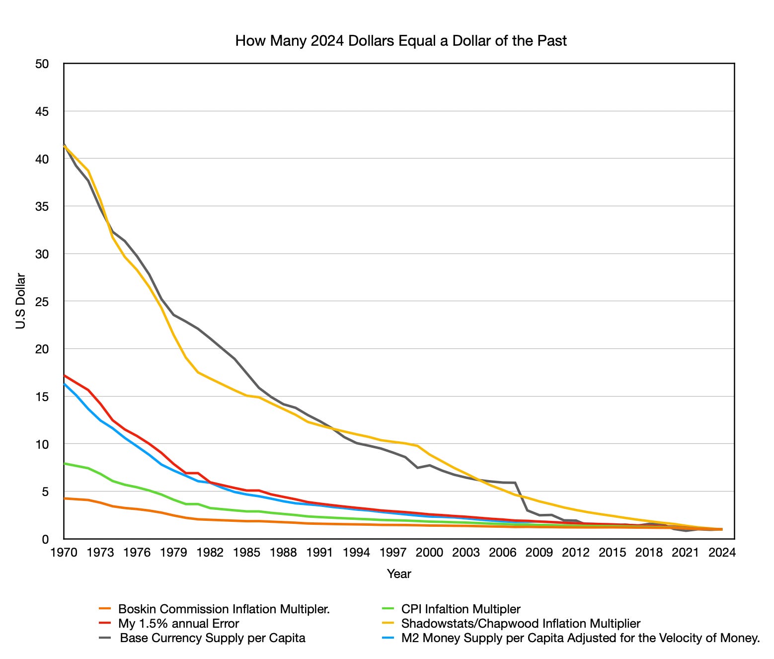
The graph above shows how many dollars today it takes to equal one dollar from the past under different measures of inflation. For example, the M2‑baseline adjusted for velocity of money indicates that $1 in 1980 is roughly equivalent to about $7 in 2024, depending on the exact dates and revisions. Each curve is an inflation “multiplier”: it takes a past dollar and compounds it forward to 2024 to show how much nominal cash you would need today to have the same purchasing power if that index were the true measure of inflation. The graph plots these CPI‑based multipliers alongside two monetary benchmarks: one based on the monetary base per person and one based on M2 per person adjusted by the velocity of money, which reflects only the portion of broad money that actually turns over into measured spending each year.
Standard CPI (green) and the Boskin‑adjusted index (orange) show relatively little cumulative growth, far below any measure of monetary expansion, an unlikely outcome if prices broadly reflect more dollars chasing goods.
ShadowStats/Chapwood (yellow, about 7 percentage points above CPI since 2000) at times outpaces even explosive growth in the monetary base, implying an inflation level that cannot be reconciled with money creation or observed economic stability.
My 1.5‑percent annual understatement thesis (red) tracks the velocity‑adjusted M2‑per‑capita line most closely. This inflation interpretation is the most consistent with the classical view that broad money growth is the main driver of long‑run price levels of the inflation measures tested. It does mildly overshoot this benchmark, but the gap falls within the range of calculation error for GDP, M2, and an inflation adjustment based on an average drift. In practical terms, the money‑supply path is consistent with a CPI understatement of about 1.4–1.5% per year. I use 1.5% as a simple, rounded estimate rather than a claim of exact precision.
This alignment is not accidental. This version of M2 is the best proxy for liquid money that can readily enter the real economy and influence consumer prices, whereas the monetary base, while crucial for banking policy, includes reserves that may never reach households directly. My proposal does not require a perfect one‑for‑one match, but it does provide the clearest connection between our inflation gauge and monetary reality.
It is also important to note that I arrived at the 1.5‑percent drift estimate before I ever compared it to monetary expansion. In other words, I did not tune the 1.5‑percent figure to match M2 per capita adjusted for the velocity of money; the close fit in this graph emerged only after the fact, as one more link in a growing body of evidence consistent with the drift thesis. At the same time, neither the Food Puzzle results nor this version of the M2 benchmark, nor any single chart, is enough on its own to “prove” the theory. Taken together, they motivate the 1.5‑percent interpretation as a serious, testable alternative, but fully validating or refuting it will require further work across other sectors, countries, and data sources.
The Results of the Food Puzzle.
At this point, every path we have tested points in the same direction. The physical data from farms and food baskets say prices should have fallen much more than CPI admits; Boskin’s downward correction makes the puzzle worse; the ShadowStats–Chapwood adjustments overshoot into fantasy; and when we line all of them up against the growth of money per person, only a modest 1.5‑percent annual understatement keeps prices and money moving in step. In other words, the Food Puzzle is not a mystery of missing savings in the real economy but a measurement problem in our main inflation gauge. The final step is to show, piece by piece, how this 1.5‑percent drift not only reconciles food with productivity, but also brings wages, housing, and everyday living costs back into a story that matches what households actually feel, which is the work of the next section, “Why the 1.5% Drift Validates your Gut feeling about the Economy.”
Methods and Sources
How Many 2024 Dollars Equal One Dollar of the Past (1970–2024)
This graph shows the cumulative inflation multiplier—how many 2024 dollars are required to match the purchasing power of one dollar in a given past year—under four different inflation adjustment methods. It also plots three measures of money‑supply growth, adjusted where noted, which serve as benchmarks for the classical view that long‑run price changes are largely driven by increases in money available to consumers.
Inflation multipliers (forward‑adjusted to 2024):
Boskin Commission adjustment (orange): Subtracts about 1.3 percentage points of annual overstatement before 1996, then 1.1 points after, following the 1996 Advisory Commission report.
Author’s 1.5‑percent understatement thesis (red): Adds 1.5 percentage points to reported CPI across the period to capture unmeasured deflation from productivity, as developed in the NETs framework.
ShadowStats/Chapwood‑style adjustment (yellow): Uses official CPI through 1999, then adds about 7 percentage points of annual understatement from 2000 onward, based on published divergences from Shadow Government Statistics and the Chapwood Index.
Money-Supply Multipliers:
Monetary base per capita (gray): Currency in circulation plus reserve balances at the Federal Reserve (BOGMBASE), divided by U.S. population, then expressed as a ratio to its 2024 level.
M2 per capita adjusted for velocity (blue): M2SL multiplied by the velocity of M2 (M2V), then divided by population and expressed as a ratio to its 2024 value; this series approximates “effective money per person” that actually turns over into measured nominal GDP each year.
For each inflation series, a dollar from a past year is compounded forward to 2024 using that method’s cumulative factor. Money‑supply levels (monetary base, M2, and M2×velocity) are taken from FRED as annual year‑end values, then divided by population (Macrotrends for recent years and Maddison‑style estimates from Bolt and van Zanden for earlier years) and expressed as ratios to their respective 2024 per‑capita levels (for example, 1980 M2×velocity per capita ÷ 2024 M2×velocity per capita).
Sources
Board of Governors of the Federal Reserve System (US). (2026). M2 (M2SL) Dataset. Federal Reserve Bank of St. Louis. Retrieved April 19, 2026, from https://fred.stlouisfed.org/series/M2SL
Board of Governors of the Federal Reserve System (US). (2026). Monetary base: Total (BOGMBASE) Dataset. Federal Reserve Bank of St. Louis. Retrieved April 19, 2026, from https://fred.stlouisfed.org/series/BOGMBASE
Bolt, J., & van Zanden, J. L. (2024). Maddison style estimates of the evolution of the world economy: A new 2023 update. Journal of Economic Surveys, 38(1), 1–41. https://doi.org/10.1111/joes.12618
Boskin, M. J., Dulberger, E. R., Gordon, R. J., Griliches, Z., & Jorgenson, D. W. (1996). Toward a more accurate measure of the cost of living: Final report to the Senate Finance Committee from the Advisory Commission to Study the Consumer Price Index. U.S. Senate Committee on Finance. https://www.ssa.gov/history/reports/boskinrpt.html
Bureau of Labor Statistics. (2026). Consumer price index for all urban consumers (CPI‑U) Dataset. U.S. Department of Labor. https://www.bls.gov/cpi/
Chapwood Index. (n.d.). The Chapwood Index: Our solution. Retrieved January 4, 2026, from https://chapwoodindex.com/the-solution/
Federal Reserve Bank of St. Louis. (2026). Velocity of M2 money stock (M2V) Dataset. Federal Reserve Bank of St. Louis. Retrieved April 19, 2026, from https://fred.stlouisfed.org/series/M2V
Macrotrends. (2025). United States population 1820–2024 Dataset. Macrotrends LLC. https://www.macrotrends.net/global-metrics/countries/usa/united-states/population
Williams, J. (2023, June 14). Shadow Government Statistics: Analysis behind and beyond the economic reporting. Retrieved January 4, 2026, from https://www.shadowstats.com/alternate_data/inflation-charts
Author: Kyle Novack
April 27, 2026
A Monumental Venture, LLC: research project (Novack Equilibrium Theory – NETs)
Attribution Required: © 2025–2026 Kyle Novack / Monumental Venture, LLC. For educational use with credit; commercial use requires permission. Full details in linked PDFs.