
The Final Straw: Comparing Inflation Metrics to Monetary Expansion
Food Puzzle Part 13.


Editorial Note, May 2026
This article has been updated to correct a methodological error in the monetary comparison section, identified by a well-known economist whose feedback I am grateful for.
The original version used M2 adjusted for the velocity of money as the primary monetary benchmark. The problem is that M2 times velocity equals nominal GDP by definition, meaning the original comparison was not a monetary test at all. It was measuring my inflation estimate against total economic output per person.
The corrected version uses raw M2 per capita, which is the appropriate measure. The core conclusion is unchanged and is strengthened by the correction. The original published version remains accessible above for transparency.
The Monetary Test
The extreme critiques in the last section highlight a genuine issue: the official CPI may indeed under-capture some cost pressures in specific urban or lifestyle contexts, but the magnitude of these pressures leads to conclusions that defy empirical reality. ShadowStats applies a rough, constant adjustment to official data rather than a full methodological recalculation. The Chapwood Index relies on informal surveys of frequently purchased items in major cities, which overweights high-cost urban areas and volatile essentials. Both approaches overcorrect, producing numbers that do not line up with observable productivity gains, wage trends, or overall economic stability, as established in the Food puzzle Part 12.
Like the Boskin Commission, these alternatives identify real measurement flaws but misjudge their scale and direction. The Food Puzzle, and the broader perception of stagnation, remains unresolved until we adopt a more modest adjustment, such as my roughly 1.5% annual understatement proposed here (the 1.5% drift). This allows for unmeasured deflationary forces from productivity without drifting into absurdity.
How to Read the Data in This Post
To keep the main story readable, I limit in-text citations and technical details. Tables and figures include only short captions and a few key references, so you can follow the argument without wading through footnotes on every line. All of the underlying data series, transformations such as per-capita conversions, and exact inflation formulas are documented in the Methods and Sources section at the end of this part. If you have questions about where a number comes from or how a graph was constructed, that is the place to look for full sourcing and methodology.
Why the Monetary Test Is Necessary
To put these inflation measures under one more stress test, we need to compare them with monetary expansion. In the classical monetary tradition, going back at least to the quantity theory of money, sustained inflation is largely seen as a monetary phenomenon: over long periods, the price level tends to track the amount of money circulating in the economy, once you allow for real growth. That does not mean every short-term price move is caused by money, but it does give us a simple benchmark: if an inflation index claims large changes in the value of the dollar, those changes should bear some reasonable relationship to how much the money stock itself has grown.
Before explaining which monetary measure this comparison uses, it is worth briefly naming the key options and why each one falls short in a specific way.
Monetary base (high-powered money): Currency in circulation plus reserve balances held by banks at the Federal Reserve. In 2024 to 2025 this stood at roughly 5.4 to 5.9 trillion dollars. The monetary base is heavily influenced by Federal Reserve policy decisions, particularly the post-2008 and post-2020 rounds of quantitative easing, which caused it to expand dramatically without producing proportionate increases in consumer prices. It is a useful policy metric, but a poor proxy for money actually available to households.
M1: Currency held by the public plus transaction deposits such as checking accounts. M1 is too narrow; it excludes savings accounts and money market funds that households draw on for purchases.
M2: The broadest standard measure, including M1 plus small-denomination time deposits under 100,000 dollars and retail money market mutual fund shares. M2 is the most relevant measure for consumer spending because it captures the full stock of liquid dollars that households can access.
M2 adjusted for the velocity of money: Velocity measures how many times, on average, each dollar of M2 is used in transactions over the course of a year. Multiplying M2 by the velocity of money approximates the amount of spending those dollars generate. This sounds like an improvement because it filters out dollars sitting idle in savings. However, it creates a more serious problem: M2 times velocity is, by the quantity theory of money, equivalent to nominal GDP. Using it as an inflation benchmark means comparing a price measure to total economic output, which grows for reasons entirely unrelated to consumer prices, including real productivity gains, capital deepening, and shifts in the sector mix. The velocity adjustment solves one problem and introduces a worse one.
Why Raw M2 Per Capita Is the Right Benchmark
Given the limitations above, raw M2 per capita is the appropriate benchmark for this comparison. It represents the total stock of liquid dollars available per person, which is the relevant question when asking whether money creation over time is consistent with a given inflation rate.
The per-capita adjustment is not optional. A growing population requires a larger money supply simply to maintain the same dollar amount per person. Without adjusting for population, raw growth in M2 would exaggerate inflationary pressure by confusing a larger economy with a less valuable dollar. The correct question is not how large the total money supply is, but how many dollars each person in the economy has.
The M2 per capita ratio used in the graph is calculated straightforwardly as 2024 M2 per capita divided by M2 per capita in a given past year. This tells you how many times larger the per-person money supply is today than in the past, which is the natural upper bound on how much of that money creation could have shown up in consumer prices.
It is an upper bound, not a target, and that distinction matters. Not all dollars in M2 reach consumer goods markets. Some flow into asset prices, some remain in savings, and some are absorbed by the banking system without circulating into spending. This means any honest inflation measure is expected to sit below the raw M2 per capita line, not track it precisely. A measure that equaled or exceeded M2 per capita growth would be claiming that consumer prices absorbed every dollar created, which no serious monetary economist would argue.
How Different Inflation Interpretations Compare to the Money Supply
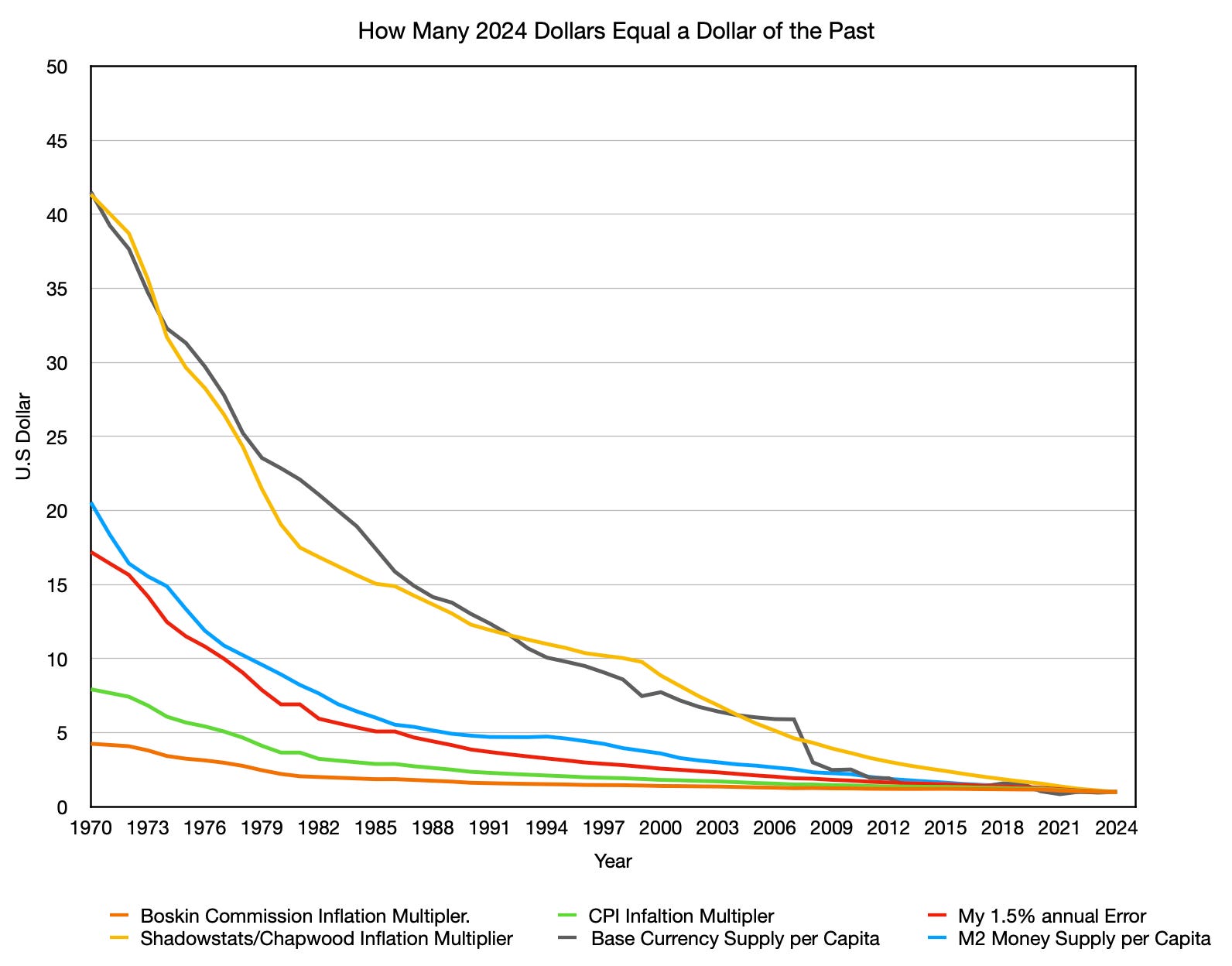
The graph above shows how many dollars today it takes to equal one dollar from the past under different measures of inflation. Each curve is an inflation multiplier: it takes a past dollar and compounds it forward to 2024, showing how much nominal cash you would need today to have the same purchasing power if that index were the true measure of inflation. The graph plots these CPI-based multipliers alongside two monetary benchmarks: the monetary base per capita and raw M2 per capita.
Reading the graph honestly produces several clear findings.
Standard CPI (green) and the Boskin-adjusted index (orange) sit far below all measures of monetary expansion throughout the entire 54-year period. This is the central puzzle the graph raises. If the money supply per person expanded dramatically, the question is not whether that showed up somewhere in prices; it is where. Official CPI implies that the overwhelming majority of money creation evaporated without touching consumer prices, asset prices, or any observable price level. That conclusion is not consistent with what we observe in housing, equities, farmland, or everyday costs of living.
ShadowStats/Chapwood (yellow) at times outpaces even the monetary base per capita, implying a level of consumer price inflation that exceeds total money creation. That is not possible in any coherent monetary framework. An inflation measure that rises faster than the money supply suggests purchasing power was destroyed faster than money was printed, which would require a mechanism of monetary destruction that is not present in the data.
My 1.5% annual drift (red) sits below the raw M2 per capita line for the entire period. This is not a weakness in the argument. It is the only logically correct position. The gap between the red line and the blue line represents dollars that were created but did not reach consumer prices, flowing instead into asset markets, savings, and reserves. That gap has a coherent story behind it. The red line is high enough to suggest CPI meaningfully understates consumer price inflation, and low enough to remain consistent with the portion of money creation that plausibly reached household spending.
The Question This Graph Actually Raises
The most important observation is not that my 1.5% drift tracks the M2 line reasonably well. It is that official CPI sits so far below the expansion of the money supply that it raises a question no mainstream economist has answered cleanly: where did all that money go?
There are three possible destinations for money creation that do not show up in CPI: consumer price inflation, asset price inflation, or genuine productivity-driven deflation that offsets the monetary expansion. The NETs framework argues that all three are present, but CPI captures only the third and ignores the first almost entirely. The result is a measured inflation rate that is systematically too low, and a population that feels the gap between official numbers and lived experience precisely because the money did reach them, just not in ways CPI tracks.
It is also important to state clearly what this comparison does not prove. It does not prove the drift is exactly 1.5% rather than 1.2% or 1.8%. It does not prove that the gap between official CPI and raw M2 per capita is entirely attributable to CPI mismeasurement; some of it reflects genuine savings and asset absorption. What it does show is that official CPI is too low to be consistent with monetary reality, and that a modest upward correction in the range I have proposed is directionally required by the data. I arrived at the 1.5% figure independently, before ever comparing it to monetary expansion. The fact that it lands in the defensible zone between official CPI and the raw M2 upper bound emerged after the fact as one more piece of a consistent pattern, not as a number I tuned to fit this chart.
The Results of the Food Puzzle
At this point, every path we have tested points in the same direction. The physical data from farms and food baskets say prices should have fallen much more than CPI admits. Boskin’s downward correction makes the puzzle worse. The ShadowStats and Chapwood adjustments overshoot into territory that monetary data cannot support. And when we line all of them up against the growth of money per person, only a modest 1.5% annual understatement keeps consumer prices in a defensible relationship with monetary expansion, sitting below the upper bound set by raw M2 per capita and far above the floor implied by official CPI.
In other words, the Food Puzzle is not a mystery of missing savings in the real economy. It is a measurement problem in our main inflation gauge. The final step is to show, piece by piece, how this 1.5% drift not only reconciles food with productivity, but also brings wages, housing, and everyday living costs back into a story that matches what households actually feel, which is the work of the next section, “Why the 1.5% Drift Validates Your Gut Feeling About the Economy.”
Methods and Sources
How Many 2024 Dollars Equal One Dollar of the Past (1970 to 2024)
This graph shows the cumulative inflation multiplier, meaning how many 2024 dollars are required to match the purchasing power of one dollar in a given past year, under four different inflation adjustment methods. It also plots two measures of monetary expansion as benchmarks for the classical view that long-run price changes are largely driven by increases in money available to consumers.
Inflation multipliers (forward-adjusted to 2024):
Boskin Commission adjustment (orange): Subtracts about 1.3 percentage points of annual overstatement before 1996, then 1.1 points after, following the 1996 Advisory Commission report.
Author’s 1.5% understatement thesis (red): Adds 1.5 percentage points to reported CPI across the period to capture unmeasured deflation from productivity, as developed in the NETs framework.
ShadowStats/Chapwood-style adjustment (yellow): Uses official CPI through 1999, then adds about 7 percentage points of annual understatement from 2000 onward, based on published divergences from Shadow Government Statistics and the Chapwood Index.
Money supply multipliers:
Monetary base per capita (gray): Currency in circulation plus reserve balances at the Federal Reserve (BOGMBASE), divided by U.S. population, then expressed as a ratio to its 2024 level.
Raw M2 per capita (blue): M2 (M2SL) divided by U.S. population for each year, then expressed as a ratio to its 2024 per-capita level. Calculated as 2024 M2 per capita divided by M2 per capita in any given past year. This series represents the total stock of liquid dollars available per person without any velocity adjustment, and serves as the upper bound for how much money creation could have reached consumer prices.
For each inflation series, a dollar from a past year is compounded forward to 2024 using that method’s cumulative factor. Money supply levels are taken from FRED as annual year-end values, then divided by population from Macrotrends for recent years and Maddison-style estimates from Bolt and van Zanden for earlier years, and expressed as ratios to their respective 2024 per-capita levels.
Sources
Board of Governors of the Federal Reserve System (US). (2026). M2 (M2SL) Dataset. Federal Reserve Bank of St. Louis. Retrieved April 19, 2026, from https://fred.stlouisfed.org/series/M2SL
Board of Governors of the Federal Reserve System (US). (2026). Monetary base: Total (BOGMBASE) Dataset. Federal Reserve Bank of St. Louis. Retrieved April 19, 2026, from https://fred.stlouisfed.org/series/BOGMBASE
Bolt, J., & van Zanden, J. L. (2024). Maddison style estimates of the evolution of the world economy: A new 2023 update. Journal of Economic Surveys, 38(1), 1-41. https://doi.org/10.1111/joes.12618
Boskin, M. J., Dulberger, E. R., Gordon, R. J., Griliches, Z., & Jorgenson, D. W. (1996). Toward a more accurate measure of the cost of living: Final report to the Senate Finance Committee from the Advisory Commission to Study the Consumer Price Index. U.S. Senate Committee on Finance. https://www.ssa.gov/history/reports/boskinrpt.html
Bureau of Labor Statistics. (2026). Consumer price index for all urban consumers (CPIU) Dataset. U.S. Department of Labor. https://www.bls.gov/cpi/
Chapwood Index. (n.d.). The Chapwood Index: Our solution. Retrieved January 4, 2026, from https://chapwoodindex.com/the-solution/
Macrotrends. (2025). United States population 1820 to 2024 Dataset. Macrotrends LLC. https://www.macrotrends.net/global-metrics/countries/usa/united-states/population
Williams, J. (2023, June 14). Shadow Government Statistics: Analysis behind and beyond the economic reporting. Retrieved January 4, 2026, from https://www.shadowstats.com/alternate_data/inflation-charts
Author: Kyle Novack
May 20, 2026
A Monumental Venture, LLC: research project (Novack Equilibrium Theory – NETs)
Attribution Required: © 2025–2026 Kyle Novack / Monumental Venture, LLC. For educational use with credit; commercial use requires permission. Full details in linked PDFs.