
The Hidden 1.5% Inflation Gap: Technical Proof
A NETs appendix – why housing, wages, money supply, and GDP all converge on the same missing drift


For years, I had a vague sense that the official inflation numbers weren’t telling the whole story. It wasn’t a theory at first—it was a math problem. If wages were “at record highs” and inflation was “under control,” why did so many households still feel squeezed?
This post is the story of what happened when I stopped taking the Consumer Price Index (CPI) at face value, started stress‑testing it against other data, and kept seeing the same number come back: a hidden drift of about 1.5 percentage points a year.
The search for a missing ruler
In 2021, when inflation spiked back into the headlines, the usual suspects jumped in:
Alternative sites claiming CPI “really” understates inflation by 5–7 percentage points.
Politicians are calling the index fraudulent.
Analysts are pointing to money‑supply charts and to money velocity.
Those arguments were loud, but they all shared a gap: very few showed what those claimed errors would actually do to long‑run price series like housing, wages, or GDP if you applied them consistently.
So, I pulled the data myself.
I downloaded every long‑running series I could get my hands on:
GDP per capita
Median home prices
National average wages
Federal tax revenue per person
A broad measure of the money supply per person (M2 per capita: cash plus checking, savings, and other easily accessible deposits, divided by population).
At first, I wasn’t hunting for a “flat line” or a magic number. I didn’t know what I would find. I simply asked:
What happens to the history we think we know if CPI has been off by a little bit, every single year?
So I re‑ran the same data with different constant errors added to the CPI—0.5%, 1%, 1.25%, 1.5%, 3%—and watched how the series changed.
The Flatline Discovery
I expected some noise, not a revelation. But at a 1.5% drift, something startling happened across multiple datasets at once:
• Housing, inflation‑adjusted, stopped marching endlessly upward and became almost flat for nearly a century.
• Wages per person looked roughly flat until the well‑known 1970s wage and productivity gains started to diverge.
• Government revenue and spending per capita settled into remarkably stable bands instead of exploding.
In the median home price data, for example, adjusting only with official CPI still leaves a clear upward trend, while CPI plus 1.5 percentage points a year flattens the series into a tight range; pushing the correction to 3% makes 1970s homes “worth” close to $1 million in today’s dollars—an obviously absurd result.
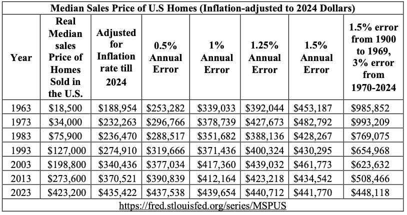
The odds that all of these series would accidentally flatten at the same error rate are tiny. It was the first sign that, with the right correction, one dollar in the past behaves almost like one dollar today when comparing prices over time.
Under official CPI, all of these per‑person series show strong long‑run upward trends. Under CPI, plus a 1.5 percentage-point drift, they compress into nearly horizontal lines over long stretches of history.
In other words:
When you assume CPI has understated inflation by about 1.5 percentage points per year, the “explosive growth” story evaporates. On a per‑person basis, the economy starts to look surprisingly flat.
Why a 1.5% error fits when 3% doesn’t
A natural question is: why not 1%? Why not 2%? Why make such a big deal over 1.5?
Smaller corrections (0.5%, 1%) don’t fix the core paradoxes. Housing still looks like a long, rising staircase. Money‑supply growth and price growth still don’t match well. Wage and tax series still explode upward too much to square with lived experience.
Larger corrections (2%, 3%) make basic series nonsensical. You end up with homes that “should” be far cheaper than anyone’s experience, or implausibly huge deflation in categories that clearly didn’t collapse.
The 1.5% drift is not a magic constant; it’s the rate that:
Flattens multiple independent per‑capita series into ranges that still make intuitive sense, and
Brings the long‑run behavior of prices into line with what you’d expect from money supply and productivity.
That brings us to the “why” behind the gap.
Why the CPI gap exists
1. Productivity is deeply deflationary
Over the last century, technology has relentlessly slashed the human‑time cost of producing most goods.
In 1940, the average farm could feed 20.89 people; today, that average farmer can feed 181.82 people, thanks to mechanization and better methods.
Manufacturing, logistics, and computing tell similar stories: we can make far more stuff per hour than we used to.
In a world like that, every producible good should tend to get cheaper in real terms over time. Outside of things you can’t easily “productivity‑hack” (like fixed land in prime locations, or inherently scarce services), the natural tendency is toward falling real prices.
CPI, however, is built on the assumption that prices tend to rise and treats many price drops as “quality adjustments” rather than what they often are: genuine deflation driven by productivity. When you systematically relabel genuine price declines as “same price, higher quality,” you understate true inflation.
Over decades, a small annual understatement compounds into a huge drift.
2. Money supply vs prices: the 1.5% mirror
The first objection any trained economist will raise is: “You can’t just compare money supply and prices—you have to account for velocity (how often that money moves).” That’s true, so I did.
Since 1970, M2 per capita adjusted for velocity—a broad measure of how much effective money each person has in circulation—has grown by roughly a factor of 17.5, while official CPI says the price level has risen only about 7.9 times. When I add a 1.5 percentage point drift to CPI and compound it, the adjusted price level rises by almost the same factor as effective M2, and on the chart, the “1.5% drift” line runs alongside the money‑supply line instead of peeling away from it
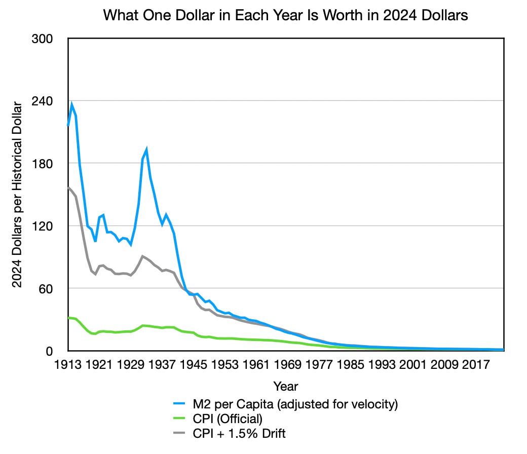
When you extend the comparison back to 1913, the pattern holds: unadjusted CPI never really catches up with the long‑run expansion of the money supply, but CPI plus roughly a 1.5% annual drift tells a money and price story that rhymes. Velocity and money per person still matter; together they reinforce the idea that persistent inflation ultimately reflects how much money is created and how quickly it circulates, not some mysterious surge in ‘real value.’ The value of money does exactly what you’d expect if new money had been quietly eroding the dollar faster than CPI has admitted.
The point isn’t that 1.5% is a perfect constant. It’s that when you let the data speak—across housing, wages, government revenues, and the money supply—the same drift keeps reappearing. At some point, the burden of proof shifts: either six independent series are all conspiring to lie, or our main inflation gauge has been off by roughly the same small amount for more than a century.
3. The surprisingly fixed value of a human hour
Under official CPI, GDP per capita since 1900 appears to explode: increasing by 784.37%.
Under a 1.5% correction, that explosion shrinks dramatically. The implied economic value generated per person per year barely creeps upward, only 30%. Matching what you’d expect from population and basic structural change.
This fits a simple intuition:
A baker 200 years ago might make 10 loaves an hour.
A modern baker with modern equipment might make 100.
The modern baker produces more units per hour, but that doesn’t mean a human hour itself is ten times more valuable. It means the value created in that hour is spread across more units, making each one cheaper.
Viewed through that lens, a mostly flat GDP‑per‑person line says:
A human hour of economic effort is roughly as valuable as it has always been; what changed is how many units we can squeeze into that hour.
That’s exactly what you see when you adjust CPI upward by about 1.5% a year.
4. Productivity measures point to the same number
Independent measures of productivity growth point to the same range as the drift:
U.S. agricultural total factor productivity has averaged about 1.46% a year over many decades (Wang, Nehrign, Mosheim, & Njuki, 2024).
Non‑farm business productivity has run around 2.1% annually over the post‑war period (U.S. Bureau of Labor Statistics, 2026).
When CPI, due to design, almost entirely misses productivity‑driven cost reductions, especially in sectors where quality adjustments are poorly handled. As a result, you’d expect a wedge between “true” inflation and reported inflation on the order of that productivity.
A 1.5 percentage point drift sits right in that band.
What This all Means
None of this requires you to believe in a grand conspiracy. It only requires three modest claims:
Productivity has slashed the human‑time cost of producing most goods.
CPI, by construction, fails to fully recognize the deflationary impact of that productivity.
Over a century, even a small annual understatement compounds into a large hidden gap.
When you correct CPI by about 1.5 percentage points a year, that hidden gap largely disappears:
Per‑capita series that looked like explosive growth flattened into realistic ranges.
Money supply and prices tell a more coherent long‑run story.
The value of a human hour appears stable rather than mysteriously skyrocketing.
Numbers can be messy, but when this many independent series all “fit” best around the same drift, the burden of proof shifts. At some point, you have to stop asking whether there’s a hidden inflation gap and start asking what we’re going to do about it.
In coming posts, I’ll show how this mismeasurement quietly rewrites our understanding of wages, housing, and even fertility—and why fixing the ruler is the first step toward an economy that finally tells the truth about your time.
This document assumes familiarity with the core argument. If you have not read the narrative version, start with the “Food Puzzle Master Summary” or the full series beginning at Part 1. For more Technical Proof read “NETs: Unmasking Economic Illusions with Time-Based Truth” and “NETs Core Claim: The 1.5% Drift.”
References:
U.S. Census Bureau and U.S. Department of Housing and Urban Development, Median Sales Price of Houses Sold for the United States [MSPUS], retrieved from FRED, Federal Reserve Bank of St. Louis; https://fred.stlouisfed.org/series/MSPUS, February 4, 2026.
Wang, S. L., Nehring, R., Mosheim, R., & Njuki, E. (2024). Measurement of output, inputs, and total factor productivity in U.S. agricultural productivity accounts (Report No. TB-1966). U.S. Department of Agriculture, Economic Research Service. https://www.ers.usda.gov/dataproducts/agricultural-productivity-in-the-united-states/
U.S. Bureau of Labor Statistics, (January 29, 2026) “Productivity and Costs.” U.S. Department of Labor, https://www.bls.gov/productivity/.
United States, Bureau of Labor Statistics. “Consumer Price Index.” U.S. Department of Labor, www.bls.gov/cpi/.
Author: Kyle Novack
March 8, 2026
A Monumental Venture, LLC: research project (Novack Equilibrium Theory – NETs)
Attribution Required: © 2025–2026 Kyle Novack / Monumental Venture, LLC. For educational use with credit; commercial use requires permission. Full details in linked PDFs.