
The Inflation Number Was Never Calibrated Correctly, and It Is Costing You $26,000 a Year
Your financial reality is not the exception. It is the equilibrium.


You already know how this month ends. You run the numbers in your head at the grocery store, at the gas station, when you inevitably must decide which bill gets paid first and which one waits another week. You are not bad at managing money. You are not spending carelessly. You are doing the math correctly, yet it keeps coming up short.
That gap between what you earn and what a stable life costs is not a personal failure.
It has a number.
It has a cause.
It has a paper trail.
The paper trail ends at a number the official story never even contemplated.
That number is $26,000.
That is the annual difference between what the median American household earns today and what the data indicate they should earn. Not a political target. Not an economist’s wish. A ratio that held steady from the late 1920s to 1970, that broke at a specific, identifiable moment, and has been drifting in the wrong direction for fifty years.
The Ratio Nobody Set, and Nobody Fixed
From 1950 through 1970, median household income sat at approximately 50% of GDP per household, occasionally rising above it but never falling meaningfully below. In 1970, it peaked at 52.71%. The decline that followed has never reversed. The line was not perfectly flat, but it was close enough that, if you drew it across two decades of data, all observations would fall near it.
That was not a policy target. Nobody set it deliberately. It was the natural result of an economy in which the median worker received a historically normal share of what the economy produced. It was the period when a single income could support a family of four, when a working household could afford a modest home, absorb an unexpected expense, and save something for the future without requiring two full-time incomes just to stay solvent.
That ratio is now 38%.
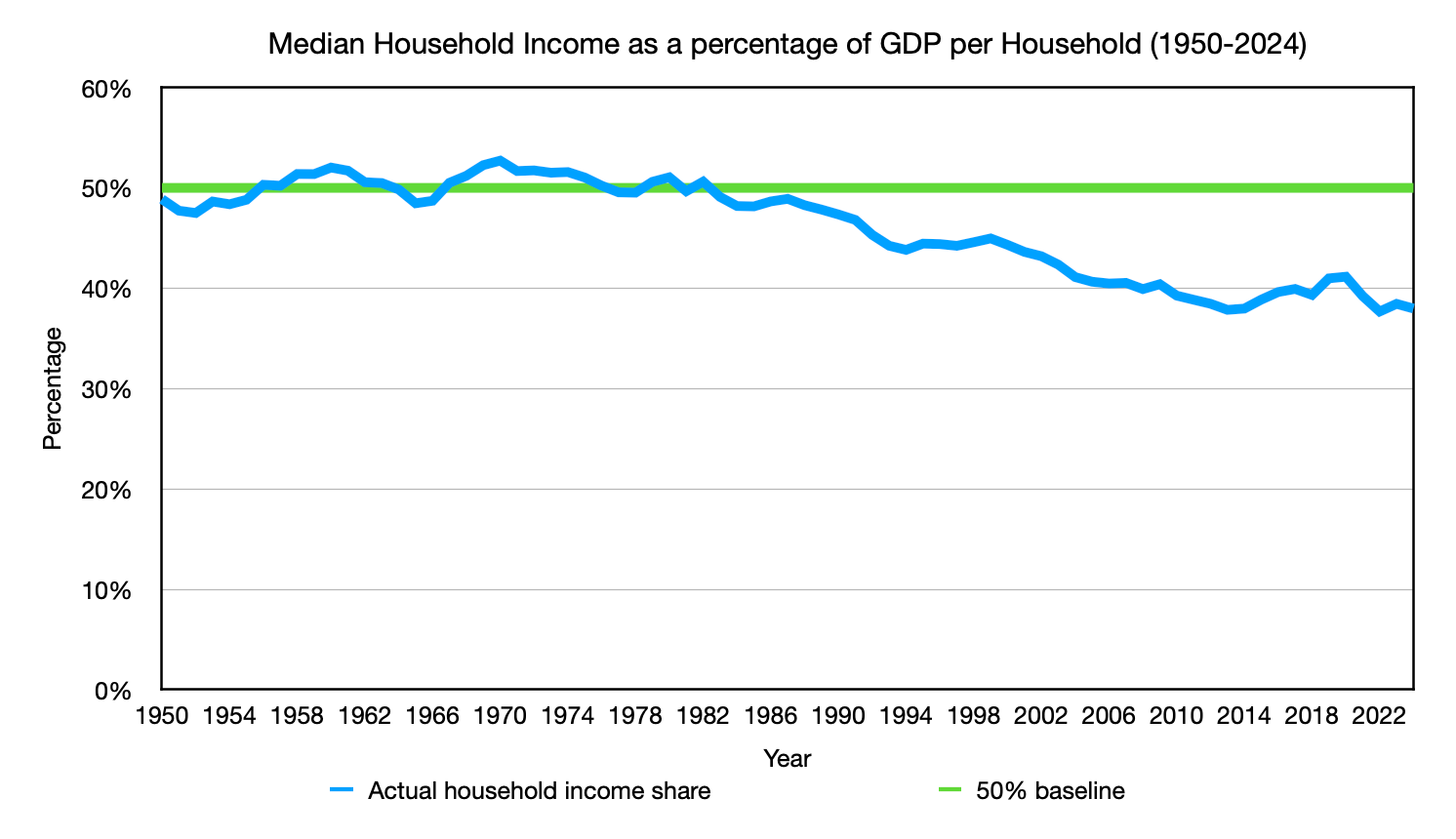
As of 2024, GDP per household was $220,472. Median household income was $83,730, which represents approximately 38% of that figure. The historical baseline, maintained consistently from 1950 through the early 1970s, was 50%. Restoring that ratio at 2024 GDP-per-household levels would put median household income at approximately $110,000. The difference between $83,730 and $110,000 is $26,270, approximately $26,000 per year, and it is the gap this article is built around.
That $110,000 is not a lavish lifestyle. It is not financial freedom. It is the income at which a family of four can maintain a stable life without requiring both parents to work full-time simply to stay solvent. A modest home. Reliable transportation. The ability to absorb an unexpected expense without a crisis. Enough margin to save something. That is the definition of a middle-class life as most Americans over fifty remember it. It is not a memory of wealth. It is a memory of stability.
Twenty years of stable data is a reasonable starting point. It is not, on its own, a foundation.
But the household income ratio is not the only dataset telling this story. Wage and salary accruals as a percentage of GDP show the same 50% baseline holding from 1929 to 1970, a span of roughly forty years. That trend survived the Great Depression as well as World War II. Two of the most economically disruptive events in modern history pushed against it and it held. The ratio was not fragile. It was structural.
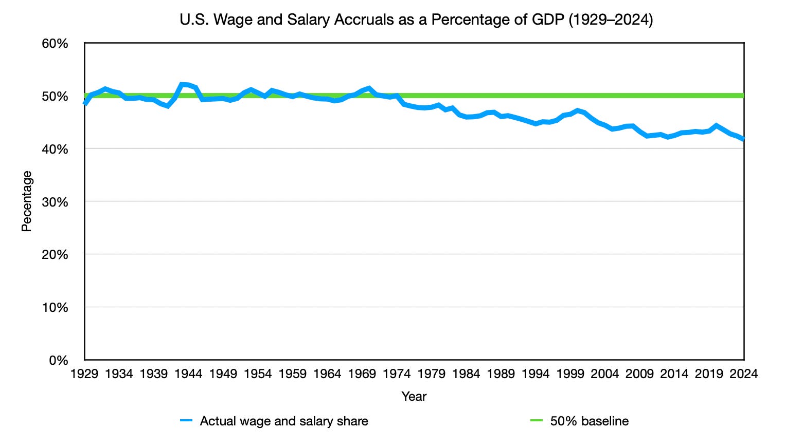
Both datasets peaked in the same year. In 1970, total wage and salary accruals as a percentage of GDP reached 50.38%. In the same year, median household income as a percentage of GDP per household peaked at 52.71%. From that shared peak, both lines began a descent that has continued with only brief recoveries for more than fifty years.
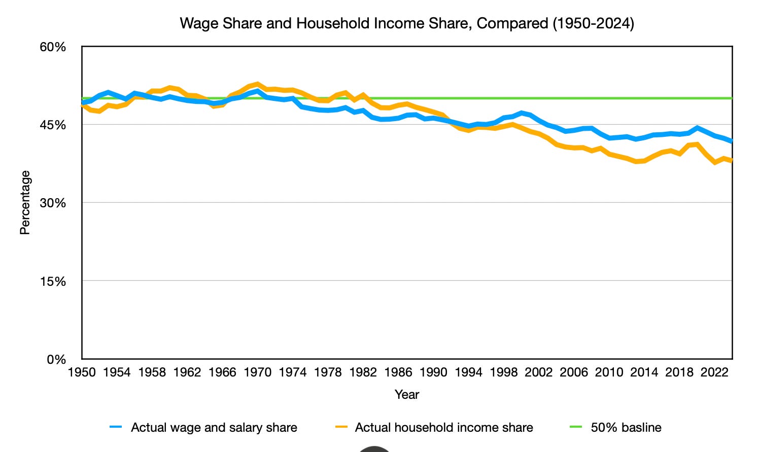
They do not track each other precisely. Given that both are derived from wage and salary data, you might expect near perfect correlation. The historical record does not support that expectation. One can be used as a directional estimate of the other within a margin of error, but they are measuring different populations within the same wage base: one captures the aggregate across all earners, the other captures the midpoint of the distribution. Substituting one for the other without the actual data would produce an unreliable conclusion.
What they do confirm together is more important than what separates them: the structural shift was real, it was simultaneous across both measures, and it has not reversed.
The Math Hiding Inside the Two-Income Household
The data shows a structural shift. Here is what that shift looks like from inside a household budget.
At the median, one income is no longer enough. Most families of four now require two incomes to cover what one income covered two generations ago. The second income looks like the solution. The arithmetic says otherwise.
Consider a household where one partner earns $60,000 and the other earns $40,000, for a total of $100,000, an illustrative example built from real cost data rather than a single reported case. That second income sounds significant on paper. According to the Department of Labor, full-day childcare for one child costs between $6,552 and $15,600 per year, averaging approximately $11,000. For two children, that is between $13,000 and $31,200 annually, approximately $22,000 on average, paid out of the second income in after-tax dollars. After childcare, commuting, additional food costs, and the professional expenses that come with holding a job, the household nets approximately $10,000 per year from that second income. To generate that same $10,000 after taxes with one income, the primary earner would only need to earn $12,000 more, bringing their income to $72,000, meaning the household is paying roughly $30,000 in combined costs and taxes to bring home $10,000.
This confirms what most households already feel, and the data makes it precise: a household earning $100,000 on two incomes is significantly worse off than a household with one earner earning $100,000. The reported income is identical. The financial reality is not. The two-income household is not funding a lifestyle. It is funding the conditions that make working possible.
The economy is charging families to replace the very thing it simultaneously makes too expensive to keep.
This is not a critique of working parents. It is a description of a constraint dressed up as a choice. The one-income household was the norm for most of American economic history. It did not disappear because families stopped wanting it. It disappeared because the economics of maintaining it quietly became inaccessible at the median, gradually enough that it looked like a cultural shift rather than a financial one.
The second income is not supplementing the household. In many cases, it is simply paying for the privilege of existing.
The shift in the ratio means that every four years, the median household falls approximately $104,000 short of where the historical ratio would place it. It does not stop there.
The Squeeze Does Not Stop at the Median
Goldman Sachs’s 2025 Retirement Survey and Insights Report found that rising costs in housing, childcare, healthcare, and education have outpaced wage growth since 2000, narrowing the gap between income and expenses across all income levels, including high earners. Goldman Sachs attributes this to category-specific cost increases. That explanation describes what the trend looks like. It does not explain what is producing it beneath the surface.
The NETs project offers an explanation for why purchasing power has compressed faster than even CPI-adjusted income figures suggest. There is a cultural benchmark for what a high income should deliver. That benchmark was set years ago based on a wage that no longer provides what we think it does. Yet, the expectation has only marginally shifted. A $250,000 income today carries the weight of extraordinary success. By drift-adjusted purchasing power, which corrects for what CPI misses, it is approximately equivalent to a $100,000 income in 2000, which was considered a very good income but not an extraordinary one. The housing data confirms this directly. In 2000, the median new home price was $172,900, which represented 1.73 times a $100,000 income. In 2024, the median new home price was $419,200, which represents 1.68 times a $250,000 income. The ratio is nearly identical. The market has priced the drift-adjusted equivalence that CPI has never admitted.
To put this into perspective, according to Pew Research, in 2000, a $100,000 income placed a household in the upper-middle-class income range. That same purchasing power, as the housing data above confirms, requires approximately $250,000 today. Yet according to Pew Research’s 2023 income-tier data, $250,000 places a household well within the upper-income tier, above the $183,000 entry threshold. The same purchasing power that once delivered an upper-middle-class life now carries an upper-income label. The classification changed. The absolute quality of life has improved. But the expectation of how much better your life should feel relative to everyone else has expanded faster than the purchasing power that was supposed to deliver it.
This expectation gap compounds in a second direction. The experiential gap between what an ordinary household and a high-income household can access has been closing for decades. The quality of housing, vehicles, and consumer goods available at the median has risen enough that meaningfully differentiating a high-income lifestyle now requires dramatically more spending than it once did. High-income earners are not simply trying to signal wealth to others. They are trying to prove to themselves that the income delivered what it was supposed to deliver. When it does not, the gap between expectation and reality does not stay as savings. It becomes spending.
None of this absolves the responsibility to manage what you have wisely. The paycheck-to-paycheck feeling is not only a personal finance problem. It is what a structural measurement error feels like when it compounds across an entire economy for fifty years.
The Instrument Was Never Built for This Job
If the gap is this large and this persistent, why does every official report tell you wages are up, inflation is under control, and the fundamentals are strong?
Because the number they are using to measure inflation was never designed to measure what they are asking it to measure.
The Consumer Price Index tracks the final price of goods and services after the entire economy has already done its work. By the time CPI starts measuring, productivity gains have already been absorbed into the prices it records. The productivity dividend, the savings from better technology, more efficient logistics, and improved agricultural output, disappear into final prices before measurement even begins.
What CPI measures is net inflation: the price change you observe after productivity has already suppressed what prices would otherwise be. What it does not measure is gross inflation: the true rate at which the dollar is losing purchasing power from monetary expansion alone.
That distinction is not a technicality. It is the entire argument. When you use a net figure to adjust gross economic data, wages, GDP, and real returns, you are comparing measurements that are not measuring the same thing. Every downstream conclusion built on that comparison is quietly miscalibrated. This means every major economic decision made against that number for a century, interest rates, wage negotiations, pension adjustments, policy targets, has been built on a measurement that was never capturing what it was asked to prove.
The squeeze you feel every month is the accumulated result of that miscalibration. It is not in your head. It is not your spending habits. It is a measurement error compounding silently over decades, and it has a name: the 1.5% annual drift between what CPI reports and what the dollar is actually losing.
One and a half percent per year does not sound like enough to explain what households have been feeling. Compounded over decades, it explains the divergence between the measured and the felt economy.
That divergence has consequences beyond the household budget. When the official numbers consistently contradict what people experience directly, and when those people are repeatedly told their instincts are wrong, the result is not just financial stress. It is a slow erosion of trust in the instruments used to describe shared reality. The institutional distrust, the conspiracy thinking, the sense that something is deeply wrong that nobody in authority will name, these are not irrational responses to a functioning system. They are rational responses to a system whose measurement is broken. The felt economy has been trying to send a signal for fifty years. The measured economy has been telling people to ignore it.
The Proof Is in the Public Record
This publication exists to prove that claim, piece by piece, in plain language, using publicly available data that anyone can verify.
The mechanism behind the measurement error is explained in full here: The Economy’s Most Important Number Is Miscalibrated. If you want to understand why the $26,000 gap exists at the structural level, that is the place to start.
If you want to follow the evidence as it builds, the Food Puzzle series begins with American agriculture, the single most productive sector in the economy, and asks the question that started all of this: if agricultural productivity has tripled since 1948, according to the USDA, why does your grocery bill keep going up? The answer runs through every article in this publication.
The data is in the public record. The methodology is open. If the argument is wrong, it can be falsified, and anyone who wants to try is invited to do so in the comments.
If it is right, the implications are significant enough that they deserve to reach every household that has been quietly doing the math and coming up short.
That household is not the exception. At the median, it is the rule.
The income equivalence figures in this article use a drift-adjusted inflation rate rather than the official CPI figure. The methodology behind that adjustment, including the data sources, the calculation, and the falsification conditions, is explained in full here. The GDP household and wage share comparison graphs use nominal figures drawn directly from public data sources. The methodology and sources for those comparisons are explained here.
Author: Kyle Novack
June 19, 2026
A Monumental Venture, LLC: research project (Novack Equilibrium Theory – NETs)
Attribution Required: © 2025–2026 Kyle Novack / Monumental Venture, LLC. For educational use with credit; commercial use requires permission. Full details in linked PDFs.