
The Money World Paradox: Where Did All the Savings Go?
Food Puzzle: Part 2

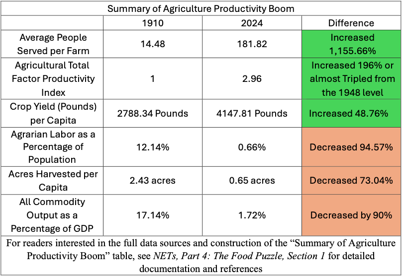
On the physical side, the story is crystal clear: more food, fewer people, less land. So, the natural next question is simple: how does this transformation show up in agricultural datasets measured in U.S. dollars? If productivity is doing what every textbook says, the cost of farming per person should have collapsed in real, inflation‑adjusted dollars.
How to Read the Data in This Post
Unless otherwise noted, all dollar figures in this section are expressed in CPI‑adjusted 2024 dollars. All the charts and numbers in this article come from standard public data sets: USDA (NASS and ERS), and official population estimates. Citations in the main text are kept to a minimum; each figure has a short caption explaining how it was calculated and which datasets it uses. At the end of the post, a “Source and Methods” section lists all underlying series, so anyone who wants to audit or recreate the charts can do so.
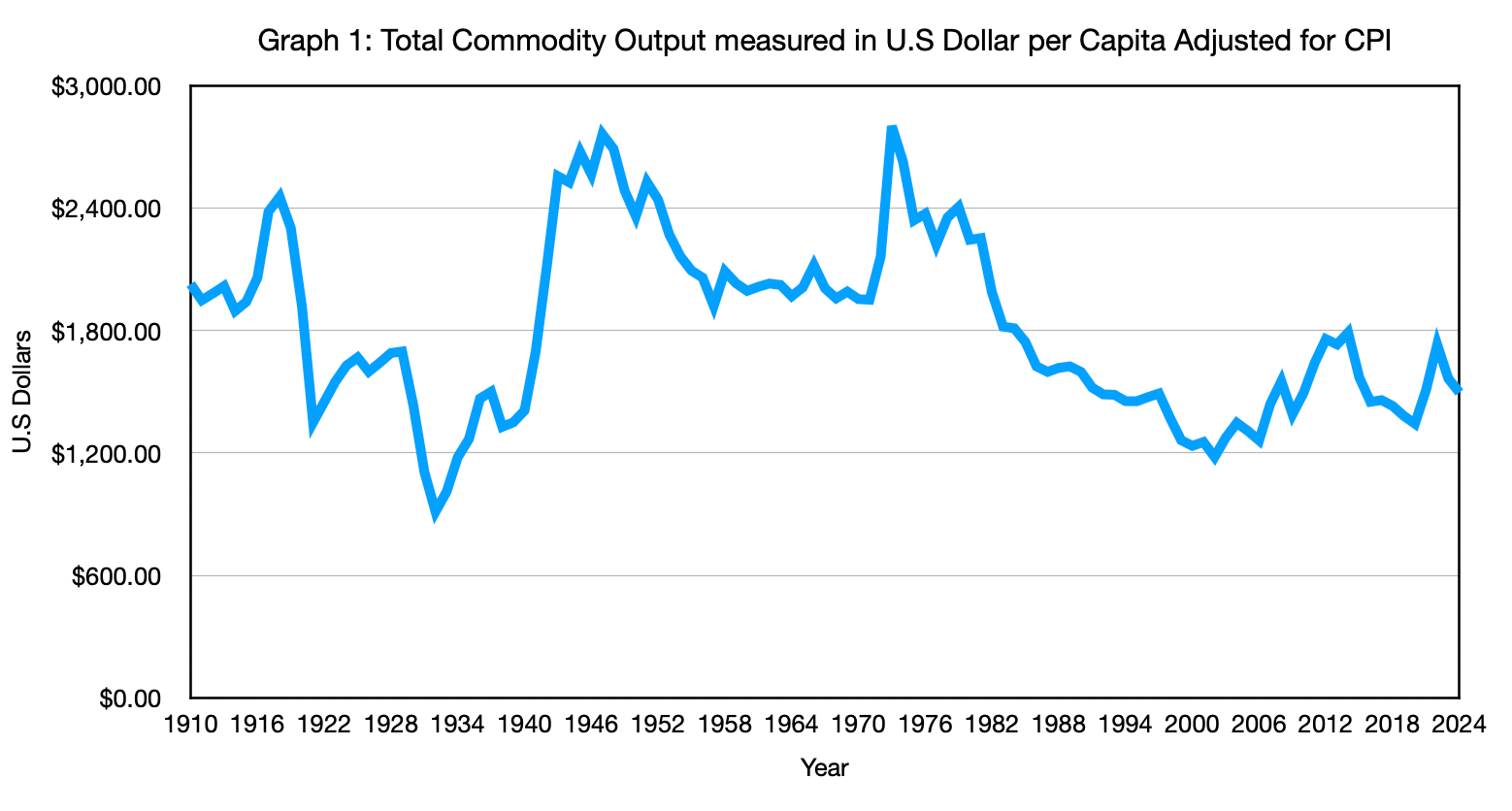
First Suspect: Total Commodity Output Measured in U.S Dollars
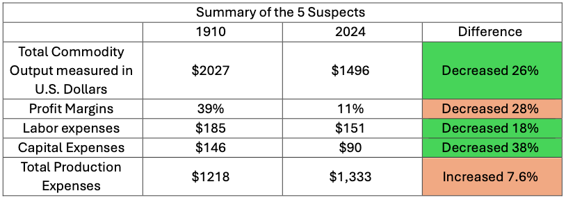
Let’s start with the big picture. When we look at total farm commodity output per American, we should see a dramatic drop. After all, we are getting more food per person from far fewer inputs. Instead, the series barely budges. In 1910, total farm commodity output amounted to about $2,027. By 2024, after more than a century of miraculous efficiency gains, that figure is down to about $1,496 per capita, a decline of roughly 26%. That’s it! Tripling productivity and roughly doubling food production per head translates into only a quarter‑off in the official money world.
Second Suspect: Agriculture Labor Expense
You might think: “Okay, maybe the savings just show up in lower labor costs.” After all, farm labor as a share of the population has collapsed by about 94–95%. That should be an enormous source of cost reduction. Let’s test it. I take total farm labor expenses from the USDA and divide by the U.S. population. The result? Per‑capita farm labor costs have fallen by only about 18% since 1910. Not 80%. Not 50%. Eighteen. Agriculture, however, has a peculiar mix of paid and unpaid labor that almost no other industry does. It was true in 1910, and it’s still true today—which is exactly why the story behind that 18% is anything but simple.
At this point, the numbers don’t quite add up. If there are far fewer workers, why haven’t labor costs per person collapsed? The data push us toward four complications:
Family labor doesn’t show up as wages.
In 1910, most farm work was done by owner-operators and their families. They were “paid” through food, housing, and farm profits rather than a paycheck, so a large share of the labor never appears in the official wage bill.A similar bias still exists today.
Modern farm accounts also undercount family labor. When you divide today’s total labor expenses by all workers on farms—owners, spouses, kids, and hired hands—you get an average cost per worker well below the published wage for hired employees. That’s a sign that many people are still working for less cash and more in‑kind compensation.We’re mixing different kinds of workers.
Historical data often takes a single pool of labor expenses and spreads them across everyone connected to a farm. That means we’re averaging together highly paid hired specialists, underpaid family helpers, and owner-operators who earn both wages and returns on their land and equipment.Headcounts and wages don’t fully cancel.
Even after accounting for these complications, total paid labor cost per person has only fallen by 18%. One worker now produces food for far more people, which should spread the cost across more consumers and push per‑capita figures down, but the offsetting forces are strong enough that the drop is small rather than dramatic.
Put together, the evidence says something subtle. Yes, we use far fewer people to produce food than we did a century ago. Yes, the remaining workers are paid much more. But because so much farm work—then and now—happens off the formal payroll, total labor cost per American has only nudged down, not collapsed. Labor savings help, but they can’t be the main driver of cheap food. The real cost revolution must be coming from somewhere else, which means the investigation keeps going.
Third Suspected: Capital Expenses
Maybe the savings are being eaten by machines and buildings instead. The usual story is that tractors, combines, irrigation systems, and grain bins replaced human sweat with expensive capital. If that were true, we would expect capital expenses per person to explode upward over time.
Again, the data do not cooperate. When we look at agricultural capital expenditures per capita, it averaged about $146 in 1910 and around $90 per person in recent years, even dipping to about $68 in some years—a decline of roughly 38% over the long run. The category that is supposed to be ballooning is smaller in real per‑capita terms than it was a century ago. That not only defies the textbook story, but it also falls far short of explaining the missing cost savings we are looking for.
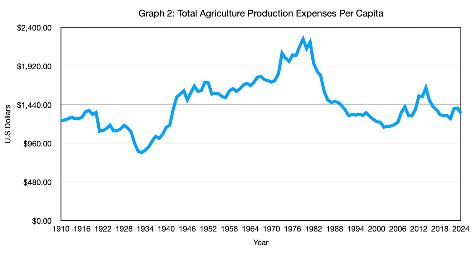
Fourth Suspect: Total Production Expenses
If the savings aren’t in labor, and they aren’t eaten by capital, maybe they are hiding in other inputs—seeds, fertilizer, chemicals, fuel, and so on. This is the last place for the official story to rescue itself. Here, the numbers do move, but not in the way anyone rooting for CPI would hope. When we look at total production expenses per capita—labor, capital, and intermediate inputs together—farm costs per person rise from about $1,238 in 1910 to around $1,333 today, an increase of roughly 7.6%. Put plainly, after all the technological progress, all the bigger tractors, better seeds, and smarter practices, the official statistics tell us it now costs more per American to farm than it did before tractors were common.
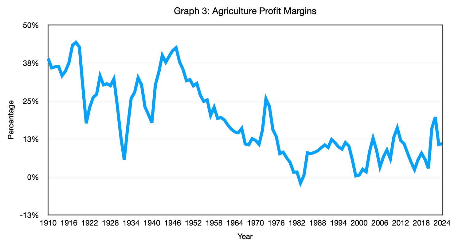
Fifth Suspect: Farm Profit Margins
At this point, many readers (and economists) reach for one last explanation: “Ah, the gains must have been captured as higher profits. Farmers and agribusiness simply kept the surplus for themselves.” That would at least be internally consistent: if we see no big drop in consumer‑facing costs, maybe someone is skimming the cream at the top.
The problem is that profit margins went the wrong way, too. Historical USDA accounts show that farm profit margins averaged about 39% around 1910, but in recent decades they have fallen to around 11%. In CPI‑adjusted terms, the modest 26% decline in per‑capita commodity value mostly reflects the fact that farmers’ slice of the pie got thinner, not that they hoarded efficiency gains. The “greedy farmer” escape hatch slams shut, because if farmers were pocketing the cost savings from productivity gains, profit margins would be rising, not shrinking.
So we are left with a strange picture. In the real world, we see:
But in the CPI‑adjusted money world, we see some decrease, but they don’t add together; they average out since they are all part of the same metric:
We checked labor. We checked capital. We checked inputs. We checked profits. The savings never show up anywhere they are supposed to. Yet the physical data insist those savings are real and enormous. At that point, it becomes hard to avoid the uncomfortable conclusion: the problem is not with the farms, or the tractors, or the farmers’ honesty. The problem is with the thermometer we are using to measure “real” costs and “real” prices.
Economists already sense that broad price indexes like CPI and standard deflators can muffle what is happening inside specific industries, which is why they often switch to sector‑specific deflators for areas like agriculture—but that “fix” brings its own problems, and that is where we turn next.
What Deflators Actually Are
Before we go further, it helps to define a word economists use casually, and almost no one else ever hears deflator. A deflator is just a mathematical tool we use to translate between nominal dollar values and inflation‑adjusted values over time. When the news says “GDP in constant dollars” or an analyst talks about “inflation‑adjusted profits,” they have taken the original dollar numbers and run them through a deflator to get back to “real” values.
That process works in both directions. Deflators are used not only to deflate current prices to a real base, but also to inflate old prices into today’s dollars. Every time NETs shows a 1910 or 1967 price expressed in 2024 dollars, it uses a deflator built from year-over-year inflation rates to convert. If this sounds like a silly game, it is, but it is a necessary game. As long as inflation is part of how our current monetary system works, we have to adjust for it to make any honest comparison across decades.
CPI is a type of deflator, based on a consumer basket. The national accounts also use other deflators, for GDP as a whole, for specific types of spending, and for individual industries. On paper, each of these tools is trying to answer the same basic question: How many real goods and services sit behind this pile of dollars, once we filter out the changing value of money?
Sector‑Specific Deflators: Shrinking the Mile
Now we can be precise about the problem. Economists will say, “You shouldn’t use CPI to deflate agriculture. Use the agricultural deflator.” That sounds like a technical improvement. Instead of one broad index, we use a sector‑specific one.
But the deeper issue is simpler. Whether a dollar is spent by an individual or a business, its underlying value does not change. One dollar of farm revenue and one dollar of restaurant wages are still claims on the same pool of real goods and services in the wider economy. Industry‑specific deflators quietly presume otherwise. They treat the “real value” of a dollar inside one sector as if it can drift away from the value of a dollar everywhere else, which is why a general inflation deflator is the only honest starting point when you want to compare across industries.
Deflators also cannot change the basic year‑to‑year relationships that tell us what is going on. Imagine a company whose revenue grows 50% while its expenses grow just as fast and profit margins stay stuck at 9%. In nominal dollars, it looks bigger. Once you deflate everything by the same inflation index, you see that the firm did not really grow at all; prices went up, but its underlying business strength did not. No matter what sector‑specific deflator you invent, you cannot turn flat margins into an efficiency miracle.
Sector‑specific deflators are like changing the miles for each vehicle on the road. We all know a semi‑truck and an SUV do not get the same miles per gallon. The truck burns more fuel because it is hauling a much heavier load. That comparison is meaningful because a mile is a mile, and a gallon is a gallon. Now imagine we decide that it is embarrassing for the truck, so we quietly shrink the length of “a mile” whenever we measure its fuel economy. On paper, the truck suddenly looks as efficient as the SUV. In reality, nothing about physics has changed; we just broke the ruler.
Giving every industry its own deflator does the same thing. Agriculture gets one ruler, manufacturing another, and services a third. Each ruler can be bent until the chart for that sector looks tidy, but the cross‑industry comparisons that matter for real people and real policy become meaningless. The agricultural facts do not care which deflator you pick. Farmers produce far more food per person with far fewer people and less land, and farm profit margins are lower, not higher. A deflator cannot make those realities disappear or reappear; it can only change how they look in a spreadsheet.
In a sound measurement system, we should not need a different “mile” for every sector. A single, well-behaved inflation yardstick should let us compare farms, factories, and fast-food chains directly while keeping the basic economic logic in line. The moment we need to rescale the dollar differently for each industry just to make the charts look comfortable, we are no longer measuring the economy; we are editing it.
Up to this point, we have stayed on the farm’s side of the ledger, tracking how much it costs to grow food in the first place. But consumers do not buy direct from the farm; they buy groceries. If the savings from agriculture’s productivity boom really did make their way to ordinary people, we should see it in the prices families pay at the store over time. In section 3, we leave the farm gate and follow the food dollar all the way to the checkout line to see whether those missing savings ever showed up for consumers.
Next: Maybe the savings disappeared somewhere between the farm and the cart. Continue to "From Farm Gate to Cart: The Missing Miracle."
Methods and Sources (Non‑Graphed Series)
Labor expense per capita.
Labor expenses are calculated as total hired farm labor expenses from USDA ERS Farm Income and Wealth Statistics, converted to CPI‑adjusted 2024 dollars, divided by the U.S. population. This measure captures only paid hired labor; unpaid family and operator labor are not included in this expense series, which is part of why official labor costs understate total labor input on farms.
Capital expense per capita.
Capital expenses are calculated as total farm capital expenses from USDA ERS Farm Income and Wealth Statistics, converted to CPI‑adjusted 2024 dollars, divided by the U.S. population. Capital expenses include items such as machinery, buildings, and other farm capital costs as defined in the ERS accounts.
Sources:
Bolt, J., & van Zanden, J. L. (2024). Maddison style estimates of the evolution of the world economy: A new 2023 update. Journal of Economic Surveys, 1–41. https://doi.org/10.1111/joes.1261
Macrotrends LLC. (n.d.). United States population 1950–2024 [Data set]. Macrotrends. https://www.macrotrends.net/global-metrics/countries/usa/united-states/population
U.S. Department of Agriculture, Economic Research Service. (n.d.) Farm income and wealth statistics [Data set]. U.S. Department of Agriculture. https://data.ers.usda.gov/report.aspx?ID=4059
U.S. Department of Agriculture, Economic Research Service. (n.d.) Farm income and wealth statistics: Value of production and cash receipts tables [Data set]. U.S. Department of Agriculture. https://data.ers.usda.gove/report.aspx?ID=4055
Author: Kyle Novack
March 20, 2026
A Monumental Venture, LLC: research project (Novack Equilibrium Theory – NETs)
Attribution Required: © 2025–2026 Kyle Novack / Monumental Venture, LLC. For educational use with credit; commercial use requires permission. Full details in linked PDFs.