
The Silent Ghost That Distorted a Century of Measurement
CPI Series Part 4


The problem was never the people. It was always the question that got lost in the data. And if that question turns out to have a real answer, if there is something systematically acting on prices before CPI starts measuring, then the implications don’t stay contained to the measurement. They cascade outward into every inflation-adjusted figure in the economy. Every real wage calculation. Every GDP figure. Every cost-of-living adjustment. Every policy decision calibrated against a number that was quietly, consistently measuring something slightly different than what it claimed to measure. That mechanism exists, and that’s where we head next.
The question that got lost has an answer. Not a theoretical one. Not a philosophical argument about how we should think about measurement. A specific, structural answer to why the most important inflation metric in the world has been systematically measuring something slightly different than what it claims to measure.
This is why no index that relies solely on final prices could ever fix it.
Here is the argument at the center of everything.
Productivity: The Ghost Nobody Was Looking For
The Silent Ghost is productivity. And it is invisible to CPI because CPI measures final prices. Not production costs. Not wholesale prices. Not what it costs to make something. Final prices are the prices you actually pay at the register, on the website, or in the contract. That is what gets recorded, tracked, and reported as inflation.
This seems obvious. Of course, CPI measures what things cost. That is the whole point.
But here is what that means in practice. By the time a price reaches the consumer, it has already traveled through the entire economy. Raw materials were extracted. They were processed and refined. They were manufactured into products. Those products were distributed through supply chains. They were marketed and sold. At every step of that process, productivity gains were quietly pushing costs down. Better machinery, more efficient logistics, improved agricultural yields, automation, all of it flowing through the production process and showing up in the final price as lower costs than there would have been otherwise.
So when CPI records the final price of a product, it records a price that has already absorbed the deflationary effect of productivity gains. The productivity dividend, the cost savings from innovation and efficiency that would have pushed prices down further, but instead quietly offset part of the dollar’s loss of value, has already been subtracted out before the measurement even begins.
This is the difference between net and gross inflation.
Gross inflation is the true rate at which the dollar is losing purchasing power, the rate driven purely by monetary expansion, debt, and the debasement of the currency itself.
Net inflation is what CPI measures: gross inflation minus the productivity dividend already baked into final prices.
The distinction matters enormously because CPI has always been reported as if it were gross inflation. As if it were measuring the true rate of monetary debasement. But it isn’t. It never was. It was measuring net inflation from the beginning, not because anyone intentionally designed it that way, but because final prices are, by definition, net of productivity.
Some economists will argue that this is precisely what inflation is supposed to measure, the change in what your dollar buys. If productivity made things cheaper and your cost of living improved, that should show up as lower inflation. Why add the productivity dividend back in?
The answer lies in how we treat every other economic metric. We don’t report net revenue and call it gross revenue. We don’t report post-tax income and call it pre-tax income. We don’t report real GDP and call it nominal GDP. In every other context where two distinct forces are acting on the same number simultaneously, we separate them so we can understand what each force is doing independently.
This matters for the currency because the dollar isn’t just a tool for measuring your grocery bill. It’s the unit that determines the cost of your daily life. Why does it feel harder to make the month work, no matter how carefully you budget? Why does the grocery store feel unbearable every time you go? Why housing now feels like something reserved for the wealthy. These aren’t personal failures or isolated complaints. They are the side effects of measuring net inflation, thinking it tells the whole story when gross inflation is the measurement we needed all along.
Money’s value isn’t just theoretical; it’s derived from a specific source. The dollar represents the collective output of human time and effort. And human time is the one constant in the entire economic system. Capital changes. Technology changes. Productivity changes. But an hour of human labor is always an hour of human labor. The worker in 1910 was operating at peak efficiency for their era. The worker in 2026 is operating at peak efficiency for this era. The monetary claim that one human hour generates against the total economy has remained relatively stable across time, regardless of what that hour could produce.
Which means when the dollar diverges from human productive output, something specific is happening. It isn’t that past hours were worth less than present hours; both always represented maximum human effort for their time. What’s happening is that productivity is making the output of those hours cheaper over time. If it used to take 10 hours to produce a widget and now it takes 1 hour, the widget should cost roughly a tenth of what it once did in real terms. The dollar isn’t gaining value, but it can buy more widgets because widgets have become cheaper to produce. Those are two entirely different things.
A simple example makes the mechanics clear. Imagine the money supply as water flowing from a tap; turn it on, and it flows immediately. When more money enters the economy, prices start feeling it within months. Productivity gains work differently. Think of them as drains being added to the sink. One company finds a more efficient way to produce something, and a new drain gets added. That innovation slowly spreads to competitors, then through the supply chain, and over time, more drains keep getting added. The water from the tap keeps flowing. The drains keep getting added. The level in the sink rises, but more slowly than it would have without those drains. CPI measures the water level in the sink. It can tell you how fast the level is rising. What it cannot tell you is how fast the tap is running, because the drains were already doing their work before the measurement began.
This is the part that feels counterintuitive. A more productive economy means more goods, lower prices, and a higher standard of living. That feels like the dollar is holding its value or even gaining. But it isn’t. Productivity masked the debasement. It didn’t prevent it. Here’s an oversimplified version of how the mechanism works: if monetary debasement runs at 5% (tap) and productivity gains absorb 2% (drains), CPI records 3% inflation (measured water level). Not because the dollar only lost 3% of its value, but because the drains reduced the tap’s input by 2% before the measurement began. The real rate of monetary debasement was 5%. CPI saw 3%. The other 2% disappeared before the index ever started counting.
CPI does what it was designed to do: it tracks how the sticker prices of a relatively fixed basket of goods change over time. That is a legitimate but limited measurement. What it cannot tell you is how your cost of living is actually changing over decades, because the real cost of living is a moving target. New essentials appear, old ones disappear, and the mix of what people must buy to live a normal life keeps shifting. CPI captures the net result of productivity and inflation acting on a fixed basket. It was never built to separate them.
This all ties back to a single point: the problem is not a flaw in CPI’s execution, but a structural limitation of what price-based measurement can capture. No refinement of the basket, no improvement in the weights, no better hedonic adjustment methodology can fix it. Because the productivity dividend disappears into prices before CPI starts measuring it. It is invisible to any system that measures final prices.
Which means the only way to get from net inflation to gross inflation is to add the productivity dividend back in. And that requires measuring something that CPI was never designed to measure.
Finding the Productivity Dividend: Why 1.2-1.8%?
If CPI has been measuring net inflation all along, the obvious next question is: how large is the productivity dividend that’s been silently subtracted out? And how do I know?
This is where the argument gets empirical. And it’s worth being honest about what I can and cannot claim.
I will probably never be able to pinpoint the exact gross inflation rate. The productivity dividend isn’t a number you can read directly off a government report. It has to be derived by triangulating multiple independent metrics, each capturing a different aspect of the relationship among productivity, prices, and purchasing power. None of those metrics alone is definitive. But when multiple independent approaches consistently point toward the same range, that convergence is meaningful.
The table below shows five independent lines of evidence. Each one approaches the question from a different angle: mainstream CPI-bias literature, agricultural productivity data, housing-price divergence, economy-wide TFP, and monetary expansion. None of them was derived from the others. All of them point toward the same range.
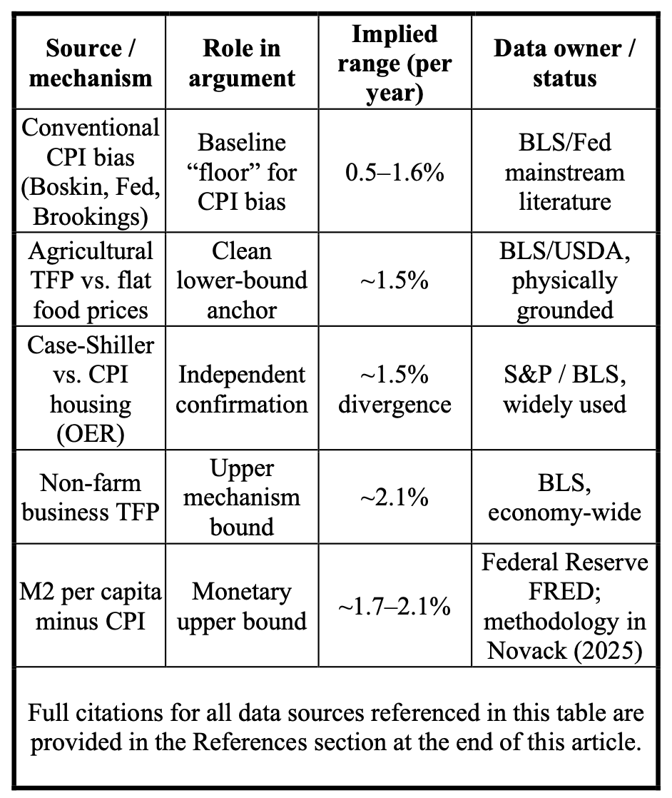
The range that emerges is 1.2% to 1.8% annually. For communication purposes, 1.5% serves as a useful midpoint. But the precise figure matters less than two things: the direction and the order of magnitude.
On direction, the argument is unambiguous. Productivity is deflationary. CPI measures final prices. Final prices are net of productivity. Therefore, CPI is measuring net inflation. That conclusion doesn’t depend on whether the dividend is 1.2% or 1.8%. It follows directly from accepted economic principles.
In terms of order of magnitude, the 1.2-1.8% range is consistent with what we observe in the economy. It’s large enough to produce the divergences we see between measured living standards and felt experience. It’s small enough that it could plausibly stay hidden for decades behind improving living standards. And critically, it’s consistent across five independent data sources that were never designed to corroborate one another.
It’s also worth noting what pushed the estimate toward this range rather than to a larger one. If I were theorizing without rigorous data, I might have guessed the error was running at 2-3% annually. That sounds plausible in the abstract; productivity has been a powerful force in the American economy for over a century. But when I examined what a 2-3% error would mean for food prices, wage growth patterns, and housing data, anomalies emerged that don’t match what we observe. The data pushed the estimate down toward 1.2-1.8%, even though initial intuition suggested a larger figure.
Given the importance of this concept to the entire argument, it is worth restating the theoretical anchor supporting this range, and adding the data that confirm it. Human time is the one constant in the entire economic system. Capital changes. Technology changes. Productivity changes. But an hour of human labor is always an hour of human labor.
Every era operates at the frontier of its own productive capacity. The worker in 1910 was not being lazy or inefficient relative to what 1910 made possible. The worker in 2026 is not being lazy or inefficient relative to what 2026 makes possible. Both are operating at peak efficiency for their era.
This matters because it means the input, one human hour of maximum effort within a given era, has always been the same unit. Not the same output. Not the same productivity. The same commitment of human time and effort against whatever tools and knowledge that era provided.
And because that input has always represented the maximum available human contribution to the economy, the monetary claim it generates against total economic output should remain relatively stable over long time horizons. Capital accumulation, technological disruption, and monetary policy can all create shorter-term variance. But across decades, the anchor holds: the economy cannot outrun its human hours, and human hours cannot be manufactured.
The GDP per capita data, when adjusted for gross rather than net inflation, is consistent with this assumption. Not proof of it, but consistent in a way that the standard CPI-adjusted narrative is not. If the human hour is relatively constant in value, then the only way to grow an economy in monetary terms is to add more human time, a growing population. Productivity affects how much we can produce per hour.
Think of it this way. If one worker produces ten widgets an hour and becomes twice as productive, they now produce twenty widgets an hour. The economy has more widgets, but it still has only one worker’s hour. The value of that hour, measured against what human time can claim in the economy, hasn’t changed. To genuinely grow the economy’s total value in human time terms, you need more hours, which means more people. It doesn’t change the fundamental value the economy derives from that hour. Which means 1.5% drift-adjusted GDP per capita should stay relatively stable over time. And it does.
The graph below makes this concrete across 114 years of American economic history. Two lines. Same underlying GDP data. Two different rulers.
The green line is GDP per capita adjusted for official CPI, the familiar story of American prosperity. Starting at roughly $12,500 in 1910 and climbing to nearly $87,000 in 2024. A nearly sixfold increase in real GDP per capita. The story most people know: an economy that delivered extraordinary improvements in living standards over a century of innovation and growth.
The blue line is GDP per capita adjusted for gross inflation; the same data measured against the correct ruler. Starting at roughly $62,500 in 1910 and ending at roughly $87,000 in 2024. A 41% increase over 114 years, with the Great Depression and World War II showing as expected disruptions that normalized quickly afterward.
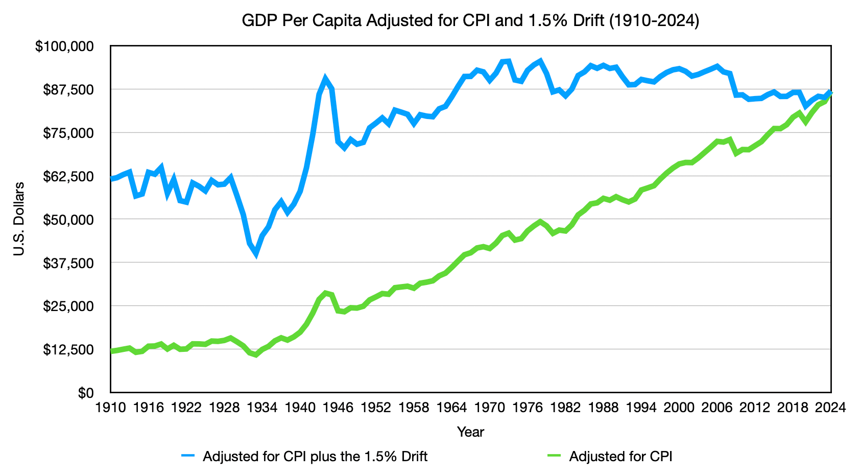
The gap between those two lines tells the whole story. Under CPI, GDP per capita grew nearly 600%. Under gross inflation, it grew 41%. The difference isn’t prosperity. It’s the Silent Ghost, a century of productivity gains absorbed into net prices, quietly misclassified as real economic growth.
This doesn’t mean living standards didn’t improve. They did, genuinely and meaningfully. But the improvement came primarily from productivity, making things cheaper and better, not from each individual’s hour of work becoming more valuable in real terms. The blue line holds relatively steady, not because the economy stopped growing, but because the growth was in what each hour could produce, not in the monetary claim each hour could make.
This is not a claim of precision. It is a claim of direction and magnitude, and the convergence of the theoretical anchor with the empirical data is what makes those claims meaningful.
The Error Is in the Foundation, Not the Execution
Step back and look at what we’ve established.
CPI does exactly what it was designed to do: it measures the prices consumers actually pay. Nobody designed it incorrectly. The basket is broad enough to capture systematic inflation rather than localized noise. The weighted structure contains category-specific errors within mathematical ceilings. The methodology is rigorous and carefully maintained. Within the constraints of a price‑index framework based on final consumer prices, the BLS has built the best inflation metric available.
But because CPI measures final prices, it captures inflation after the productivity dividend has already been subtracted. The result is a net figure. And for decades, that net figure has been used as if it were the complete picture of monetary debasement, not because anyone was wrong, but because the distinction between net and gross inflation wasn’t visible until you knew what to look for. That invisibility is not a flaw in the people maintaining the framework. It is a property of the framework itself, and it’s why no index that relies solely on final prices can ever give a complete picture of monetary debasement; the productivity dividend disappears into those prices before measurement begins.
This is why CPI has been systematically understating gross inflation by 1.2-1.8% annually for over a century in the United States. The framework was built before the knowledge existed to see the blind spot, and that blind spot lies outside the boundaries of what any price-based measurement system could ever capture.
This distinction matters enormously for what comes next. If the error were in the execution, if the BLS were making avoidable methodological mistakes, the fix would be straightforward. Correct the methodology. Update the calculations. Publish revised figures.
But a foundational error is different. It can’t be fixed by refining the existing framework, as it works correctly within its own constraints. What’s needed is something that can measure what price-based measurement cannot, a framework capable of separating the productivity dividend from the monetary debasement signal before they collapse into a single net figure. That is what the NETs framework is designed to do.
Which raises an uncomfortable question: if this blind spot has existed since CPI was built, why did it take until now to become impossible to ignore? For decades, it was a measurement problem without catastrophic consequences; the dollar still had a physical anchor in gold that, in theory, could reveal divergences between measured and actual inflation.
That changed in the 1970s when two things happened simultaneously. The Nixon shock removed the last physical anchor; the dollar was untethered from gold, and its value became entirely dependent on measurements like CPI to maintain credibility. And at the same time, the belief that economists could actively manage the economy through policy tools meant that CPI stopped being just a measure and became the steering wheel. Monetary policy, wage negotiations, Social Security adjustments, interest rates, all of it now calibrated against a net inflation figure with nothing physical left to check it against.
Without a physical anchor, there is no external reference point. The ruler began checking itself, with no anchor, and any systematic bias in the net inflation measure no longer stays confined to statistics; it bleeds directly into policy, contracts, and expectations.
It took roughly fifty years for that divergence to grow large enough to feel. The gap between what the numbers said and what people experienced became too wide to explain away. That’s not a coincidence. That’s compounding finally crossing the threshold of perceptibility.
An error that took fifty years to compound into the economy will take decades to unwind, even after the measurement is corrected. The economy has been calibrated against the wrong ruler for so long that recalibrating it is not a technical fix. It is a generational one.
Understanding how we got here is the first step. That is what Parts 5-8 are for.
Next: To understand why this flaw went unnoticed for over a century, it helps to know how the dollar itself came to exist. Continue to "The Chaos Before the Dollar."
Methods and Sources
GDP Per Capita Adjusted for CPI and 1.5% Drift (1910–2024)
Construction Method
Nominal GDP per capita was calculated by dividing annual nominal GDP by U.S. population for each year from 1910 to 2024.
The green line deflates nominal GDP per capita using the official BLS CPI-U series, producing the standard real GDP per capita figure.
The blue line deflates nominal GDP per capita using a compounded gross inflation rate — constructed by adding the 1.5% annual drift adjustment to the official CPI figure for each year. This produces a consistently higher deflator than official CPI, which is why the blue line shows lower real GDP per capita throughout.
Critical Disclosure
The blue line is a constructed series, not independently sourced data. Because it was built by applying the 1.5% drift adjustment, its relative stability over time cannot independently confirm that the 1.5% figure is correct. It demonstrates internal consistency — that when the adjustment is applied, the result aligns with the theoretical prediction that monetary value per human hour should remain relatively stable over long time horizons. The independent case for 1.5% rests on the five convergent data sources documented in the main article.
Underlying Data Sources
Nominal GDP (1910–2023): Samuel H. Williamson, “What Was the U.S. GDP Then?” MeasuringWorth, 2025. Available at measuringworth.org/usgdp/
Nominal GDP (2024): Federal Reserve FRED, series GDP. Annual frequency, end of period. Available at fred.stlouisfed.org/series/GDP
U.S. Population (1910–2022): Bolt, Jutta and Jan Luiten van Zanden (2024), “Maddison style estimates of the evolution of the world economy: A new 2023 update,” Journal of Economic Surveys, 1–41. DOI: 10.1111/joes.12618
U.S. Population (2023–2024): Macrotrends. Available at macrotrends.net/global-metrics/countries/usa/united-states/population
CPI Historical Series: U.S. Bureau of Labor Statistics, CPI-U All Items.
Sources
Advisory Commission to Study the Consumer Price Index. (1996). Toward a more accurate measure of the cost of living: Final report to the Senate Finance Committee. U.S. Senate Finance Committee.
Bolt, J., & van Zanden, J. L. (2024). Maddison style estimates of the evolution of the world economy: A new 2023 update. Journal of Economic Surveys, 38(1), 1–41. https://doi.org/10.1111/joes.12618
Federal Reserve Bank of St. Louis. (n.d.). M2 money supply [Data series M2SL]. FRED Economic Data. https://fred.stlouisfed.org/series/M2SL
Federal Reserve Bank of St. Louis. (n.d.). Gross domestic product [Data series GDP]. FRED Economic Data. https://fred.stlouisfed.org/series/GDP
Macrotrends. (n.d.). United States population 1950–2024. https://www.macrotrends.net/global-metrics/countries/usa/united-states/population
Nixon, R. (1971, August 15). Executive Order 11615: Providing for stabilization of prices, rents, wages, and salaries. Federal Register.
Novack, K. (2025). The final straw: Comparing inflation metrics to monetary expansion. Monumental Venture, NETs Project. https://open.substack.com/pub/netsproject/p/the-final-straw-comparing-inflation?r=5rrs9a&utm_campaign=post-expanded-share&utm_medium=web
S&P CoreLogic. (n.d.). Case-Shiller home price index. Available via Federal Reserve FRED.
https://fred.stlouisfed.org
Social Security Administration. (n.d.). Cost-of-living adjustments. https://www.ssa.gov/oact/cola/colaseries.html
U.S. Bureau of Labor Statistics. (n.d.). Consumer price index for all urban consumers: All items [CPI-U]. https://www.bls.gov/cpi/
U.S. Bureau of Labor Statistics. (n.d.). Consumer price index: Owners’ equivalent rent of residences [Series CUSR0000SEHC]. https://www.bls.gov/cpi/
U.S. Bureau of Labor Statistics. (n.d.). Major sector productivity and costs. https://www.bls.gov/productivity/
U.S. Department of Agriculture, Economic Research Service. (n.d.). Agricultural productivity in the U.S. https://www.ers.usda.gov/data-products/agricultural-productivity-in-the-u-s/
Williamson, S. H. (2025). What was the U.S. GDP then? MeasuringWorth. https://www.measuringworth.com/usgdp/
Author: Kyle Novack
May 15, 2026
A Monumental Venture, LLC: research project (Novack Equilibrium Theory – NETs)
Attribution Required: © 2025–2026 Kyle Novack / Monumental Venture, LLC. For educational use with credit; commercial use requires permission. Full details in linked PDFs.