
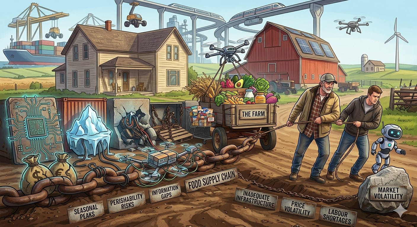
The Supply Chain Heist Part 1
Food Puzzle: Part 4

In previous sections, I showed how U.S. agriculture became vastly more productive and how food became much more affordable in terms of the hours of work required to buy it. Yet CPI‑adjusted food prices often reflect only a fraction of the decline that this productivity boom should have produced, given basic economic principles. Fewer people now work in agriculture while serving a much larger population, which should lower the labor cost per meal. At the same time, the production process itself requires fewer inputs per unit, so as output scales up, fixed and variable costs are spread over more units, further lowering prices.
That leaves us with an obvious next question: if those savings were real, where did they go? The most common answer is that they were absorbed by the modern food supply chain. So let us call our first suspect to the witness stand.
For readers joining here, this section builds on the first three sections of the series, which cover the farm productivity boom, the strange behavior of CPI-adjusted farm costs, and the gap between food affordability and official price measures.
How to Read the Data in This Section
All numbers and charts in this part of the Food Puzzle come from standard public data sets, including USDA marketing‑bill and Food Dollar tables, BLS labor and wage series, official CPI indexes, and documented population estimates. To avoid clutter, I keep in‑text citations brief; each figure has a short note on how it was constructed, and a detailed “Methods and data sources” section at the end lists every underlying series so that readers can audit or replicate the calculations.
Unless otherwise noted, all dollar amounts in this section are adjusted for inflation using the CPI‑U and expressed in constant 2024 dollars, so differences over time reflect real changes rather than general price inflation.
How Supply-Chain and Non-Farm Costs Shape Food Prices
The supply-chain explanation begins with something ordinary people can see for themselves: the modern grocery store is not just a place where raw farm output changes hands. It is a highly organized distribution system that sorts, packages, stores, moves, brands, and displays an enormous range of products in forms that are easy for households to buy and use. If food savings disappeared somewhere between the farm and the checkout lane, this is the part of the economy where many readers would expect to find them.
That intuition becomes even stronger once we remember how different grocery shopping used to be. In the early 1900s, most stores kept goods behind the counter, and shoppers typically handed a clerk a list rather than walking the aisles themselves. Most of those stores carried fewer than 100 items, and even well-stocked ones may have had only around 250. The modern self-service model began to take shape with Piggly Wiggly in 1916, which offered aisles, checkout lanes, shopping carts, and more than 1,000 items. By 1923 the chain had expanded to more than 1,200 locations (Blazeski, 2016 & ArcGIS StoryMaps, 2020).
From there, the system only became more elaborate. By the 1950s, supermarkets were carrying around 10,000 items while relying on low margins and high volume. Today, the average supermarket carries about 31,795 items and generates roughly $1 trillion in annual sales. That increase in variety and convenience implies a much more complex network of packaging, warehousing, transportation, stocking, and inventory management than existed a century ago. On the surface, then, the standard story makes sense: perhaps farms got cheaper, but the system surrounding them got more expensive (Ganzel, 2007; Food Marketing Institute, n.d.).
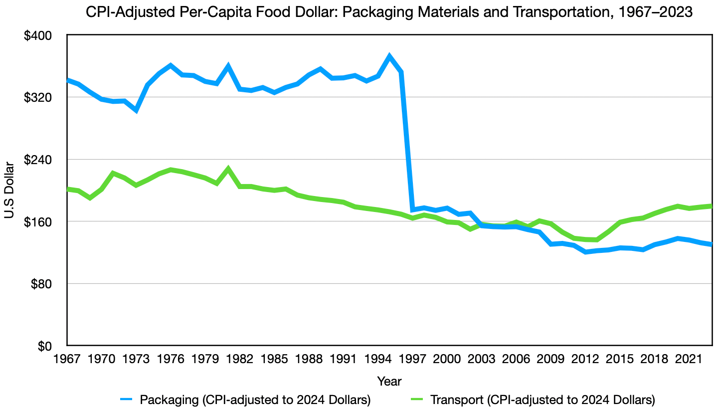
That story, however, must survive a basic test. If the supply chain really absorbed the missing savings, then major post-farm costs should show a clear tendency to rise in real per-capita terms over time. But when the USDA food-dollar data are adjusted for CPI and population, packaging materials and transportation do not behave like runaway cost centers. In the long run, packaging trends down overall, and transportation remains roughly flat to slightly down from 1967 to 2023. Even though the transportation category was broadened in 1997 in a way that should have pushed measured costs higher. This does not imply CPI is ‘right’; it simply means that under standard CPI‑based adjustments, these categories are already flat or falling rather than rising.
This does not prove that the supply chain is irrelevant. It does show that two of its most visible components do not fit the simple idea that post-farm costs swallowed the entire productivity dividend. At minimum, the first pass through the evidence gives us a mixed verdict rather than a conviction. The suspect still looks plausible, but the data already suggest we will need a more careful look, especially when we turn to labor.
Labor’s Role in the Food-Price Puzzle
Labor is the part of the supply‑chain story that initially looks most persuasive. In a modern food system, millions of people clearly work beyond the farm gate, and total post‑farm employment in food manufacturing, grocery wholesalers, and food and beverage retailers rose from roughly 3.5 million in 1958 to about 5.9 million. This sounds like exactly the kind of expanding cost structure that could soak up farm‑level savings.
But headcount alone is the wrong metric. What matters is not just how many people work in the supply chain, but how much labor cost each consumer ultimately bears once those costs are spread across the population. Measured this way, the story looks very different. The number of people served by each post‑farm worker has improved by almost 16 percent since 1958. On top of this, USDA Food Dollar and Marketing Bill data, converted to per capita terms, show that real labor costs per person in food manufacturing have been trending downward over the long run. Even after accounting for the 1997 break between the older Marketing Bill series and the newer Food Dollar series.
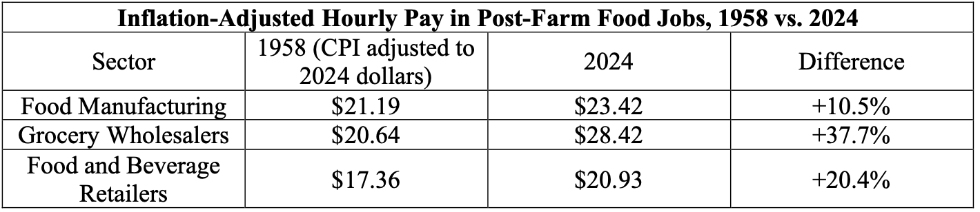
To dig deeper, we can move from totals to paychecks, extending the analysis beyond food-manufacturing labor to the rest of the chain. Using inflation‑adjusted hourly wage data for food manufacturing, grocery wholesalers, and food and beverage retailers, and weighting those wages by the size of each industry’s workforce. We find that the average real hourly cost rises only 19.8% over nearly seven decades.
Taken together, accounting for both wage changes and the fact that each worker now serves about 16 percent more people. The implied labor cost per person rises by only about 3.8 percent over the entire period—roughly one bad year of inflation. Not a structural force capable of swallowing seven decades of farm‑level savings.
The labor evidence points in the same direction as the packaging and transportation evidence. The supply chain clearly became larger and more complex, but that does not automatically mean it became more expensive in real per-capita terms. A bigger system can still be more efficient, and the data indicate that post-farm labor became more productive rather than simply more burdensome. Labor, you may step down from the witness stand.
So far, the supply chain case has begun to weaken. Packaging and transportation do not appear to be runaway cost centers in the long run. Also, labor looks even less threatening when measured on a per-person basis. That leads to the next question: are the industries between the farm and the checkout lane creating their own productivity gains, or were they just living off the gains created on the farm?
How Supply‑Chain Productivity Should Reinforce Farm Cost Savings
The productivity data give a clear answer. Across the core post-farm parts of the food system, food manufacturing, wholesale trade, retail trade, and transportation and warehousing. Total Factor Productivity generally held steady or rose, rather than collapsing. The gains were slower and less spectacular than those in agriculture, but they were still real. This means these sectors were adding to overall efficiency rather than simply cancelling out farm-level progress.
That point matters more than it may seem. Total Factor Productivity measures how efficiently industries convert combined inputs, such as labor, capital, energy, materials, and purchased services, into outputs. When those industries learn to use their resources more efficiently over time, they push down the real cost of getting food from the farm to the consumer. Even if their progress is far slower than the spectacular gains on the farm itself.
The wholesale and retail evidence is especially important because those are the sectors people most often picture as bloated middlemen. Total Factor Productivity rose by roughly 37 percent in wholesale trade and about 47 percent in retail trade between 1987 and 2023. Those gains align with what we know about the evolution of these industries. Key technologies and practices include:
Better inventory tracking
Barcodes and RFID
Larger, taller warehouses
Standardized cargo handling
More efficient picking systems
All these improvements helped move more goods with less waste and less labor per unit of output. (Boysen & De Koster, 2025, NOVA, 2020, Barcodes Inc., n.d., & U.S. Department of Homeland Security, 2024).
Food manufacturing looks more restrained, and that is fine because it faces its own challenges that make productivity harder to achieve. These gains can also be obscured by the added complexity in modern processing, which is a discussion for another time. The long‑run pattern here is one of gradual improvement, not explosive change. This is not a story about forcing every part of the food system to mimic the agricultural boom. It is a simpler point: even where progress was slower, the post‑farm system was still moving toward greater efficiency, not deeper inefficiency.
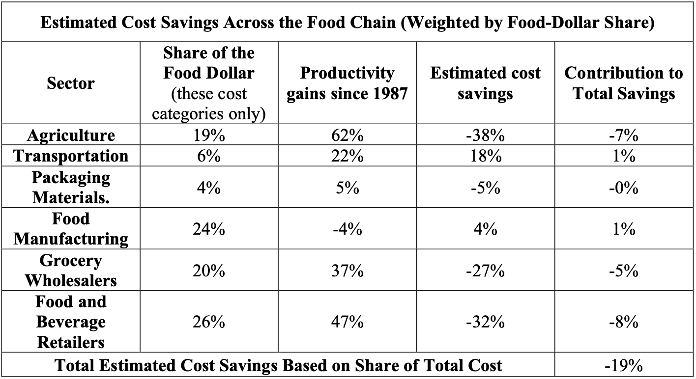
That is because productivity gains across the chain work like a weighted average. As agriculture’s share of the food dollar shrinks, its contribution to total savings naturally falls, while gains in other sectors matter more. Put differently, what counts is not just how much each sector improves, but how big a slice of the bill it represents. The table below illustrates this with rough estimates: three sectors show price reductions of about 30 percent, while food manufacturing becomes somewhat more expensive. When we weight each sector’s estimated change in cost by its share of the food dollar, the combined effect is an overall cost saving of about 19 percent. This is not evidence that any one sector is “skimming” the gains; it is simply the arithmetic of how different parts of the chain interact once you add them up.
This suspect’s case is now hanging by a thread. We are no longer looking at a story where the supply chain simply swallowed farm‑level savings. Instead, the evidence points to a system that, on net, became more efficient even as it grew more complex. But before we let this suspect walk, there is one more place we need to check: how all of this shows up in the prices of a simple, unprocessed food basket, leaving the usual “processed‑food” excuse with very little room to hide.
This distinction matters because it explains why the standard narrative feels half‑right. It is like noticing that the first runner just set a world‑record lap. Then, looking at the final team time and seeing only a tiny improvement, you conclude the other runners must have slipped—even though, on closer inspection, each of them also ran the fastest laps of their careers.
In the food system, something similar is going on. There really are more stages, more brands, and more services wrapped around our food today. As a result, those layers do absorb part of the farm’s cost reductions. But once you allow for the productivity gains we have just walked through, the evidence no longer points to “too many middlemen” as the main reason CPI-adjusted food prices did not fall further. Instead, it points to measurement systems that make genuine savings look smaller than the physical and productivity records suggest.
At the same time, we are not done with this suspect yet. The next step is to follow these aggregate patterns down to the level where prices hit you: the individual items in a simple basket of staple foods. Critics often argue that supply‑chain costs are rising because we buy more processed, branded products. But the basket I use deliberately avoids those complications, focusing on basic, unprocessed items that are easy to compare over time.
We have already seen a first pass at this basket in Section 3 of the Food Puzzle, but now we can add more context by examining how its CPI-adjusted cost behaves alongside the productivity story. When we do, the usual escape hatch for the supply‑chain narrative gets much narrower, and the puzzle posed by CPI becomes even harder to ignore.
Next: The supply chain is still on the stand, and the deeper data tells the same story. Continue to "The Supply Chain Heist Part 2."
Sources and Methods
Methods
Food Dollar and Marketing Series (Labor, Packaging Material, Transportation)
Data for 1967–1996 come from the USDA’s historical marketing‑bill series for domestically produced farm foods. Which report detailed input components such as packaging materials, transportation, and fuels/electricity. Data for 1997–2023 use the revised USDA ERS Food Dollar Series, which expands coverage to include imports and away‑from‑home food expenditures and reports value added by broad industry groups. The 1997 transition reflects a methodological expansion and therefore produces an apparent level shift in totals rather than a sudden real jump in costs. To maintain comparability over time, I combine agribusiness inputs with farm production value after 1997 and collapse downstream service categories—wholesale trade, retail trade, food services, finance and insurance, advertising, and legal/accounting—into a single “Other” aggregate representing marketing, distribution, and overhead costs. Corporate profits are not reported separately in the Food Dollar Series; they are embedded in each industry’s value added, and fuels/electricity are bundled into “Other” for 1967–1969. Population denominators for per‑capita figures are drawn from Bolt and van Zanden’s Maddison‑style historical estimates (up to the latest overlapping year) and Macrotrends’ United States population series for 1950–2025, which I splice into a single annual U.S. population series before dividing CPI‑adjusted dollar values by population.
Total labor data for food manufacturing, grocery wholesaler, and food and drink retailer.
Employment totals for the post‑farm food system are constructed by summing three industry groups: food manufacturing, grocery wholesalers, and food and beverage retailers. For 1939–1989, I use annual employment counts from the U.S. Bureau of Labor Statistics bulletin Employment, Hours, and Earnings, United States, 1909–94 (Bulletin No. 2445), which reports sector‑level series under the older SIC classification. For 1990–2024, I use seasonally unadjusted annual employment series from the BLS Current Employment Statistics program, accessed via FRED, for Food Manufacturing (NAICS 311), Grocery and Related Product Wholesalers (NAICS 4244), and Food and Beverage Stores (NAICS 445). Because BLS switched from SIC to NAICS around 1990, there is a classification break; I handle this by reporting long‑run totals and trends rather than treating 1989–1990 as a continuous year‑to‑year change. The “3.5 million for 1957” and “5.9 million for 2024” employment figures in the text are simply the sum of these three-sector series.
How many people does one worker serve?
To estimate how many people each post-farm food worker serves, I divide the total U.S. population for each year by the combined employment in food manufacturing, grocery wholesalers, and food and beverage retailers. Population comes from the spliced Maddison/Macrotrends series described above, and employment totals come from the BLS bulletin (1939–1989) and the three NAICS‑based BLS/FRED series (1990–2024).
wholesaling, and food and beverage retail only and therefore exclude restaurant and other foodservice employment, which makes the “people served per worker” ratios a conservative measure of supply‑chain labor productivity.
Inflation‑Adjusted Hourly Pay in Post‑Farm Food Jobs, 1958 vs. 2024 table
Nominal hourly earnings for food manufacturing, grocery wholesalers, and food and beverage retailers come from BLS Current Employment Statistics series on average hourly earnings of production and nonsupervisory employees for each sector (CEU3231100008, CEU4142400008, and CES4200000008). For each year, I deflate these nominal wages using the CPI‑U all‑items index so both 1958 and 2024 wages are expressed in constant dollars. The values shown in the figure are simple sectoral averages (no employment weighting), intended to illustrate broad changes in real hourly pay across major post‑farm food industries.
Total Factor Productivity in Post‑Farm Food Supply Chain Industries, 1987–2023
Uses total factor productivity (TFP) indexes from the U.S. Bureau of Labor Statistics for four NAICS‑defined industry groups that approximate the post‑farm food supply chain: food and beverage manufacturing (NAICS 311–312), wholesale trade (NAICS 42), retail trade (NAICS 44–45), and transportation and warehousing (NAICS 48–49). TFP measures the efficiency with which combined inputs—labor, capital, energy, materials, and purchased services—are converted into real output, so higher index values indicate more output per unit of total input.
Source. U.S. Bureau of Labor Statistics. (2025). Major industry total factor productivity (KLEMS): Annual data [Excel spreadsheet]. Office of Productivity and Technology. Retrieved December 28, 2025, from https://www.bls.gov/productivity/tables/major-industry-total-factor-productivity-klems.xlsx (data extracted from the “Annual” sheet for NAICS 311–312, 42, 44–45, and 48–49).[
Note. TFP series are available only for NAICS-based industries beginning in 1987; the aggregates include some non-food activities (e.g., tobacco within 311–312, non-grocery wholesalers within 42), but they provide close proxies for productivity trends in the post-farm food supply chain. The series ends in 2023, the latest year available at the time of extraction
Sources
ArcGIS StoryMaps. (2020, December 23). Grocery stores in 1910s. Retrieved December 21, 2025, from https://storymaps.arcgis.com/stories/c3c065b10dae4c1eb689564e55e2aad8
Barcodes Inc. (n.d.). History of barcodes. Barcodes Inc. Retrieved December 28, 2025, from https://www.barcodesinc.com/articles/history.htm
Blazeski, G. (2016, December 25). Piggly Wiggly – The first true self-service grocery store. The Vintage News. Retrieved December 21, 2025, from https://www.thevintagenews.com/2016/12/25/piggly-wiggly-the-first-true-self-service-grocery-store/
Bolt, J., & van Zanden, J. L. (2024). Maddison style estimates of the evolution of the world economy: A new 2023 update. Journal of Economic Surveys. Advance online publication. https://doi.org/10.1111/joes.12618
Boysen, N., & de Koster, R. (2025). 50 years of warehousing research—An operations research perspective. European Journal of Operational Research, 320(3), 449–464. https://doi.org/10.1016/j.ejor.2024.04.031
Canning, P. (2011). A revised and expanded food dollar series: A better understanding of our food costs (Economic Research Report No. 114). U.S. Department of Agriculture, Economic Research Service. http://www.ers.usda.gov/publications/pub-details/?pubid=44827
Food Marketing Institute. (n.d.). Food industry facts. Retrieved December 21, 2025, from https://www.fmi.org/our-research/food-industry-facts
Ganzel, B. (2007). Supermarkets dominate. Wessels Living History Farm. Retrieved December 21, 2025, from https://livinghistoryfarm.org/farming-in-the-1950s/making-money/supermarkets-dominate/
Macrotrends. (n.d.). United States population 1950–2025. Retrieved December 12, 2025, from https://www.macrotrends.net/global-metrics/countries/usa/united-states/population
NOVA. (2020, May 14). When was the ASRS system invented? NOVA Racking. Retrieved December 28, 2025, from https://www.novaracking.com/When-was-the-ASRS-system-invented-id3513603.html
U.S. Department of Agriculture, Economic Research Service. (1999). Food cost review, 1950–97 (Agricultural Economic Report No. 780). U.S. Department of Agriculture. https://ers.usda.gov/sites/default/files/_laserfiche/publications/41035/15334_aer780h_1_.pdf
U.S. Department of Agriculture, Economic Research Service. (2024, November). Food Dollar Series [Data set]. https://www.ers.usda.gov/data-products/food-dollar-series
U.S. Department of Agriculture, Economic Research Service. (2026). Food Dollar [Data product]. https://www.ers.usda.gov/data-products/food-dollar
U.S. Department of Homeland Security. (2024, August 1). Radio frequency identification (RFID): What is it? U.S. Department of Homeland Security. Retrieved December 28, 2025, from https://www.dhs.gov/archive/radio-frequency-identification-rfid-what-it
U.S. Bureau of Labor Statistics. (2025). All employees, food manufacturing (NAICS 311), United States [IPUEN311W200000000]. In FRED, Federal Reserve Bank of St. Louis. Retrieved December 27, 2025, from https://fred.stlouisfed.org/series/IPUEN311W200000000
U.S. Bureau of Labor Statistics. (2025). All employees, food and beverage stores (NAICS 445), United States [IPUHN445W200000000]. In FRED, Federal Reserve Bank of St. Louis. Retrieved December 27, 2025, from https://fred.stlouisfed.org/series/IPUHN445W200000000
U.S. Bureau of Labor Statistics. (2025). All employees, grocery and related product wholesalers (NAICS 4244), United States [IPUGN4244W200000000]. In FRED, Federal Reserve Bank of St.
United States Bureau of Labor Statistics. (1994). Employment, hours, and earnings, United States, 1909–94 (Bulletin No. 2445). U.S. Government Printing Office. https://fraser.stlouisfed.org/title/employment-earnings-united-states-1909-94-4039
U.S. Bureau of Labor Statistics. (2025). Consumer Price Index for all urban consumers (CPI‑U), U.S. city average, all items [Data set]. U.S. Department of Labor. Retrieved December 20, 2025, from https://www.bls.gov/cpi
U.S. Bureau of Labor Statistics, Office of Productivity and Technology. (2025). Major industry total factor productivity (KLEMS): Annual data [Data set]. U.S. Department of Labor. Retrieved December 28, 2025, from https://www.bls.gov/productivity/tables/major-industry-total-factor-productivity-klems.xlsx
U.S. Bureau of Labor Statistics. (2025). Average hourly earnings of production and nonsupervisory employees, food manufacturing, not seasonally adjusted (Series CEU3231100008) [Data set]. U.S. Department of Labor. Retrieved December 27, 2025, from https://data.bls.gov
U.S. Bureau of Labor Statistics. (2025). Average hourly earnings of production and nonsupervisory employees, merchant wholesalers, nondurable goods, not seasonally adjusted (Series CEU4142400008) [Data set]. U.S. Department of Labor. Retrieved December 27, 2025, from https://data.bls.gov
U.S. Bureau of Labor Statistics. (2025). Average hourly earnings of production and nonsupervisory employees, retail trade, seasonally adjusted (Series CES4200000008) [Data set]. U.S. Department of Labor. Retrieved December 27, 2025, from https://data.bls.gov
Author: Kyle Novack
March 27, 2026
A Monumental Venture, LLC: research project (Novack Equilibrium Theory – NETs)
Attribution Required: © 2025–2026 Kyle Novack / Monumental Venture, LLC. For educational use with credit; commercial use requires permission. Full details in linked PDFs.