
The Supply Chain Heist Part 2
Food Puzzle: Part 5

In the last section, we put the modern food supply chain on the witness stand to test a popular story: that all the savings from America’s farm productivity boom were quietly absorbed between the farm gate and the checkout lane. Using USDA Food Dollar and marketing-bill data, along with BLS labor and wage series adjusted into constant 2024 dollars. We tracked the per-capita costs of key post-farm activities, such as packaging, transportation, and labor. Instead of exploding upward, packaging costs trended down, and transportation stayed roughly flat from 1967-2023, even after a 1997 data revision that should have pushed measured transportation costs higher.
Labor, the most intuitive suspect, also failed to explain away the missing savings once we measured it correctly. While total post‑farm employment in food manufacturing, grocery wholesaling, and food and beverage retailing grew, each worker now serves more people than in 1958. On top of this, real labor costs per person barely rose over seven decades, roughly equivalent to a single bad year of inflation. Real hourly pay in these sectors also rose modestly, but those higher wages were largely offset by the number of people served by workers, leaving no sign of a structural labor-cost explosion large enough to swallow an agricultural revolution.
Finally, we looked beyond costs to productivity across the rest of the chain. Total Factor Productivity in wholesale and retail trade rose strongly from 1987–2023, with more modest but still positive gains in food manufacturing, meaning these “middlemen” were generally becoming more efficient, not less. When we weight each sector’s productivity-driven cost changes by its share of the food dollar, the result is an overall cost reduction on the order of 19%, which makes it hard to argue that the supply chain simply skimmed off the farm’s savings—and points instead to a deeper problem in how our price indexes are measuring (or masking) those gains.
How to Read the Data in This Section
All numbers and charts in this part of the Food Puzzle come from standard public data sets, including USDA marketing‑bill and Food Dollar tables, BLS labor and wage series, official CPI indexes, and documented population estimates. To avoid clutter, I keep in‑text citations brief; each figure has a short note on how it was constructed, and a detailed “Methods and data sources” section at the end lists every underlying series so that readers can audit or replicate the calculations. Unless otherwise noted, all dollar amounts in this section are adjusted for inflation using the CPI‑U and expressed in constant 2024 dollars, so differences over time reflect real changes rather than general price inflation.
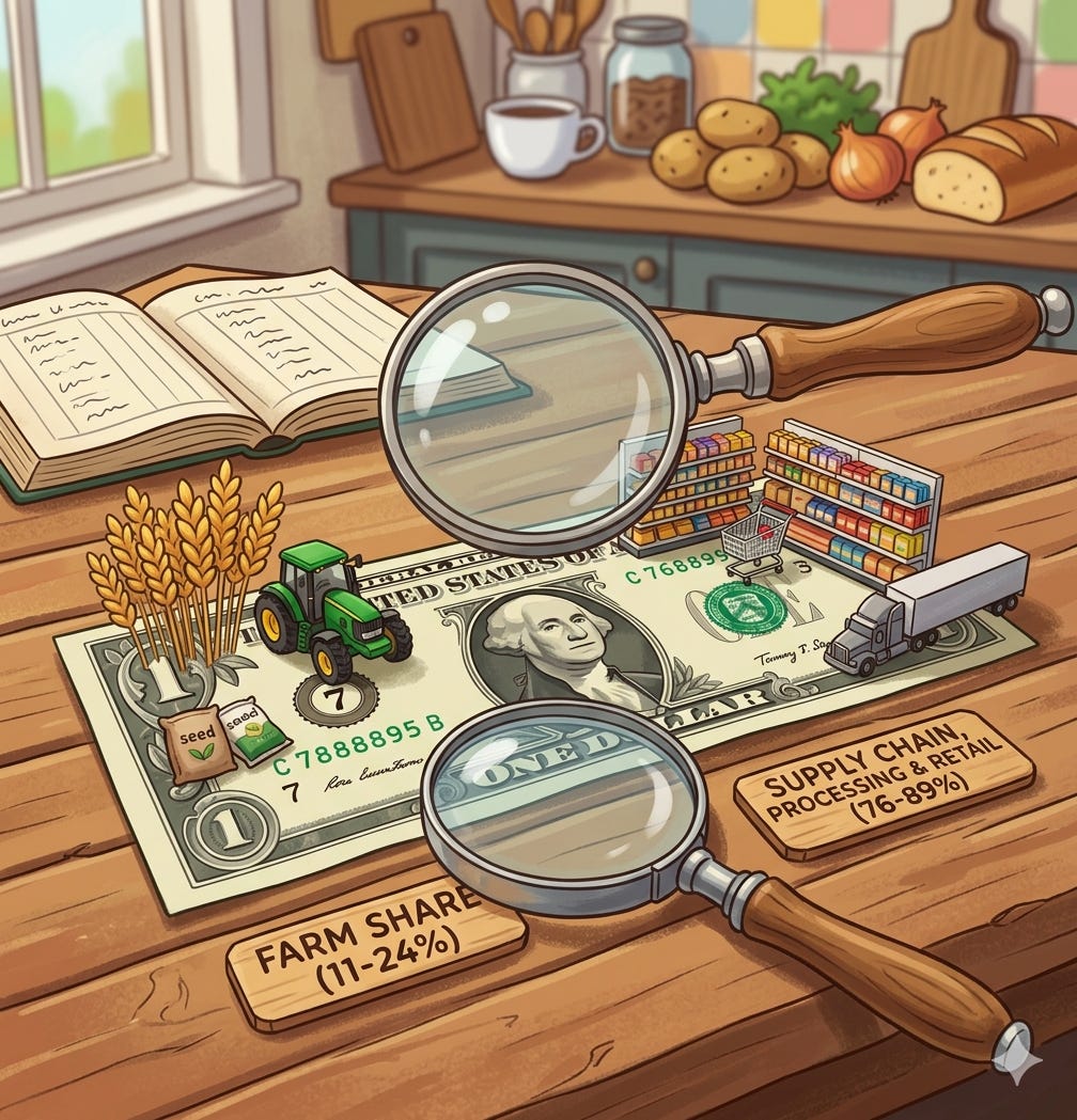
The Silent Reality of the Farm Share
CPI has one more key witness to call in defense of the standard story of the supply chain: the farm share of the food dollar. On the surface, the chart looks damning. In the early 1950s, farms accounted for close to 40 percent of what consumers spent on food; by 2023, that share hovers near 11 percent. This is widely taken as proof that the supply chain gradually swallowed the savings from the agricultural productivity boom. If the farmer’s slice keeps shrinking, the thinking goes, the middlemen must be eating the difference.
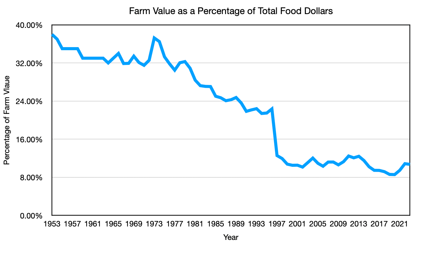
But that conclusion follows only if we understand what “farm share” measures and how the underlying data have changed over time. The legacy USDA Marketing Bill series is not directly comparable to the modern Food Dollar series. They define the pie differently, and the modern version also includes all forms of food spending, such as restaurants and other away-from-home options, which have always had very low farm shares. As more of our food budget flows through those channels, the overall farm share is mechanically pulled down, even if nothing “bad” is happening in the grocery supply chain.
That is why the Food Dollar food‑at‑home farm share, about 24.3 percent in 2023, gives us a much better apples‑to‑apples lens for this puzzle than the all‑food number, and why we should be cautious about treating the long‑run drop from older Marketing Bill estimates to today’s aggregate Food Dollar as proof that the supply chain simply ate the farm’s gains.
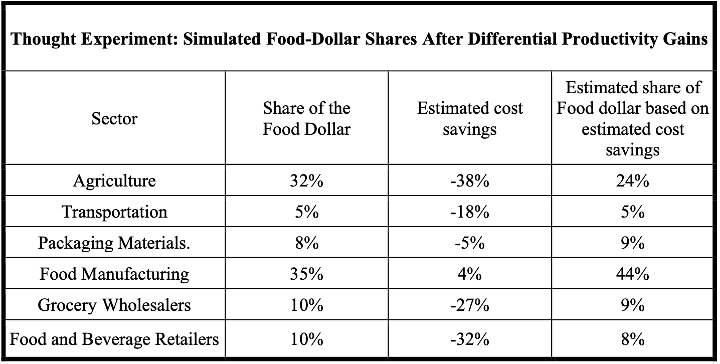
What, exactly, is the farm share telling us? At its core, it is a story about how the final dollar paid by the consumer gets split among all the stages that add value along the way. If consumers shift toward more restaurant meals and more heavily processed products, it is expected, not suspicious, that the non‑farm stages account for a larger share of the final price. The question is not “Did the farm share fall?” but “Does the fall necessarily mean the supply chain became bloated and ate all the savings?” To test that, we can run a simple thought experiment using the estimated cost savings from Section 4 to see how shares would shift if sectors simply became cheaper at different rates, without anyone padding their margins.
When we start with a 32 percent farm share under a legacy‑style definition and apply the estimated cost changes, agriculture’s share falls to about 24 percent, while food manufacturing rises from 35 percent to roughly 44 percent. Transportation, packaging, wholesale, and retail all move a few points in one direction or another, but the key point is that the total still adds up to the same amount: we have simply recut the pie based on who became more or less expensive relative to everyone else. This table is not a replacement for the official Food Dollar series; it is a thought experiment whose purpose is to show that even if every sector were playing fair, and even if the supply chain were becoming more efficient, the farm share could still drift downward simply because it was reducing its own costs at the same time other parts of the system were also cutting costs or holding their value steady.
Seen in that light, the long‑run decline in the farm share looks less like a smoking gun and more like a composite of three forces: definitional changes in the data, a shift toward more spending on away‑from‑home and more processed food, and genuine changes in who does what along the chain. None of those automatically implies that the supply chain has absorbed all the farm’s productivity dividend as higher costs. To answer that claim, we need to zoom in further—first by looking at farm share for specific categories like fresh fruits, vegetables, and dairy, and then by testing everything we have learned against a simple, concrete basket of staple foods.
Farm Share of Category Specific Food Groups
The USDA’s own numbers give us a way to see how different food categories perform. For 2010–2024, the Food Dollar data include sector‑specific farm‑share estimates for various product types. When we look specifically at fresh fruits, fresh vegetables, and dairy, we are looking at categories where the processing story should matter least, and the farm’s role should be most visible. If the supply chain were truly adding unnecessary costs, we would expect the farm share of these categories to trend downward over time.
Instead, the pattern is much more stable. Farm share for fresh fruit has been rising over the last decade and now sits at about 39 percent. Fresh vegetables account for around 26 percent of the farm share in 2023, and milk and dairy products account for around 25 percent in 2024. Those numbers align much more closely with the 1960–1980 Marketing Bill era once we make the apples‑to‑apples adjustments. In other words, when we strip away restaurants and heavy processing and just look at basic staples, the farm’s slice of the dollar has not mysteriously vanished.
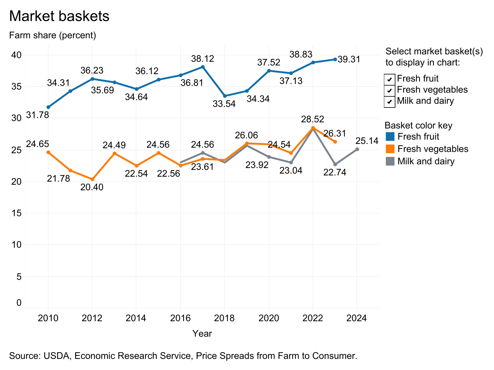
This matters because the items in your everyday grocery cart look much more like these categories than like ultra-processed snack aisles. For the kinds of foods people buy regularly, milk, cheese, produce, and basic proteins, the farm share today is still in the same ballpark as it was when the earlier Marketing Bill data were compiled. That does not mean nothing has changed in the food system; it means the “processed food” story cannot bear the weight it is often asked to. If farm shares for simple, minimally processed items remain healthy and the supply chain for those items is more efficient than before, we should expect to see meaningful price relief in the final prices of a basic basket of staples.
Examining an Illustrative Household Food Basket
That brings us back to the puzzle that will anchor the rest of this section: when we build a simple, largely unprocessed food basket and compare 1985 to today, the CPI‑adjusted total cost barely moves—yet the number of hours the average worker needs to buy that basket falls by about 30 percent. With everything we now know about productivity, farm share, and supply chain efficiency, that flat inflation-adjusted price is exactly what no one should expect to see.
1985 and 2025 food prices are taken from BLS Average Price Data (AP), U.S. city averages, using the same source for all items except 1985 milk, which is drawn from a historical review of nominal milk prices by year. Average hourly earnings come from FRED’s ‘Average Hourly Earnings of All Employees, Total Private’ (CES0500000003), with monthly values averaged to obtain an annual wage; hours of work required equal total basket cost divided by this wage.
In Section 3, we compared the cost of a basket of staple items in 1985 to the same basket in 2025, using BLS average price data and adjusting 1985 prices into 2025 dollars. The list is deliberately boring: bread, flour, milk, cheese, butter, coffee, potatoes, rice, a couple of meats, eggs, and sugar. Apart from bread, bacon, flour, and sugar—which require some processing—most of these are straightforward farm products that must be packaged, transported, portioned into consumer sizes, and stocked on shelves.
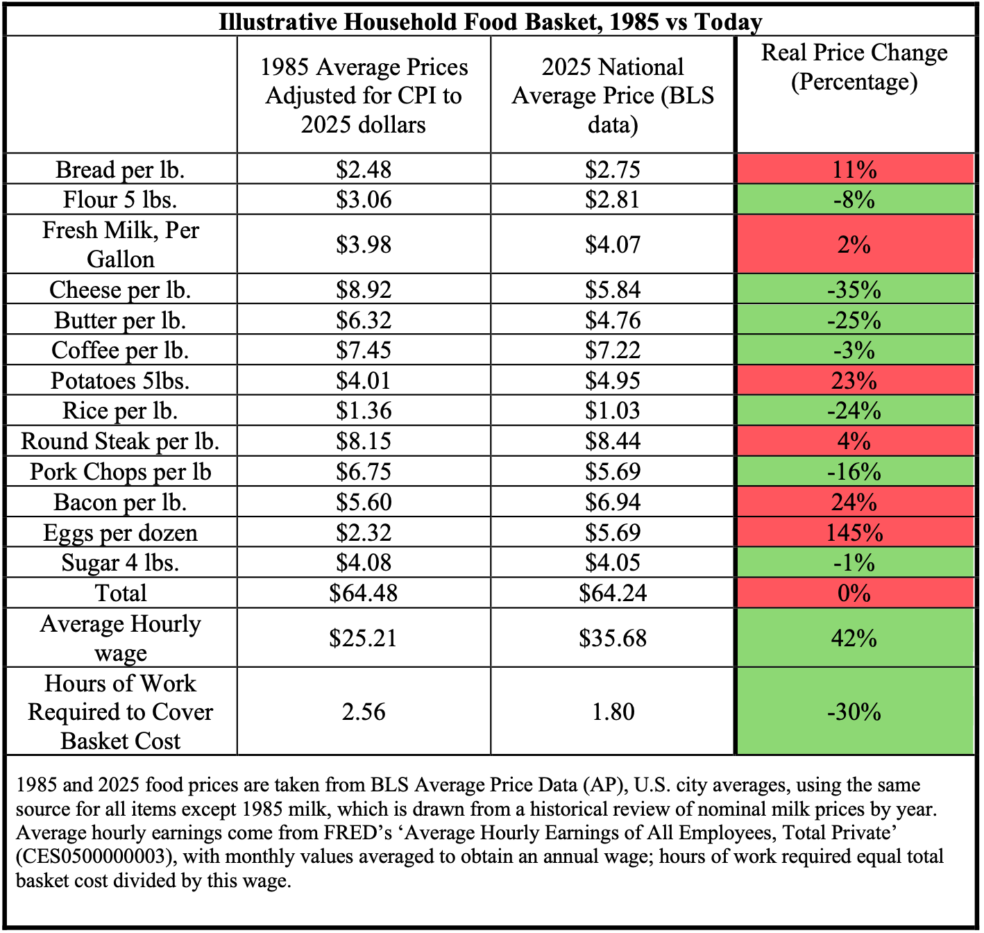
When you look at the table item by item, some prices go up, and some go down in CPI‑adjusted terms. Bacon and eggs are noticeably higher; cheese, butter, rice, and pork chops are lower; other items move only a little. What matters is the total. In 2025 dollars, the entire basket costs almost the same: about 64 dollars in 1985 and about 64 dollars today. On paper, in CPI-adjusted terms, it looks as if forty years of agricultural innovation and supply-chain improvement have left the price of this basket essentially unchanged.
This basket is not meant to replicate the full CPI; it is meant to strip away complexity and focus on basic foods where we would most expect productivity gains, on the farm and in the supply chain, to show up. For these items, we know three things: farms are vastly more productive than they were in 1985, the post-farm supply chain has not become a runaway cost center in real per-capita terms, and the farm’s share of the dollar for similar fresh categories remains healthy. Everything points in the same direction: this basket should be meaningfully cheaper in real terms than it appears in CPI‑adjusted dollars. The fact that the hours of work fall sharply while the CPI‑adjusted price stays flat is the clearest signal yet that the problem lies not with farmers or middlemen, but with the way our price indexes translate real‑world savings into “inflation‑adjusted” numbers.
Taken together, the farm‑shares evidence, and the simple basket tells a consistent story. For basic foods, farms are far more productive than they used to be, the supply chain has not turned into an out‑of‑control cost vacuum, farm share for comparable fresh items remains healthy, and the hours of work needed to buy a staple basket have fallen sharply, even though CPI‑adjusted prices appear flat. That leaves very little room for the idea that “too many middlemen” or rising distribution costs somehow swallowed the gains.
Before we can fully blame CPI’s methods for this disconnect, there are more familiar suspects we must call to the stand. Maybe it is not measurement error at all, but corporate behavior: powerful food companies using their market power to squeeze farmers on one side, raise prices on the other, and quietly pocket the difference. In the next section, we will put that story under the same kind of pressure test. Following the data on profits, margins, and concentration to see whether “market power and corporate capture” can really account for the missing savings, or whether it too starts to crumble once the numbers are on the table.
Next: With the supply chain dismissed, the next suspect is the corporations themselves. Continue to "Big Food and Greedflation: What the Margins Actually Show."
Methods and Sources.
Farm Share
Farm Share of the Food Dollar, 1953–2023. This graph shows the long‑run decline in the share of consumer food spending attributed to farms and agribusiness. For 1953–1966, farm‑share percentages are taken directly from USDA historical tables (Table 15 in “Total Farm and Marketing Totals”). For 1967–1996, farm share is calculated as total farm value divided by total consumer food expenditures in the USDA marketing‑bill data. For 1997–2023, farm share is defined as the combined value‑added share of agribusiness and farm production in the USDA ERS Food Dollar Series (“FoodDollarDataNominal (1).xlsx”). Because these series use different concepts and coverage, comparisons across periods should be treated as approximate trends rather than precise year‑to‑year changes.
Thought Experiment: Simulated Food-Dollar Shares After Differential Productivity Gains
I start from the 1967 USDA Marketing Bill breakdown of the food dollar and construct a simplified sector map. Agriculture, transportation, packaging materials, and food manufacturing shares are taken directly from the 1967 marketing‑bill data; the remaining portion of the dollar is assigned to wholesale and retail, which splits that residual share evenly. I then assume an initial total of 1 billion dollars in consumer food spending and allocate it across sectors according to these baseline shares. Next, I apply the estimated real cost changes for each sector by multiplying its initial dollar amount by (1−expected price decrease), producing a new dollar cost for every sector under the “after productivity” scenario. Finally, I sum those adjusted sector totals to obtain a new overall food‑dollar amount and recompute each sector’s share as its adjusted cost divided by this new total. This exercise does not attempt to re‑estimate the official Food Dollar series; it is purely a thought experiment to show how relative cost changes across sectors can shift farm share over time, even when every part of the supply chain is becoming more efficient.
Total Factor Productivity in Post‑Farm Food Supply Chain Industries, 1987–2023
Uses total factor productivity (TFP) indexes from the U.S. Bureau of Labor Statistics for four NAICS‑defined industry groups that approximate the post‑farm food supply chain: food and beverage manufacturing (NAICS 311–312), wholesale trade (NAICS 42), retail trade (NAICS 44–45), and transportation and warehousing (NAICS 48–49). TFP measures the efficiency with which combined inputs—labor, capital, energy, materials, and purchased services—are converted into real output, so higher index values indicate more output per unit of total input.
Source. U.S. Bureau of Labor Statistics. (2025). Major industry total factor productivity (KLEMS): Annual data [Excel spreadsheet]. Office of Productivity and Technology. Retrieved December 28, 2025, from https://www.bls.gov/productivity/tables/major-industry-total-factor-productivity-klems.xlsx (data extracted from the “Annual” sheet for NAICS 311–312, 42, 44–45, and 48–49).[
Note. TFP series are available only for NAICS-based industries beginning in 1987; the aggregates include some non-food activities (e.g., tobacco within 311–312, non-grocery wholesalers within 42), but they provide close proxies for productivity trends in the post-farm food supply chain. The series ends in 2023, the latest year available at the time of extraction
Sources.
Federal Reserve Bank of St. Louis. (2026). Average hourly earnings of all employees, total private (CES0500000003) [Data set]. FRED. https://fred.stlouisfed.org/series/CES0500000003
Taste of Home. (2023, November 27). Here’s the price of milk the year you were born. https://www.tasteofhome.com/article/heres-the-price-of-milk-the-year-you-were-born/
U.S. Bureau of Labor Statistics. (2013). Average food prices: A snapshot of how much has changed over a century (Beyond the Numbers, Vol. 2, No. 13). U.S. Department of Labor. https://www.bls.gov/opub/btn/volume-2/average-food-prices-a-snapshot-of-how-much-has-changed-over-a-century.htm
U.S. Bureau of Labor Statistics. (2026). Table B‑3. Average hourly and weekly earnings of all employees on private nonfarm payrolls by industry sector and selected industry detail [Data table]. The employment situation — January 2026. U.S. Department of Labor. https://www.bls.gov/news.release/empsit.t19.htm
U.S. Bureau of Labor Statistics. (2024). Average price data (AP), U.S. city average. https://www.bls.gov/charts/consumer-price-index/consumer-price-index-average-price-data.htm
USDA Economic Research Service. (1999). Food cost review, 1950–97 (Agricultural Economic Report No. 780). U.S. Department of Agriculture, Economic Research Service.
United States Department of Agriculture, Economic Research Service. (n.d.). Food dollar series: Nominal food dollar data [Data set]. Retrieved March 27, 2026, from URL-of-download-page
United States Department of Agriculture, Economic Research Service. (n.d.). Food dollar series: Nominal food dollar archived data [Data set]. Retrieved March 27, 2026, from URL-of-download-page
U.S. Bureau of Labor Statistics, Office of Productivity and Technology. (2025). Major industry total factor productivity (KLEMS): Annual data [Data set]. U.S. Department of Labor. Retrieved December 28, 2025, from https://www.bls.gov/productivity/tables/major-industry-total-factor-productivity-klems.xlsx
U.S. Department of Agriculture, Economic Research Service. (2025). Price Spreads from Farm to Consumer: Highlights and Interactive Charts. Retrieved December 31, 2025, from https://www.ers.usda.gov/data-products/price-spreads-from-farm-to-consumer/highlights-and-interactive-charts. (Chart adapted from the interactive tool showing farm share for fresh fruit, fresh vegetables, and milk and dairy baskets.)
Author: Kyle Novack
March 31, 2026
A Monumental Venture, LLC: research project (Novack Equilibrium Theory – NETs)
Attribution Required: © 2025–2026 Kyle Novack / Monumental Venture, LLC. For educational use with credit; commercial use requires permission. Full details in linked PDFs.