
Why the 1.5% Drift Validates Your Gut Feeling About the Economy
NETs Part 4: Food Puzzle Section 14.

In the last section, we tested one thing: how well the three main interpretations of inflation compare with the most honest way to assess potential monetary inflation, using M2 per capita, adjusted for velocity of money growth. I also added my thesis that CPI is understating true inflation by 1.5% a year, the 1.5% drift, to the mix to see how it compares. Only the 1.5% drift compared well.
That single alignment doesn’t close the case, but it raises a serious question: if the ruler is distorted by even that small an amount, what else has it been mismeasuring? This article answers that question for food. We’ll take the 1.5% adjustment and run it through the same stress test that all other inflation interpretations went through: farm expenses, wages, supply chain costs, and what you pay at the grocery store, to see if the pieces finally fit.
Before I get into the data, it’s worth being clear about what I am and am not claiming. The Food Puzzle does not prove that CPI is wrong. It does not prove the drift is exactly 1.5%. What it does is reveal gaps, places where the numbers CPI gives us don’t line up with first principles of economics, with physical reality, or with what you feel every time you check out at the grocery store. Those gaps deserve an honest conversation. The 1.5% drift is the hypothesis that best explains them. The rest of the NETs Project is where we put that hypothesis to the test.
Unless otherwise noted, all dollar figures in this section are expressed in “1.5% drift”–adjusted 2024 dollars. The 1.5% drift is defined as the official CPI-U inflation rate plus 1.5 % points per year, compounded annually from each series’ base year. This adjustment reflects the hypothesized systematic understatement of inflation that the Food Puzzle has been testing throughout Parts 1-13.
To keep the main story readable, I limit in-text citations and technical details. Tables and figures include only short captions and a few key references, so you can follow the argument without wading through footnotes on every line. All the underlying data series, transformations (such as per-capita conversions, the construction of the 1.5%-drift inflation multipliers, and percentage-change calculations), and exact formulas are documented in the Methods and Sources section at the end of this part. If you have questions about where a number comes from or how a graph was constructed, that is the place to look for full sourcing and methodology.
The Farm Data
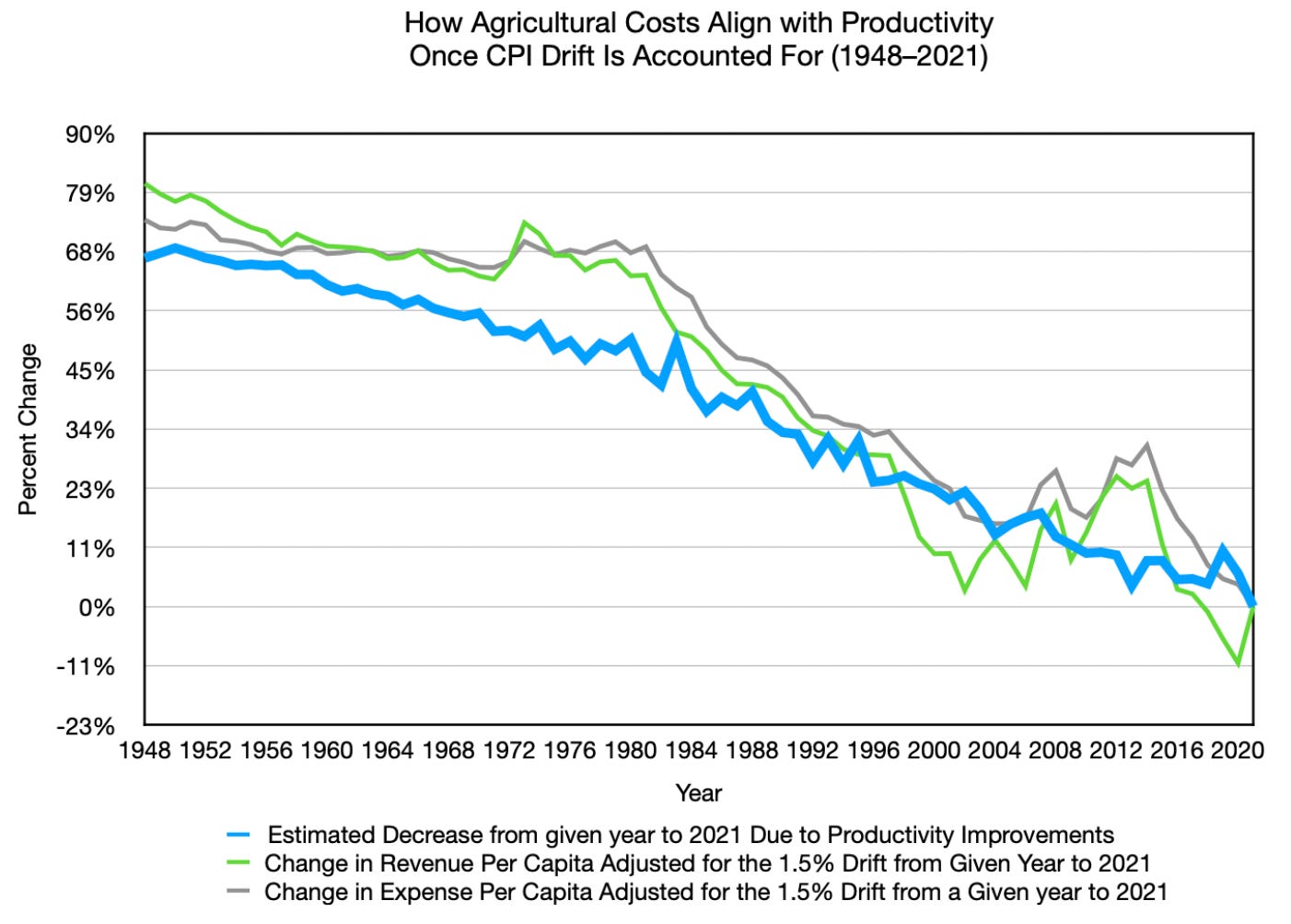
When we adjust agricultural revenue and expenses per person using the 1.5% drift rather than the standard CPI, a trend emerges. The numbers finally start to track the productivity line much more closely and, in some periods, fall even faster than productivity alone would predict. That overshoot isn’t an error. It can be partly accounted for by the agricultural bubble of the 1970s and 1980s, where elevated prices had to revert to normal, pushing costs down further than the long-run trend would suggest on its own. On top of this, all the nominal data tells a different story under the lens of the 1.5% drift. Why the overshoot goes beyond the bubble is a question the broader NETs framework will address; it requires context from several other layers of the analysis that haven’t been laid out yet.
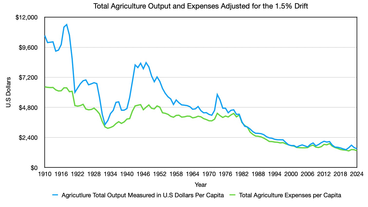
When we look at agricultural output measured in U.S. dollars and per-capita expenses, the data also align much more closely with historical reality. The major price movements throughout the century all have clear explanations:
World War I (1914–1918): Wartime demand and uncertainty drove prices sharply higher, followed by a crash once the war ended.
The Overindebted Farm Boom (Early 1920s through the Great Depression): Elevated farm prices persisted through the 1920s, only to collapse during the Great Depression.
World War II (1939–1945): Uncertainty about food supply dramatically increased revenues and expenses for farms. On top of this, governments spent heavily to feed soldiers in the field. After the war, prices dropped and continued falling as productivity improvements compounded.
The Energy Crisis and the End of the Gold Standard (1970s–Early 1980s): Severe speculation about the dollar’s purchasing power, combined with the Iranian oil crisis, drove heavy investment into agriculture and created a well-known agricultural bubble. Importantly, by this point, crop yields per acre had already improved significantly, and the share of the population needed to produce food had fallen dramatically. meaning the underlying pressure was already deflationary. That’s why this bubble was smaller in scope than earlier price movements.
Today, farming is more productive than ever, and per-capita food prices are the lowest relative to income. Americans now spend a smaller share of their income on food than at any point in recorded history. All the data aligns throughout the century.
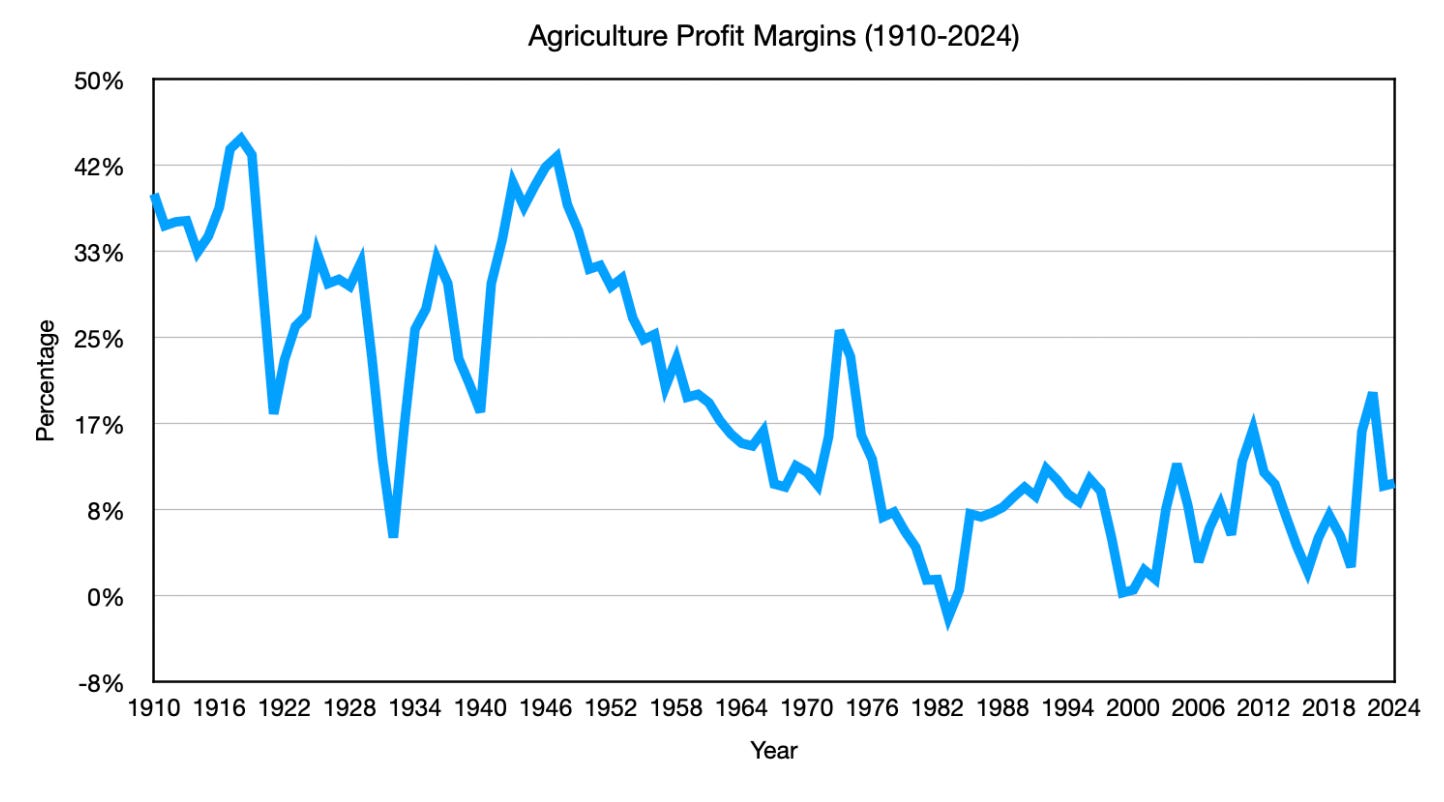
Farm profit margins tell the same story. Once you strip out the price spikes from World War II and the 1980s grain crisis, sustained margins were higher during the Great Depression than they are today. This is also part of why total output and per-capita expenses fell more than productivity did, because less value could be obtained from food. The farm sector was never secretly hoarding the productivity gains.
This is what makes farming unique. Demand per capita can’t meaningfully grow; biology sets the ceiling. So, every efficiency gain the farmer made didn’t open new markets; it just made the existing market cheaper. Market forces drove them to innovate so relentlessly, and become so efficient, that they forced themselves to become essentially irrelevant in the overall economy, shrinking from roughly 18% of GDP at their WWI peak to around 2% today.” The market pressure on farming didn’t stop at output prices. The other major cost of production, wages, was being quietly compressed at the same time.
When we adjust farm wages for inflation, they have fallen by roughly 30.9% since 1958. Under the official CPI, those same wages appear to have risen by about 78.4% over the same period, so, on paper, workers look better off. That gap is the drift made visible. Businesses believed they were paying more each year, and in nominal terms, they were. But because inflation was being mismeasured, much of that apparent rise was illusory. The typical farm worker’s purchasing power quietly contracted while the official numbers said everything was fine.
As striking as that number is, farm wages turn out to be the best case in the food industry. When we apply the same 1.5% drift correction across the broader food supply chain, wages collapse even more.
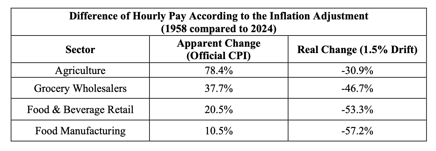
Every single segment of the food industry, from the field to the factory to the warehouse to the checkout lane, shows the same pattern. Workers were nominally paid more every year. Inflation quietly erased it. And because the ruler was bent, nobody could see it happening. This is not a farming problem. It is an economy-wide problem that the food industry makes impossible to ignore.
This matters beyond its implications for workers. As productivity gains compressed input costs, falling real wages further reduced input costs, lowering food prices even more. As I showed in Part 7, the food industry is extremely competitive, and as Part 6 demonstrated, corporate profits in this sector are not rising. That means businesses cannot hold onto these savings; competition forces them through to the consumer. The result is that food prices could fall even further than productivity alone would predict, because cost compression is occurring on multiple fronts simultaneously, leaving nowhere else for those savings to go. With costs falling at the farm, wages compressing across every stage of the supply chain, and competition preventing businesses from holding onto the savings, there is only one place left for all of that to show up: the price you pay at the store.
What You Pay at the Store
When we apply real inflation to total food revenue per capita, it falls about 45.8% from 1967, somewhat less than the roughly 66% drop at the farm level. That gap exists because the rest of the supply chain doesn’t capture the full farm-level improvement, not because middlemen swallowed the savings. As we showed earlier in this series, every stage of the supply chain got more efficient, too. The farm share of the food dollar shrank because farms improved faster than the rest of the chain, not because downstream costs exploded.
Using USDA data, acres harvested per capita decreased from roughly 0.9 acres in 1980 to around 0.6 acres in 2024, a nearly 29% decrease in land utilization. Total food revenue per person tells a similar story by falling by about 34.4% in real terms over the same period. For a sample of 17 commonly purchased, lightly processed staples, items that require relatively little value-added work beyond the farm, prices fall about 48.72% after adjusting for real inflation. That’s slightly larger than the aggregate estimate, which is exactly what you’d expect for simple, minimally processed foods that sit closest to farm-level productivity gains. Add in the suppressed wages, and the difference becomes almost self-evident.
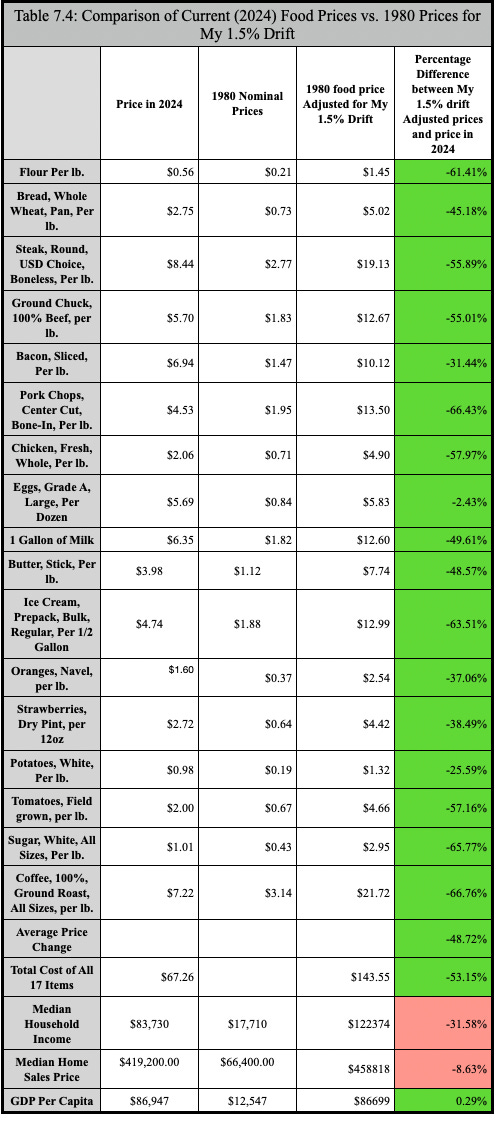
The table above also tells a broader story that goes well beyond groceries. Median household income, adjusted for the 1.5% drift, has fallen 31.58% since 1980. That decline is happening even as more households have shifted to two incomes just to keep pace, meaning families are working more and still losing ground. The gap between what paychecks should buy and what they buy isn’t a personal failure. It’s the drift, compounding quietly for decades.
Housing tells a similar story. The home that most people assume has grown in value is largely an illusion. Adjusted for real inflation, home prices are down about 8.63% since 1980. For millions of Americans, their home is their single largest asset, the cornerstone of their retirement plan, their financial safety net, and the wealth they hoped to pass on to their children. Under the 1.5% drift, most of that assumed wealth quietly evaporates.
And then there’s GDP per capita, the number politicians and economists point to as proof that the economy is growing, and life is getting better. Adjusted for the 1.5% drift, GDP per capita is essentially flat since 1980, up just 0.29%. Nearly half a century of reported economic growth, and in real terms, output per person has barely moved.
Taken together, these three data points reframe everything. It’s not that the economy stopped working. It’s that the ruler we use to measure it has been making economic decline for the average person just trying to get by, like you, look like progress for a very long time.
What This Means
The Food Puzzle started as a simple question: if farms and food companies can produce so much more with so much less, why haven’t real food prices collapsed? The answer they did. It’s that we couldn’t see it.
The physical economy did its job. Productivity rose. Supply chains became more efficient. Corporate margins didn’t secretly balloon. But our inflation gauge left most of that deflationary boom invisible, and that invisibility has had real consequences for real people. It’s why wages that looked like raises weren’t. It’s why your grocery bill feels wrong even when the official numbers say it shouldn’t. It’s why millennials and Gen Z are on track to be the first generations in modern history not to be better off than their parents, and economists have largely accepted that as an unfortunate fact of life rather than a measurement problem worth investigating.
The Food Puzzle doesn’t prove the drift is 1.5%. It doesn’t prove CPI is broken beyond repair. What it does is open a door. It shows that there are gaps in how we measure the economy that can’t be explained away by supply chains, corporate greed, regulation, or bad luck. Those gaps follow a pattern. And that pattern points toward a distorted ruler, one that has been making genuine progress invisible and genuine erosion look like stability for a very long time.
The food chapter is now closed. But what it leaves behind is bigger than food. If a systematic measurement error has been distorting how we read one of the most data-rich sectors in the entire economy, then that same ruler has been distorting everything else it has ever measured, too: your wages, your home’s value, your retirement savings, the interest rate on your mortgage, and the policies that govern all of it. The rest of the NETs project is about following that thread. Because if the ruler is bent here, it’s bent everywhere. And everything we thought we understood about how the economy works needs to be reconsidered.
Methods and Sources
Graph 1: Expected Price Decreases from Productivity vs. Observed Changes in Revenue and Expenses Per Capita, 1948–2021 (Adjusted for 1.5% Drift)
This graph compares the cumulative deflationary impact implied by agricultural productivity gains against the observed changes in per-capita farm revenue and expenses, all adjusted for real inflation (CPI-U plus 1.5% annual drift).
Data series:
Total Factor Productivity (TFP): USDA ERS Agricultural Productivity in the U.S., annual TFP index 1948–2021. https://www.ers.usda.gov/data-products/agricultural-productivity-in-the-united-states/
Agricultural revenue: USDA ERS Farm Income and Wealth Statistics, “Value of Production” (all commodities), annual 1948–2021.
Agricultural expenses: USDA ERS Farm Income and Wealth Statistics, “Total Production Expenses,” annual 1948–2021.
Population: U.S. Census Bureau historical estimates.
CPI-U: BLS Consumer Price Index, annual averages 1948–2021.
Calculation:
For each starting year from 1948 onward, three percentage changes to 2021 are calculated:
1. Expected price decrease from productivity (blue line):
For a given year (e.g., 1980), the TFP index value in that year is compared to the 2021 TFP index. The percentage increase in productivity is calculated as:
% TFP Increase = [(TFP(2021) / TFP(year)) - 1] × 100 This productivity gain is then converted into an expected price decrease, assuming full pass-through to consumers:
Expected Price Decrease = -[% TFP Increase] (For example, if TFP rose 50% from 1980 to 2021, the expected price decrease is -50%.)
2. Observed revenue per capita change (green line):
Nominal revenue for the starting year and 2021 are converted to constant 2024 dollars using the 1.5%-drift-adjusted inflation multipliers (CPI-U inflation rates plus 1.5 percentage points annually, compounded). Both values are divided by population to get per-capita figures. The percentage change is:
% Revenue Change = [(Revenue per capita(2021) / Revenue per capita(year)) - 1] × 100
3. Observed expenses per capita change (gray line):
Same method as revenue, using total production expenses instead. Signs are flipped so that cost declines plot as positive numbers and cost increases (like the 1948–1980 period) appear as negative.
The graph plots these three series against each starting year (1948, 1949, ... 2020) on the x-axis, with the y-axis showing percentage change to 2021. This reveals whether observed revenue and expense changes track the productivity-implied cost reductions, or fall short of them.
Note: The 2021 endpoint is used (rather than 2024) because it is the last year available in the USDA TFP series at the time of analysis. All dollar values are expressed in constant 2024 dollars for consistency with the rest of the Food Puzzle series, even though percentage changes are calculated to 2021.
Graph 2: Agricultural Revenue and Expenses Per Capita, Adjusted for Real Inflation (1.5% Drift), 1910–2024
This graph provides the historical context referenced in “The Farm Data” subsection, showing how major price movements align with known economic events (WWI, Great Depression, WWII, 1970s–80s agricultural bubble).
This graph displays total U.S. agricultural commodity revenue and total production expenses on a per-capita basis, adjusted for “real inflation” (official CPI-U plus 1.5 percentage points annually), expressed in constant 2024 dollars. It tracks how farm-level costs and revenues have changed relative to population and the corrected inflation measure, with major historical price movements (WWI, Great Depression, WWII, 1970s–80s agricultural bubble) annotated to provide context for volatility.
Revenue and expenses are taken from the USDA ERS Farm Income and Wealth Statistics, “Value of Production” (all commodities) and “Total Production Expenses,” annual series 1910–2024. Population data provide by Macrotrends 2023 and 2024 and Maddison-style estimates for all other years. Official CPI-U annual averages (1913–2024) are from the BLS, with interpolated or proxy estimates for 1910–1912 where needed.
For each year from 1910 to 2024, annual CPI-U inflation rates are computed, then 1.5 percentage points are added to produce the “real inflation rate.” A cumulative inflation multiplier series is constructed starting from 1910 (base = 1.000), compounding the real inflation rates year by year. Nominal revenue and expenses are converted to constant 2024 dollars by multiplying by the ratio [Multiplier(2024) by the nominal price] then divided by population to obtain per-capita figures in 2024 dollars.
Graph 3: Farm Profit Margins, Adjusted for Real Inflation (1.5% Drift), 1910–2024
Agricultural profit margins are calculated as (total value of agricultural production−total farm production expenses)÷total value of agricultural production×100, using the ERS series on the value of agricultural production and total production expenses from the Farm Income and Wealth Statistics. This margin is constructed directly from the same output and expense series used in the per‑capita graphs, to keep the accounting consistent.
Table: Real Wage Changes Across the Food Supply Chain, 1958–2024
Nominal average hourly earnings for three food-sector industries and agriculture are taken from BLS and USDA sources, then converted to constant 2024 dollars using both official CPI-U and the 1.5%-drift adjustment (official CPI inflation rates plus 1.5 percentage points annually, compounded from 1958).
Data sources:
1958–1989 (SIC codes): U.S. Bureau of Labor Statistics, “Employment, Hours, and Earnings, United States, 1909–94: Bulletin 2445” (September 1994). Food Manufacturing (SIC 20): Vol. 1, p. 477; Grocery Wholesalers (SIC 514): Vol. 2, p. 873; Food and Beverage Retailers (SIC 54): Vol. 2, p. 901. https://fraser.stlouisfed.org/title/189/item/5437
1990–2024 (NAICS codes): FRED/BLS series: Food Manufacturing (NAICS 311): IPUEN311W200000000; Grocery Wholesalers (NAICS 4244): IPUGN4244W20000000; Food and Beverage Retailers (NAICS 445): IPUHN445W200000. Retrieved December 27, 2025, from https://fred.stlouisfed.org
Agriculture (1958–2024): USDA NASS “Farm Labor” survey, hourly wage rates for hired farm workers. https://quickstats.nass.usda.gov. Note: In 1972, reporting changed from “per hour with board and room pay” to “all hired farm workers” ($/hour); 1972 definition used from that year forward.
Calculation: For each sector, 1958 and 2024 nominal wages are adjusted to 2024 dollars using: (1) standard CPI-U, and (2) CPI-U + 1.5% annual drift, compounded. Percentage change = [(2024 wage / 1958 wage in 2024$) – 1] × 100.
Comparison of Current (2024) Food Prices vs. 1980 Prices Adjusted for 1.5% Drift
All price and income figures are converted to 2024 dollars using a 1.5-percentage-point annual understatement adjustment to CPI-U before comparison.
Food item prices: For each of the 17 food items, nominal monthly prices for 1980 and 2024 are taken from the BLS Average Price (AP) series and averaged over the 12 months to get an annual price for each year. The 1980 annual prices are then rolled forward to 2024 by taking the official CPI-U inflation path and adding 1.5 percentage points to the annual inflation rate from 1980 onward, reflecting the hypothesized minimum understatement of CPI. This produces 1.5%-drift-adjusted 2024-dollar values, which are compared with actual 2024 prices to compute percentage differences. The “average price change” row is the simple mean of these 17 percentage differences.
Income and housing: Median household income is taken from Census historical income tables; median home prices from the FRED MSPUS series. The 1980 values are inflated to 2024 dollars using the same 1.5%-drift adjustment (official CPI-U inflation rates plus 1.5 percentage points per year from 1980 onward) before computing percentage differences, so income and housing are treated on the same basis as the food basket.
GDP per capita: GDP levels are assembled from MeasuringWorth and FRED, with population from Maddison-style estimates and Macrotrends. I compute GDP per capita as real GDP ÷ population, then express the 1980 value in 2024 dollars using the same 1.5%-drift-adjusted CPI path where needed, to match the treatment of other income variables.
Acres Harvested per Capita, 1980–2024
Number of harvested acres summed across barley, corn/maize, cotton, oats, rice, soybeans, sugarbeets, sugarcane, tobacco, and wheat. Sources: USDA National Agricultural Statistics Service, Crop Production 2022 Summary and Crop Production 2024 Summary (historical tables on yields and harvested acreage); population series from Bolt and van Zanden (2024) and Macrotrends.
Acres harvested per capita: Total Acres harvested by 10 crops divided by total U.S. population; Sources Maddison style population estimate and Macrotrends.
Sources
Bolt, J., & van Zanden, J. L. (2024). Maddison-style estimates of the evolution of the world economy: A new 2023 update. Journal of Economic Surveys, 38(1), 1–41. https://doi.org/10.1111/joes.12618
Federal Reserve Bank of St. Louis. (2024). Median sales price of houses sold for the United States (MSPUS) [Data set]. FRED. https://fred.stlouisfed.org/series/MSPUS
Federal Reserve Bank of St. Louis. (2024). Real gross domestic product per capita (A939RX0Q048SBEA) [Data set]. FRED. https://fred.stlouisfed.org/series/A939RX0Q048SBEA
Macrotrends. (2025). United States population 1820–2024 [Data set]. https://www.macrotrends.net/global-metrics/countries/usa/united-states/population
U.S. Bureau of Economic Analysis. (2024). Gross domestic product [Data set]. https://www.bea.gov/data/gdp
U.S. Bureau of Labor Statistics. (1994). Employment, hours, and earnings, United States, 1909–94: Bulletin of the United States Bureau of Labor Statistics, No. 2445 [Employment and Earnings, United States]. https://fraser.stlouisfed.org/title/189/item/5437 (Accessed December 22, 2025. Volume 1, Page 477; Volume 2, Pages 873, 901)
U.S. Bureau of Labor Statistics. (2024). Average price data (AP), U.S. city average. https://www.bls.gov/charts/consumer-price-index/consumer-price-index-average-price-data.htm
U.S. Bureau of Labor Statistics. (2024). Current Employment Statistics (CES), average hourly earnings by industry [Data set]. https://www.bls.gov/ces/
U.S. Bureau of Labor Statistics. (2026). Consumer Price Index for All Urban Consumers (CPI-U) [Data set]. https://www.bls.gov/cpi/
U.S. Bureau of Labor Statistics. (n.d.). Employment for manufacturing: Food manufacturing (NAICS 311) in the United States [FRED series IPUEN311W200000000]. Federal Reserve Bank of St. Louis. Retrieved December 27, 2025, from https://fred.stlouisfed.org/series/IPUEN311W200000000
U.S. Bureau of Labor Statistics. (n.d.). Employment for retail trade: Food and beverage stores (NAICS 445) in the United States [FRED series IPUHN445W200000]. Federal Reserve Bank of St. Louis. Retrieved December 27, 2025, from https://fred.stlouisfed.org/series/IPUHN445W200000
U.S. Bureau of Labor Statistics. (n.d.). Employment for wholesale trade: Grocery and related product wholesalers (NAICS 42444) in the United States [FRED series IPUGN4244W20000000]. Federal Reserve Bank of St. Louis. Retrieved December 27, 2025, from https://fred.stlouisfed.org/series/IPUGN4244W20000000
U.S. Census Bureau. (2024). Historical income tables: Households [Data set]. https://www.census.gov/data/tables/time-series/demo/income-poverty/historical-income-households.html
United States Department of Agriculture, National Agricultural Statistics Service. (2022). Crop production 2022 summary. https://www.nass.usda.gov/Publications/Todays_Reports/reports/croptr22.pdf
United States Department of Agriculture, National Agricultural Statistics Service. (2025). Crop production: 2024 summary. Cornell University Library. https://downloads.usda.library.cornell.edu/usda-esmis/files/k3569432s/nk324887m/qn59s0097/cropan25.pdf
U.S. Department of Agriculture, Economic Research Service. (n.d.). Agricultural productivity in the U.S.: Summary of recent findings. Retrieved March 14, 2026, from https://www.ers.usda.gov/data-products/agricultural-productivity-in-the-united-states/summary-of-recent-findings
U.S. Department of Agriculture, Economic Research Service. (n.d.). Farm income and wealth statistics [Data set]. https://data.ers.usda.gov/report.aspx?ID=4059
U.S. Department of Agriculture, Economic Research Service. (n.d.). Farm income and wealth statistics: Value of production and cash receipts tables [Data set]. https://data.ers.usda.gov/report.aspx?ID=4055
U.S. Department of Agriculture, Economic Research Service. (n.d.). Food expenditure series [Data set]. https://www.ers.usda.gov/data-products/food-expenditure-series/
U.S. Department of Agriculture, National Agricultural Statistics Service. (1988). Farm labor (November 14, 1988). https://esmis.nal.usda.gov/sites/default/release-files/x920fw89s/dz010r78x/6d56zz45b/FarmLabo-11-14-1988.pdf
U.S. Department of Agriculture, National Agricultural Statistics Service. (n.d.). Farm labor survey: Wage rate [Data set]. QuickStats. Retrieved December 27, 2025, from https://quickstats.nass.usda.gov/?referrer=grok.com#517CF532-00CD-37E5-A724-DA9A106E59CE
Williamson, S. H. (2025). What was the U.S. GDP then? MeasuringWorth. http://www.measuringworth.org/usgdp/
Author: Kyle Novack
Date: May 1, 2026
A Monumental Venture, LLC research project Novack Equilibrium Theory (NETs)
Attribution Required: ©2025–2026 Kyle Novack / Monumental Venture, LLC. For educational use with credit; commercial use requires permission. Full details in linked PDFs.