
The Overshoot Was Never a Problem, It Was Consistency
Food Puzzle Part 15

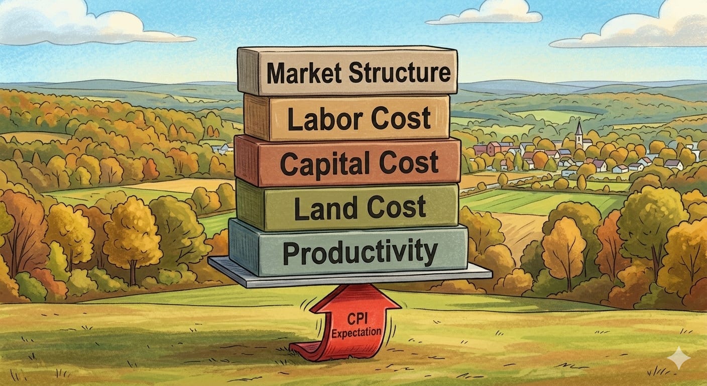
A Promise Kept
In Part 14, I flagged something that needed an honest answer. When you apply the 1.5% drift adjustment to agricultural data, the numbers finally start tracking what first-principles economics would predict. But for most of the period from 1948 to 2021, the cost savings go further than productivity alone would suggest. Prices and costs fell more than Total Factor Productivity implied they should.
I noted that this overshoot was not an error, that the agricultural bubble of the 1970s and early 1980s accounted for part of it, and that the rest required context from other layers of the NETs framework that had not yet been laid out. This article is that context.
Before I get into the argument, I want to be precise about what it does and does not establish.
The article is not a complete circular argument, but it is partly one, and I am not going to pretend otherwise. The specific figures for land costs, capital costs, and wages were all measured using the 1.5% drift adjustment. To explain why the overshoot happened, I must use drift-adjusted prices as the baseline. That means I am using the inflation adjustment to explain the data it produced. For those figures specifically, that circularity is real.
What breaks the circularity is the independent data that sits entirely outside any inflation adjustment. Workforce headcount, profit margins, GDP share, acres harvested, and productivity itself are all physical or structural measures that do not require any inflation adjustment to read. Every one of them points in the same direction as the drift adjustment produces. That non-monetary evidence is not circular. It is independent, and it gives us reasonable confidence that the direction of the argument is correct before the drift-adjusted figures ever enter the picture.
What this article does is show that the 1.5% drift is consistent with what the independent data would lead you to expect. It does not prove the magnitude is exactly right. It shows that an adjustment of this kind resolves what CPI cannot, and does so without invoking any mechanism that the underlying data contradicts.
Every mechanism described here, land costs, capital costs, wages, and the market structure of food itself, points in the same direction. That convergence is evidence, not proof. But it is meaningful evidence, and it stands on its own.
The harder challenge belongs to anyone defending CPI. If you reject the 1.5% drift, you still owe an explanation for why the Food Puzzle looks the way it does. Parts 1 through 13 systematically ruled out every standard alternative: supply chain markups, corporate profit capture, external shocks, and regulation. The drift is the explanation that survives. That asymmetry matters.
How to Read the Data in This Article
Unless otherwise noted, all dollar figures are expressed in 1.5% drift-adjusted 2024 dollars. The 1.5% drift is defined as the official CPI-U inflation rate plus 1.5 percentage points per year, compounded annually from each series’ base year. This adjustment reflects the hypothesized systematic understatement of inflation that the Food Puzzle has been testing throughout Parts 1 through 14.
To keep the main argument readable, in-text citations and technical details are kept to a minimum. All underlying data series, transformations including per capita conversions, construction of the 1.5% drift inflation multipliers, and percentage change calculations, along with exact sourcing, are documented in the Methods and Sources section at the end of this article. If you have a question about where a number comes from or how a chart was constructed, that is where to look.
What TFP Measures, and What It Misses
Total Factor Productivity is one of the most carefully constructed measures in all of economics. It is designed specifically to strip out monetary effects and capture the physical reality of production: how much output you get per unit of combined inputs, measured in real quantities rather than dollars. When TFP grows, it means farmers are doing more with less: more bushels per acre, more output per hour of labor, more food per unit of machinery and equipment deployed.
That makes TFP invaluable. It also makes it limited in a specific way that matters here.
TFP measures efficiency. It does not measure what happens to the cost of the inputs themselves. If a farmer becomes 50% more efficient at using land, TFP records that gain. But if the real price of land also falls by 60% over the same period, TFP has nothing to say about that second force. Both effects push the real cost of food downward, but only the first one appears in the productivity index. The same is true for capital and labor: TFP records that farms got more efficient at using both, but says nothing about whether those inputs became cheaper in real terms.
This is the standing premise for everything that follows. The overshoot is not a sign that the data are wrong or that the drift is miscalibrated. It is a sign that TFP captures one of the deflationary forces operating on agriculture, while at least three others were operating simultaneously and independently outside its design. When you add them together, going further than TFP alone would predict is not a discrepancy. It is exactly what you would expect.
Force One: The Real Cost of Land Collapsed
Land is priced by what it can produce. That is not a theory; it is how every buyer of productive land in history has evaluated a purchase. When an asset class generates strong returns, buyers compete for it and prices rise. When returns compress, the economic case for ownership weakens and prices follow. That mechanism is the foundation of every land market that has ever existed.
By that standard, farmland should have faced sustained downward price pressure over the last century. Three things happened simultaneously that make this conclusion unavoidable.
First, agriculture shrank from roughly 17% of GDP in the early 1910s to about 2% today. A sector that once anchored the American economy became a small corner of it. Fewer people competed for farmland as a productive asset, because fewer people were building their livelihoods around it.
Second, profit margins collapsed. From 1910 to 1930, average annual farm profit margins ran at roughly 33%. From 2004 to 2024, that average fell to roughly 9%. That early figure includes both the wartime price spike of the mid-1910s and the subsequent crash of the early 1920s, so it is not cherry-picked at the peak; it is a genuine mean across a volatile period. The direction is unambiguous regardless of how the accounting is measured: the return available per acre fell dramatically. It is worth noting that historical farm expense accounting was less comprehensive than modern reporting, meaning some costs captured today were not fully recorded in the early period, so the true compression in profitability may be somewhat smaller than the raw figures suggest. Even so, the contrast between then and now is stark. At an average margin of 33%, farming was a viable business that rewarded ownership of productive land. At 9%, with margins that have been near zero or negative in multiple years since the 1980s, the economic case for land ownership as a productive investment has weakened considerably. Land prices should reflect that transformation.
Third, productivity per acre rose dramatically over the same period, meaning the country produces more food than ever from roughly the same total acreage. Some farmland was absorbed by urban development over the century, but urban land today accounts for only about 3% of total U.S. land area, and total farmland declined by roughly 80 million acres over the same period, most of which left agriculture for economic reasons rather than development pressure. The supply constraint that would justify sustained real price increases in land never materialized, because yield gains more than compensated for any acreage lost.
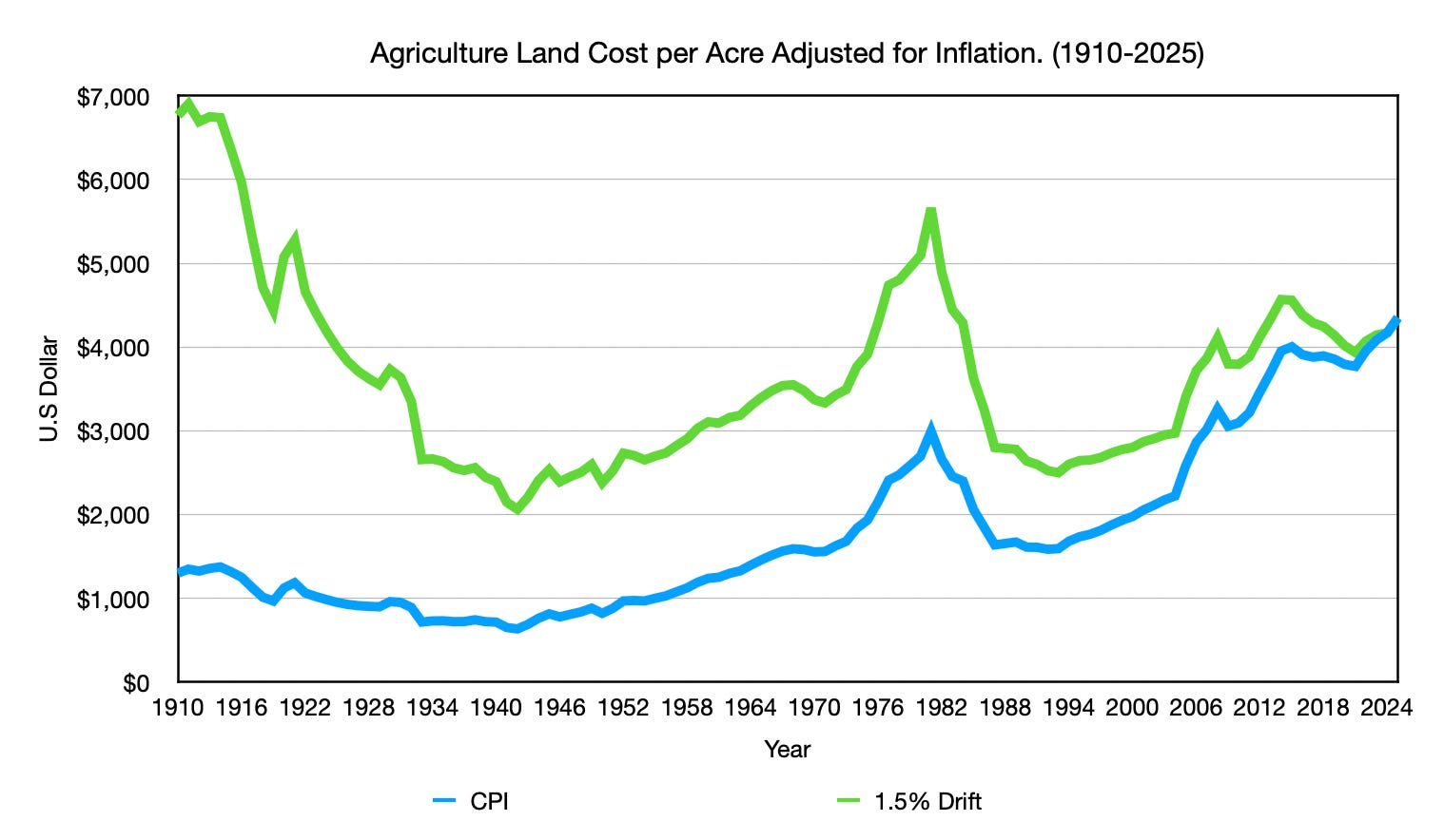
Under the 1.5% drift adjustment, the data reflect this economic logic. Farmland that started the century at roughly $6,800 per acre in drift-adjusted 2024 dollars lands at around $4,200 today: cheaper in real terms after a century of nominal price increases. That is the result you would expect from an asset that lost its economic dominance, generated declining returns, and faced no supply constraint.
Under CPI, the story runs in the opposite direction. Farmland appears to have appreciated substantially in real terms over the same period. There is no mechanism offered for this. No supply constraint. No rising returns to ownership. There is no growing share of the economy demanding more productive land at a rate sufficient to explain the sustained real appreciation in farmland prices that the CPI produces. CPI’s version of farmland prices is not an economic argument; it is an observation dressed up as one. The ruler measured prices rising, so the conclusion is that prices rose. The fundamentals that would need to support that conclusion point the other way.
Land is the first piece of evidence that the direction of the 1.5% drift is correct. Force Two examines whether capital expenses tell the same story.
Force Two: Capital Costs Tell the Same Story CPI Cannot Explain
The standard defense of rising farm costs runs like this: yes, farms became more efficient, but the machinery that replaced human labor was expensive. Every piece of equipment a modern farm depends on costs money, and that cost must go somewhere. This means that even as labor costs fell, capital costs should have risen to absorb the savings, leaving the net cost of farming roughly unchanged. It sounds plausible. The data does not support it.
To isolate capital costs honestly, this section uses two related but distinct metrics. The first is capital expenses specifically: the tractors, combines, silos, and physical infrastructure required to farm. The second is total production expenses with labor removed, which captures the broader non-labor cost structure of agriculture. Both are expressed on a per capita basis, using the same methodology applied throughout the Food Puzzle. Measuring total expenses without adjusting for population simply tracks how many more people there are to feed, rather than whether farming itself became more or less expensive. Each metric tells part of the story. Together, they close the argument.
From 1910 to 2024, capital expenses per capita adjusted for CPI fell from roughly $146 to around $90, a decline of about 38%. The $90 figure is an average from 2020 to 2024 rather than a single-year endpoint, because capital investment was unusually low during that period, likely reflecting COVID-related disruptions and uncertainty around the 2024 election cycle, though the latter remains a hypothesis. Using the average rather than the 2024 figure alone actually raises the endpoint, narrowing the gap between 1910 and today. This gives CPI the benefit of the doubt. This also means that capital investment may not have declined as much as 38% in the coming years, according to CPI. Under the drift adjustment, that decline is much larger. Either way, the machinery that was supposedly meant to absorb all the savings from labor displacement did not become more expensive in real terms. It became cheaper on a per-capita basis.

over the same window. From 1910 to 2024, total per capita farm production expenses adjusted for CPI increased from roughly $1,054 to $1,182, a 12.1% increase. After a century in which farming’s share of the American workforce fell by 94%, and in which TFP nearly tripled from its 1948 baseline alone, meaning the full gain from 1910 is larger still, CPI says farming got more expensive per person in real terms.
That is the contradiction at the center of Force Two. Not a modest failure to capture the full savings. Not a partial gap explained by energy shocks, regulatory costs, or corporate profit capture. A complete reversal of what should have happened. The physical economy says costs should have fallen dramatically. CPI says they rose. Under the drift adjustment, per capita capital and total production expenses fall in the direction first principles of economics would predict: when you produce more food per acre, per worker, and per unit of equipment deployed, the real cost per unit of output declines. That is what productivity means. One ruler reflects it. The other does not.
Capital is the second piece of evidence that the direction of the 1.5% drift is correct. Force Three examines whether the labor data closes the same argument from a third independent angle, and adds an arithmetic problem CPI cannot resolve even on its own terms.
Force Three: The Labor Arithmetic CPI Cannot Close
The hourly wage data for agricultural workers is used from 1958 onward, because compensation structures changed significantly across the early and mid 20th century, making earlier comparisons increasingly difficult to interpret on a consistent basis. A further reporting change occurred in 1972, when the USDA shifted from tracking wages for workers without board and room pay to tracking all hired farm workers. The 1958 starting point is the most defensible anchor available for this specific metric.
In 1958, roughly 5.59 million people worked in American agriculture. Today, that number is approximately 2.25 million, a decline of nearly 60% in the farm workforce. Over the same period, the U.S. population grew by about 95%, meaning each remaining farm worker produces food for more people than ever before. Both of those forces, fewer workers and more mouths served per worker, push per capita labor costs in the same direction: down.
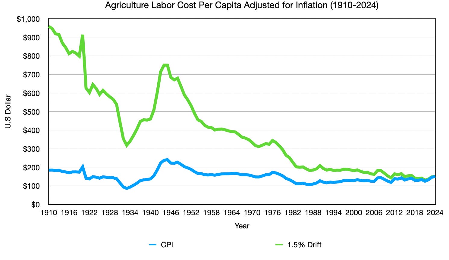
For CPI’s flat per-capita labor cost line to be correct, real hourly farm wages would have needed to increase by roughly 148% over that period, just to compensate for the workforce reduction alone, before accounting for population growth. CPI-adjusted hourly farm wages rose from roughly $10 to about $18 per hour over that period, an increase of about 80%. That is a little over half of the wage growth required to justify flat per-capita labor costs without accounting for population growth. The arithmetic does not close.
This is not a subtle measurement disagreement. It is a mathematical inconsistency between three data series that CPI itself accepts as valid: its own wage figures, federal farm employment headcount data, and population estimates. When you multiply the workforce by the wage and divide by the population, you do not get a flat line. You get a line that falls. The fact that CPI produces a flat line anyway is not a finding; it is a signal that something in the measurement is absorbing a real decline and calling it stability.
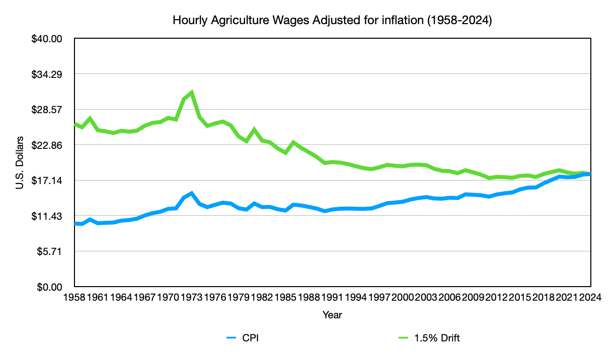
The hourly wage chart makes the individual worker’s story visible under the drift adjustment. Wages start near $27 per hour in 1958 and fall to roughly $18 today, a real decline of about 33%. The drift-adjusted line tells a story consistent with what we know about agricultural labor markets: a sector that continuously shed workers, compressed its wage floor, and increasingly relied on a smaller, lower-cost workforce to maintain output.
The per capita labor cost chart brings all three forces together. Under CPI, total agricultural labor cost per capita has been essentially flat since the early 1950s, holding between roughly $100 and $200 per person for seven decades, despite the workforce shrinking by nearly 60%, wages failing to double, and the U.S. population growing by roughly 95% over the same period, spreading whatever labor costs remained across nearly twice as many people. Three forces are pushing in the same direction, and CPI produces a flat line. Under the drift adjustment, labor cost per capita starts near $950 in 1910 and falls to around $150 today, an 84% decline that reflects what happened.
Labor is the third piece of evidence that the direction of the 1.5% drift is correct. Force Four examines the demand side of the argument: why the market structure of food guarantees that cost savings get passed through to consumers more completely than in almost any other sector of the economy.
Force Four: Market Structure Ensures the Savings Pass Through
The first three forces are all cost-side arguments. There is also a demand-side dynamic that amplifies all three simultaneously, and it is examined in full in Part 7 of the Food Puzzle.
The short version is this: food is simultaneously the most essential category of spending and one of the most substitutable within that category. You cannot stop eating, but you can switch brands, cut to store label, or move to a cheaper store. That combination creates relentless downward pressure on unit prices that does not exist for discretionary goods. When farming becomes more productive, when labor costs compress, when capital gets cheaper, those savings cannot sit on a balance sheet for long. Competition forces them through to the consumer faster and more completely than in almost any other sector.
The practical implication for this article is straightforward: even if the three cost-side forces were somewhat smaller than estimated, the market structure of food ensures that whatever savings exist get competed through to the price you pay at the store. That is why the overshoot is not just probable. It is nearly inevitable.
For the full argument on why markets prevent food from staying expensive, see Part 7.
A Note on Alternative Inflation Measures
Some will argue that CPI is the wrong measure entirely, and that PPI, PCE, or industry-specific deflators would tell a different story. It is a reasonable methodological question and worth addressing directly.
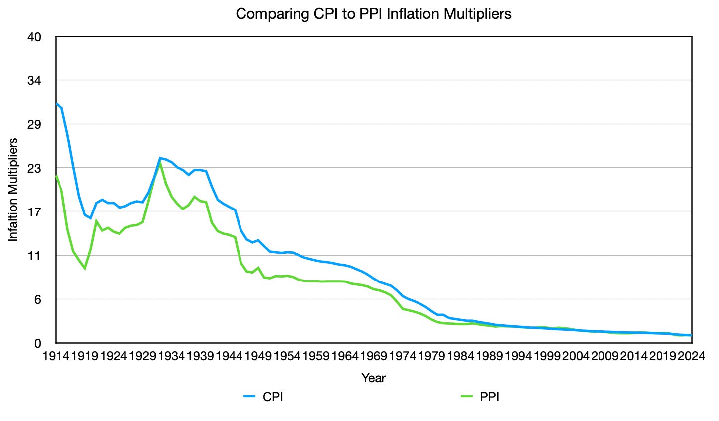
PPI has tracked consistently below CPI since 1914, as the chart above shows. PCE consistently runs below CPI as well. Both adjustments move in the same direction: under a lower inflation measure, historical prices deflate less, meaning the real cost of everything in the past appears lower than CPI would show. The gap between what productivity predicts and what the adjusted figures show only grows. The contradiction deepens; it does not resolve.
Industry-specific deflators are a separate methodological question addressed in Part 2 of this series. Unlike PPI and PCE, they are not simply lower versions of CPI; they are constructed differently and require their own treatment. Part 2 documents why they do not resolve the Food Puzzle either.
The standard alternative inflation measures are not going to save you.
Why the Overshoot Isn’t a Discrepancy, It’s a Confirmation
TFP measures one deflationary force operating on agriculture over the past century. This article has described four others that were operating simultaneously and independently outside its design. Together, they account for why the overshoot is not a discrepancy but an expected outcome. Here is the full picture:
Productivity gains (captured by TFP): The physical efficiency of turning inputs into food roughly tripled from 1948 to 2021.
Real land cost decline (not captured by TFP): The most irreplaceable input in agriculture became significantly cheaper in real terms under the drift adjustment.
Real capital cost decline (not captured by TFP): The machinery that replaced farm labor also became cheaper in real terms, compounding the efficiency gains with lower input prices.
Real wage decline (not captured by TFP): Agricultural labor became significantly cheaper in real terms, adding a third layer of cost reduction on top of the productivity gains.
Market-structure pressure (amplifies all four): Food is simultaneously non-negotiable and highly substitutable within its category, which ensures cost savings are competed through to consumers more completely and quickly than in almost any other sector of the economy.
When five forces are all pushing in the same direction, and your productivity measure is deliberately designed to capture only one of them, the result is not a surprise. It is what the data should show. TFP was designed to measure physical efficiency and to exclude monetary effects on input costs. The other four forces operated entirely outside what TFP was ever meant to see. That convergence is not proof of the drift. But it is exactly the kind of internal consistency you would expect from a measurement that is capturing economic reality, and exactly the kind of result that has no coherent explanation under CPI.
What This Argument Can and Cannot Establish
The limits of this argument are worth restating explicitly, because they apply in both directions.
This article does not prove the 1.5% drift is exactly correct. The specific figures for land, capital, and wage decline were all measured using the drift adjustment, and I cannot use drift-adjusted results to independently validate the drift itself. What I can establish is that the non-monetary data, workforce headcount, profit margins, GDP share, acres harvested, and productivity, all point in the direction the drift produces without requiring any inflation adjustment to read. Under the drift, every major input moves in directions that independent data already predicted. Under CPI, no coherent picture exists. The burden of producing a competing explanation that fits equally well belongs to those who would defend the existing measurement.
What Comes Next
Part 14 closed the Food Puzzle as an empirical argument. This article closes with something different: the question of whether the overshoot has a coherent explanation, or whether it is noise that the drift adjustment happens to produce.
The answer is that it is consistent with what the physical data of the agricultural industry indicates should have happened: every independent measure points in the same direction the drift adjustment produces, and none of them require an inflation adjustment to read.
The Food Puzzle shows that CPI struggles to accurately capture what happened within one of the most data-rich, most physically verifiable sectors in the entire economy. If that is true here, the question becomes: what has happened to your wages, your home’s value, your retirement savings, and the interest rate policies built on top of all of them? The rest of the NETs project follows that thread.
Method and Source
A Promise Kept: The Drift Adjustment Methodology
The 1.5% drift adjustment adds 1.5 percentage points to each year’s reported CPI-U annual inflation rate. If the reported rate is 3.0%, the adjusted rate becomes 4.5%. This addition is applied consistently across every year in the series.
The adjusted annual rates are then compounded using the same 1982 to 1984 base period as the standard CPI-U index, where the index equals 100, to produce a new set of inflation multipliers. Those multipliers convert nominal dollar figures into drift-adjusted real dollar figures across the 1910 to 2024 analysis window in exactly the same way standard CPI multipliers work.
Every drift-adjusted figure in this article is independently reproducible: take the CPI-U annual series, add 1.5 percentage points to each year’s reported rate, recompound from the 1982 to 1984 base, and apply the resulting multipliers to the nominal data cited above.
Source: U.S. Bureau of Labor Statistics, CPI-U 1913 to 2024, accessed via U.S. Inflation Calculator. https://www.usinflationcalculator.com/inflation/consumer-price-index-and-annual-percent-changes-from-1913-to-2008/
Force One: Land
Farmland price per acre is drawn from a single continuous USDA NASS series running from 1910 to 2024, measuring average farm real estate value including buildings in nominal dollars per acre. Both CPI-adjusted and drift-adjusted figures are derived by applying the respective multipliers to the nominal series.
Source: USDA NASS, Agricultural Land Asset Value per Acre, 1910 to 2024, national total. https://quickstats.nass.usda.gov/results/327CEF7D-99E0-3088-90A5-390CFCDD3F87 Search criteria: Program: Survey, Sector: Economics, Group: Farms and Land and Assets, Commodity: AG Land Asset Value including Buildings, Category: Asset Value measured in dollars per acre, Domain: Total, Geographic Level: National, Year: 1910 to 2025.
Agriculture as a percentage of GDP is calculated by dividing total all-commodity output from USDA ERS Farm Income and Wealth Statistics by nominal GDP for each year from 1910 to 2024.
USDA ERS Farm Income and Wealth Statistics: https://data.ers.usda.gov/reports.aspx?ID=4055 Nominal GDP 1790 to 2023: MeasuringWorth. http://www.measuringworth.org/usgdp/ Nominal GDP 2024: FRED, Federal Reserve Bank of St. Louis. https://fred.stlouisfed.org/series/GDP
Farm profit margins are calculated by subtracting total farm expenses from total commodity revenue, then dividing by total commodity revenue, expressed as a percentage. Revenue and expense figures are drawn from USDA ERS Farm Income and Wealth Statistics and Farm Production Expenditures.
USDA ERS Farm Income and Wealth Statistics: https://data.ers.usda.gov/reports.aspx?ID=4055 USDA ERS Farm Production Expenditures: https://data.ers.usda.gov/reports.aspx?ID=4059
Urban land as a percentage of total U.S. land area and total farmland acreage decline are drawn from the USDA ERS Major Land Uses series.
https://www.ers.usda.gov/data-products/major-land-uses
Force Two: Capital
Capital expenses per capita are drawn directly from the USDA ERS Farm Production Expenditures report, which publishes capital expenses as an explicit line item. No derivation was required for this series.
Total production expenses minus labor is a derived figure. It is calculated by taking total farm production expenses and subtracting the labor cost line item for each year, leaving the broader non-labor cost structure of agriculture.
Both series are divided by U.S. population for each year to produce per capita figures. CPI-adjusted and drift-adjusted figures are produced by applying the respective multipliers to the nominal per capita series.
Capital expenses endpoint note: The 2024 endpoint uses an average of 2020 to 2024 rather than a single year figure, because capital investment was unusually low during that period, likely reflecting COVID-related disruptions and uncertainty around the 2024 election cycle, though the latter remains a hypothesis. Using the average rather than the 2024 figure alone raises the endpoint, narrowing the gap between 1910 and today and giving CPI the benefit of the doubt.
Source: USDA ERS Farm Production Expenditures, 1910 to 2024. https://data.ers.usda.gov/reports.aspx?ID=4059
Population source listed in the full reference document.
Force Three: Labor
Agricultural hourly wages are drawn from two series.
From 1958 to 1988, wages are taken from the USDA ESMIS Farm Labor report. Within this series, a structural reporting change occurred between 1971 and 1972, reflecting changes in how agricultural labor compensation was tracked across the economy. Prior to this transition, the per hour without board and room pay column is used. Following the transition, the all hired farm workers column is used. The exact year the change was formally reported by USDA is not confirmed; the transition in this dataset is applied at 1972 based on where the data shift is observable in the series.
From 1989 to 2024, wages are taken from USDA NASS QuickStats using the all hired farm workers wage rate series.
Agricultural workforce headcount is drawn from two series joined at 1948. From 1910 to 1948, total farm labor force figures are sourced from Statista historical U.S. farm and non-farm labor data. From 1948 to 2024, employment figures are drawn from the BLS series via FRED.
Total agricultural labor cost per capita is drawn directly from USDA ERS Farm Production Expenditures as an explicit line item, divided by U.S. population for each year.
The 148% wage growth figure is derived arithmetically: workforce headcount in 1958 divided by workforce headcount in 2024, producing the wage increase required to hold per capita labor costs flat before accounting for population growth.
Sources: USDA ESMIS Farm Labor, 1958 to 1988: https://esmis.nal.usda.gov/sites/default/release-files/x920fw89s/dz010r78x/6d56zz45b/FarmLabo-11-14-1988.pdf
USDA NASS QuickStats, 1989 to 2024:
https://quickstats.nass.usda.gov/?referrer=grok.com#517CF532-00CD-37E5-A724-DA9A106E59CE
Statista, U.S. farm and non-farm labor force historical, 1910 to 1948: https://www.statista.com/statistics/1316855/us-farm-nonfarm-labor-force-historical/
BLS via FRED, Employment Level, Agriculture and Related Industries, 1948 to 2024: https://fred.stlouisfed.org/series/LNS12034560
Population source listed in the full reference document.
A Note on Alternative Inflation Measures
The CPI versus PPI comparison chart plots the inflation multipliers for both series across the full historical window. No derivation is required. The multipliers are constructed from the published annual index values for each series in the standard way: each year’s multiplier represents how many dollars in the base year are equivalent to one dollar in the given year.
Sources: CPI-U: U.S. Bureau of Labor Statistics, accessed via U.S. Inflation Calculator. https://www.usinflationcalculator.com/inflation/consumer-price-index-and-annual-percent-changes-from-1913-to-2008/
PPI: U.S. Bureau of Labor Statistics, Producer Price Index by Commodity, All Commodities, via FRED. https://fred.stlouisfed.org/series/PPIACO
Sources
U.S. Department of Agriculture, Economic Research Service
U.S. Department of Agriculture, Economic Research Service. (2024). Agricultural productivity in the United States, 1948 to 2021. https://www.ers.usda.gov/data-products/agricultural-productivity-in-the-united-states/methods
U.S. Department of Agriculture, Economic Research Service. (2024). Farm income and wealth statistics. https://data.ers.usda.gov/reports.aspx?ID=4055
U.S. Department of Agriculture, Economic Research Service. (2024). Farm production expenditures. https://data.ers.usda.gov/reports.aspx?ID=4059
U.S. Department of Agriculture, Economic Research Service. (2024). Major land uses. https://www.ers.usda.gov/data-products/major-land-uses
U.S. Department of Agriculture, Economic Research Service. (2024). Land use, land value and tenure: Farmland value. https://primary.ers.usda.gov/topics/farm-economy/land-use-land-value-tenure/farmland-value
U.S. Department of Agriculture, National Agricultural Statistics Service
U.S. Department of Agriculture, National Agricultural Statistics Service. (2025). Agricultural land asset value per acre, 1910 to 2025, national total. USDA NASS QuickStats. https://quickstats.nass.usda.gov/results/327CEF7D-99E0-3088-90A5-390CFCDD3F87
U.S. Department of Agriculture, National Agricultural Statistics Service. (2025). Crop production: 2024 summary. Cornell University Library. https://downloads.usda.library.cornell.edu/usda-esmis/files/k3569432s/nk324887m/qn59s0097/cropan25.pdf
U.S. Department of Agriculture, National Agricultural Statistics Service. (2022). Crop production: 2022 summary. https://www.nass.usda.gov/Publications/Todays_Reports/reports/croptr22.pdf
U.S. Department of Agriculture, National Agricultural Statistics Service. (2025). Labor hired crop and animal workers, wage rate, 1989 to 2024, national annual. USDA NASS QuickStats. https://quickstats.nass.usda.gov/?referrer=grok.com#517CF532-00CD-37E5-A724-DA9A106E59CE
U.S. Department of Agriculture, National Agricultural Statistics Service. (1920). Census of agriculture: Farms and property. https://www.nass.usda.gov/AgCensus/archive/files/1920-Farms_and_Property.pdf
U.S. Department of Agriculture, Economic Management Support Center
U.S. Department of Agriculture, Economic Management Support Center. (1988). Farm labor, 1958 to 1988. USDA ESMIS. https://esmis.nal.usda.gov/sites/default/release-files/x920fw89s/dz010r78x/6d56zz45b/FarmLabo-11-14-1988.pdf
U.S. Bureau of Labor Statistics
U.S. Bureau of Labor Statistics. (2024). Consumer price index for all urban consumers, CPI-U, 1913 to 2024. Accessed via U.S. Inflation Calculator. https://www.usinflationcalculator.com/inflation/consumer-price-index-and-annual-percent-changes-from-1913-to-2008/
U.S. Bureau of Labor Statistics. (2025). Producer price index by commodity: All commodities. Federal Reserve Bank of St. Louis, FRED. https://fred.stlouisfed.org/series/PPIACO
U.S. Bureau of Labor Statistics. (2025). Employment level, agriculture and related industries, 1948 to 2024. Federal Reserve Bank of St. Louis, FRED. https://fred.stlouisfed.org/series/LNS12034560
U.S. Bureau of Economic Analysis
U.S. Bureau of Economic Analysis. (2025). Personal consumption expenditures price index. Federal Reserve Bank of St. Louis, FRED. https://fred.stlouisfed.org/series/PCEPI
Federal Reserve Bank of St. Louis
Federal Reserve Bank of St. Louis. (2025). Gross domestic product, annual, end of period, 2024. FRED. https://fred.stlouisfed.org/series/GDP
Population Data
Bolt, J., and Van Zanden, J. L. (2024). Maddison style estimates of the evolution of the world economy: A new 2023 update. Journal of Economic Surveys, 1-41. https://doi.org/10.1111/joes.12618
Macrotrends. (2025). United States population, 2023 to 2024. https://www.macrotrends.net/global-metrics/countries/usa/united-states/population
Nominal GDP
Williamson, S. H. (2025). What was the U.S. GDP then? MeasuringWorth. http://www.measuringworth.org/usgdp/
Agricultural Labor Force, Historical
Statista. (2024). U.S. farm and non-farm labor force historical, 1910 to 1948. https://www.statista.com/statistics/1316855/us-farm-nonfarm-labor-force-historical/
Author: Kyle Novack
Date: June 2, 2026
A Monumental Venture, LLC research project
Novack Equilibrium Theory (NETs)
Attribution Required: ©2025–2026 Kyle Novack / Monumental Venture, LLC. For educational use with credit; commercial use requires permission. Full details in linked PDFs.